Best Fonts, Colors, and Graphics for Custom Hat Embroidery
Discover the best fonts, color combinations, and graphic styles for custom hat embroidery. Covers embroidery-friendly typography, thread color pairing, logo simplification techniques, and design mistakes to avoid.
Camille Dupont
Creative Director at RareCustom. BFA from RISD with 9+ years in graphic design. Camille's typography expertise has been featured in Communication Arts and Print Magazine.
The design on a custom hat occupies roughly 4 × 2.5 inches — one of the smallest canvases in the custom merchandise world. Fonts, colors, and graphics that work beautifully on a custom t-shirt with 12 × 14 inches of print area often fail on a hat where every fraction of an inch matters. Thin serif fonts become illegible blobs. Complex gradients flatten into muddy patches. Detailed illustrations lose their defining features. Designing for hats requires understanding what works at small scale in thread-based reproduction — and this guide covers the proven choices for fonts, color combinations, and graphic styles that produce outstanding embroidered headwear.
These recommendations apply to all embroidery methods — flat embroidery, 3D puff, and embroidered patches. For decoration method comparisons, see the decoration methods guide. For DTF printing, which removes most font and color limitations, the design considerations are different and more forgiving because DTF reproduces digital artwork directly.
Best Fonts for Hat Embroidery
The defining constraint of embroidered text is minimum letter height. At the stitch level, each thread is approximately 0.3mm wide, meaning very thin strokes and fine details require multiple passes of thread that can overlap, bunch, or lose definition. The practical minimum letter height for embroidery is 0.25 inches (6mm) for bold sans-serif fonts and 0.35 inches (9mm) for script and decorative fonts.
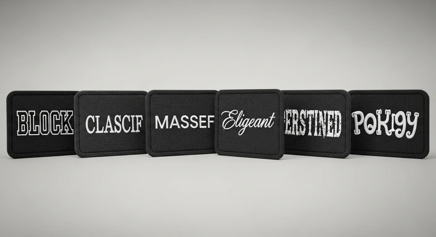
Block sans-serif fonts are the safest choice for hat embroidery. Their uniform stroke widths and clean geometry translate predictably into stitch patterns. Top recommendations: Montserrat Bold (clean, modern, excellent legibility), Oswald (condensed, fits more text in limited space), Bebas Neue (bold impact, excellent for 3D puff), Futura Bold (classic geometric, versatile across contexts), and Arial Black (heavy weight, maximum fill coverage).
Serif fonts can work if selected carefully. The thin serifs on fonts like Times New Roman or Garamond are too fine for embroidery below 0.40-inch letter height — the serifs merge into the stem strokes. Instead, use slab serif fonts like Rockwell, Clarendon, or Roboto Slab — their thick, block-shaped serifs hold up well in thread. Slab serifs convey a vintage, authoritative aesthetic popular with outdoor brands, craft businesses, and heritage-style branding.
Script and cursive fonts create elegant, flowing text but demand careful font selection and larger sizing. Only script fonts with connected letterforms and medium-to-thick strokes work reliably in embroidery. Top script recommendations: Pacifico (friendly, casual script), Playlist Script (flowing, wedding-appropriate), and Yellowtail (retro script with good weight). Avoid hairline scripts like Edwardian Script or Monotype Corsiva — their ultra-thin strokes disappear at small sizes.

Thread Color Combinations That Work
Thread color selection for hat embroidery follows the principle of sufficient contrast with intentional restraint. The design must be visible from a conversational distance (3-6 feet), which requires enough contrast between thread and hat fabric to distinguish the embroidered elements. At the same time, color restraint (2-4 colors maximum) produces cleaner, more professional results than complex multi-color designs that can appear cluttered on the small hat canvas.
Proven high-contrast combinations: White thread on navy hat (the most universally appealing combination), gold thread on black hat (premium, luxurious), white thread on forest green hat (classic, outdoor), navy thread on white hat (clean, corporate), red thread on charcoal hat (bold, energetic). These combinations work because the strong value contrast (light vs. dark) ensures legibility while the specific color pairings carry positive cultural and aesthetic associations.
Tonal embroidery — using thread that is one or two shades lighter or darker than the hat fabric — has become the dominant trend in premium headwear design for 2025-2026. White thread on cream hat, dark navy thread on mid-navy hat, or charcoal thread on black hat creates a subtle, sophisticated texture that is felt before it is read. Tonal embroidery signals design confidence and brand maturity. It works best for simple, bold designs (monograms, single words, geometric marks) where the subtle texture carries the visual impact rather than color contrast.
Thread color count directly affects production cost — each color change adds $0.50-$1.00 per hat. A three-color design costs $1.00-$2.00 more per hat than a single-color design. For budget-conscious orders, single-color embroidery with strategic stitch direction changes can create visual depth and texture without adding thread colors — the angle of the stitches catches light differently, creating subtle tonal variation within a single color.
Graphic Styles That Translate to Embroidery
Not all graphic styles work in embroidery. The key constraint is that embroidery is built from linear stitch paths — it excels at filling shapes with parallel lines of thread and creating crisp outlines, but struggles with fine gradients, photographic detail, and ultra-thin lines. The graphic styles that produce the best embroidery results share common characteristics: bold shapes, clean edges, limited detail, and strong silhouettes.
Logo marks and monograms: Single-letter or two-letter monograms are the most reliably excellent embroidery designs because their bold, simple forms translate perfectly to stitch patterns at any size. Circular logo marks, shield shapes, and badge-style enclosures also embroider beautifully because their defined boundaries create clean, contained designs.
Vintage and retro graphics: The bold outlines, limited color palettes, and simplified forms of vintage illustration style (1950s-1970s commercial art) align perfectly with embroidery capabilities. Vintage-style graphics are also highly popular in current headwear fashion, making them both technically suitable and commercially appealing.
Mascots and characters: Simplified mascot heads or character silhouettes work well if reduced to their essential shapes. A detailed, realistic animal illustration will lose definition in embroidery, but a stylized mascot head with bold outlines, flat colors, and minimal internal detail translates powerfully to the hat canvas. Professional sports teams maintain hat-specific mascot variants for this reason.
Design Mistakes to Avoid
Text too small: The single most common mistake. Any text below 0.25-inch height (approximately 18pt font at print resolution) becomes an illegible mass of thread. Taglines, phone numbers, and website URLs are frequent offenders — if the text cannot be set at 0.25 inches or larger, move it to the hat interior, a printed label, or omit it entirely.
Too many colors: Every thread color change adds cost, production time, and visual complexity. Designs with 6+ colors on a 4-inch canvas look cluttered rather than detailed. Simplify to 2-4 colors and use stitch direction for additional visual texture.
Photographic artwork: Photographs cannot be embroidered — they contain millions of colors, smooth gradients, and fine tonal transitions that thread cannot reproduce. If a photographic image must appear on a hat, use DTF printing instead of embroidery. If embroidery is required, convert the photograph to a simplified, posterized illustration with 3-5 flat colors and clean outlines.
Thin lines and fine detail: Lines thinner than 1mm (approximately 0.04 inches) will not hold their shape in embroidery — the thread width exceeds the intended line width, causing elements to merge. Increase all line weights to 1mm minimum and ensure 1mm minimum spacing between adjacent elements.
For design previews on different hat styles, use the free online design tool to test fonts, colors, and graphics before committing to production.
Frequently Asked Questions
What is the maximum number of colors for hat embroidery?
Most manufacturers support up to 15 thread colors per design, but the practical maximum for a clean, professional result on a hat is 4-6 colors. Each additional color adds $0.50-$1.00 per hat in thread change costs and increases production time. Designs with more than 6 colors should be evaluated for possible simplification or alternative methods like DTF printing which has no per-color cost.
Can script fonts be used for 3D puff embroidery?
Script fonts can be puffed only if the letterforms are thick enough (minimum 0.35-inch stroke width) for the foam to maintain its shape. Thin, delicate script fonts cannot be puffed because the narrow strokes collapse the foam, creating an uneven surface. Bold, connected script fonts like Pacifico and Lobster work in puff embroidery; hairline scripts like Edwardian do not.
How can a complex logo be simplified for hat embroidery?
Follow these steps: remove all gradients and replace with flat color fills, increase all line weights to 1mm minimum, reduce the color count to 4-6 colors by combining similar shades, eliminate fine details smaller than 2mm, and simplify or remove text below 0.25-inch height. Many brands maintain a separate "hat logo" variant specifically optimized for small-scale embroidery — this is standard practice among professional sports teams and major corporations.
Share this article
Written by
Camille Dupont
Creative Director at RareCustom. BFA from RISD with 9+ years in graphic design. Camille's typography expertise has been featured in Communication Arts and Print Magazine.