Best Fonts, Colors & Layouts for Phone Case Design: The Complete Guide
Master phone case design with expert guidance on typography, color palettes, layout composition, camera cutout integration, and common design mistakes. The definitive guide to creating stunning custom phone case designs.
Camille Dupont
Creative Director at RareCustom. BFA from RISD with 9+ years in graphic design. Camille's typography expertise has been featured in Communication Arts and Print Magazine.
A custom phone case is only as good as its design. The most premium materials and advanced printing methods in the world cannot save a poorly designed case — and conversely, a thoughtful, well-executed design elevates even a basic TPU case into something that looks and feels professional. Phone case typography, color palette selection, and layout composition follow specific rules that differ from other design surfaces because of the unique constraints of a phone case: the small canvas area (approximately 140 by 70 millimeters), the camera cutout interruption, the curved edges, and the way the case wraps around a three-dimensional object. This guide covers every aspect of phone case design, from font selection and color psychology to layout rules and common mistakes, giving you the knowledge to create designs that are not just good — but genuinely impressive.
Whether you are designing your first personal case, creating branded cases for a business, or building a portfolio of designs for a custom case business, the principles in this guide apply universally. Good design is not about artistic talent — it is about understanding rules, applying them consistently, and knowing when and how to break them for deliberate creative effect. By the end of this guide, you will have a clear framework for selecting the best fonts for phone case designs, building cohesive color palettes, composing layouts that work with (not against) the phone case form factor, and avoiding the most common mistakes that make amateur designs immediately recognizable.
Typography Rules for Phone Case Surfaces
Phone case typography operates under constraints that most designers never encounter on paper or screen designs. The printable surface area of a typical smartphone case is approximately 135 to 145 millimeters tall by 65 to 72 millimeters wide — roughly the size of a large business card. Within that space, the camera cutout occupies a significant portion of the upper area, button cutouts line the sides, and the charging port cutout occupies the bottom. The actual usable design space for text is often smaller than people expect, which makes font selection and sizing critically important for readability.
The minimum recommended font size for phone case printing is 8 points (approximately 2.8 millimeters cap height), but for comfortable readability at arm's length, 12 to 14 points is preferred for body text and 18 to 24 points for headlines or names. Sans-serif vs serif phone case typography is one of the most common design decisions: sans-serif fonts (Helvetica, Futura, Montserrat) reproduce more cleanly at small sizes on phone case surfaces because their uniform stroke widths are more forgiving with UV and sublimation printing tolerances. Serif fonts (Times New Roman, Garamond, Playfair Display) can work beautifully at larger sizes for monograms or names, but their thin strokes and delicate serifs can lose definition at sizes below 10 points, especially on textured TPU surfaces.
For additional context on how phone case design fits into the broader process of creating your first custom case, see our beginner's guide to custom phone cases, which covers the end-to-end workflow from concept to order.
Top 10 Fonts for Custom Phone Case Design
After testing hundreds of font families across thousands of custom phone case prints, these ten fonts consistently produce the best results in terms of readability, aesthetic appeal, and print fidelity across all case materials and printing methods. Each font serves a different design personality — from minimalist modern to vintage character.
1. Montserrat — A geometric sans-serif with excellent readability at all sizes. Its clean, modern appearance works for everything from business logos to personal monograms. The bold weight is particularly effective for names on phone cases. 2. Playfair Display — An elegant serif with high contrast between thick and thin strokes. Perfect for wedding monograms, formal event cases, and luxury branding. Use at 16 points or larger for best results. 3. Futura — A geometric sans-serif with a distinctly modern, forward-looking personality. Its perfect circles and uniform strokes print cleanly at small sizes. Ideal for minimalist phone case design.
4. Bebas Neue — An all-caps condensed sans-serif that makes a bold statement in minimal space. Its narrow width allows longer names or phrases to fit on a phone case without wrapping. 5. Lato — A humanist sans-serif that balances warmth and professionalism. Its semi-rounded terminals feel approachable without sacrificing readability. Excellent for corporate branding cases. 6. Pacifico — A casual brush script with a friendly, handwritten feel. Perfect for beachy, bohemian, or playful designs. Use sparingly — script fonts lose readability when overused.
7. Oswald — A reworked classic gothic typeface that pairs beautifully with wider sans-serifs. Its condensed proportions make it ideal for headlines above photo backgrounds. 8. Raleway — A neo-grotesque sans-serif with elegant thin weights that work beautifully for minimalist designs. The thin and ultralight weights create a sophisticated, airy feel on light-colored cases. 9. Abril Fatface — A display serif inspired by advertising fonts of the 19th century. Its dramatic thick-thin contrast creates a high-fashion look perfect for bold monogram phone case designs. 10. Space Mono — A monospaced font with a technical, digital aesthetic. Ideal for tech-themed designs, code-inspired patterns, and developer community branding.

Color Psychology for Custom Phone Case Products
Color psychology custom products research reveals that color is the primary factor in 85 percent of purchase decisions for personal accessories, and phone cases are no exception. The colors you choose for your custom phone case design communicate personality, mood, and values before the viewer reads a single word of text. Understanding how different colors affect perception helps you create designs that resonate emotionally with the intended audience — whether that audience is yourself, a gift recipient, or a target customer.
Blue communicates trust, stability, and professionalism — making it the most popular color for corporate and business branding cases. Red conveys energy, passion, and urgency — effective for bold personal statements and attention-grabbing event designs. Green signals growth, nature, and wellness — ideal for eco-conscious brands and outdoor enthusiasts. Yellow and orange evoke optimism, creativity, and warmth — great for fun, casual designs and youth-oriented products. Black communicates sophistication, luxury, and power — the most universally popular case color for both personal and professional use. White conveys minimalism, cleanliness, and modernity — perfect for showcasing colorful artwork or photography with maximum contrast. Pastel shades (blush pink, sage green, lavender) signal softness, femininity, and calm — trending strongly in 2025-2026 for personal phone case aesthetics.
Building Color Palettes That Work on Phone Cases
A well-constructed color palette for a phone case design typically uses three to five colors: a dominant background color (60 percent of the surface), a secondary accent color (30 percent), and one or two highlight colors (10 percent) for text, borders, or small graphic elements. This 60-30-10 distribution creates visual hierarchy and prevents the design from feeling chaotic or unfocused. On the small canvas of a phone case, using more than five colors often creates visual noise that reduces impact and readability.
When building your palette, consider the case material color as your base. A black TPU case provides a dark background that makes light and bright colors pop vibrantly. A clear polycarbonate case lets the phone's own color show through, which becomes part of your palette whether you plan for it or not. A white sublimation case gives you a blank canvas where any color combination works, but dark or saturated backgrounds will consume more ink and may show print imperfections more readily. Test your palette against the specific case material you plan to use — a color combination that looks stunning on screen may shift significantly when printed on a textured TPU surface versus a smooth polycarbonate shell.

Layout and Composition Rules for Phone Case Design
Phone case layout composition follows the same fundamental principles as any graphic design discipline — rule of thirds, visual hierarchy, focal point, balance, and white space — but adapts them to the unique proportions and constraints of a phone case surface. The most common layout mistake is treating the case like a rectangular canvas and ignoring the camera cutout, button positions, and curved edges that interrupt the design space. Effective phone case layout composition accounts for these interruptions and uses them as design elements rather than fighting against them.
The rule of thirds applied to a phone case creates a 3x3 grid over the printable area. Placing your primary design element (logo, photo, monogram) at one of the four intersection points creates a more dynamic composition than centering everything. However, for monogram phone case designs and single-name typography, centered placement remains the most popular and visually balanced option. The key is choosing one approach — centered or off-center — and committing to it, rather than mixing approaches that create visual confusion. For photo-based designs, see our photo phone case tips guide for specific advice on cropping, resolution, and color correction for phone case printing.
Designing Around the Camera Cutout
Camera cutout design integration is one of the most challenging and creative aspects of phone case design. The camera module occupies a significant portion of the upper back of the case — on modern smartphones, the camera island can be 30 to 40 millimeters in both height and width, representing roughly 15 to 20 percent of the total back surface area. Rather than treating this area as dead space, creative designers incorporate the cutout into their design concept.
Approaches to camera cutout design integration include: framing the cutout with a decorative border or ring that makes it look intentional, designing radiating patterns (sunbursts, concentric circles, geometric fans) that emanate from the camera module as a center point, creating character designs where the camera cutout becomes the character's eye, hat, or other feature, and placing typographic elements in a curve that follows the cutout's contour. The one non-negotiable rule is maintaining at least a 2 millimeter clearance between any printed design element and the camera cutout edge — this prevents ink from bleeding into the cutout and ensures the case mold seals cleanly around the camera module. RareCustom's design tool automatically enforces this safety zone and shows a visual guide when elements get too close to the cutout boundary.

Single-Side vs Full-Wrap Design Considerations
The choice between single-side (back panel only) and full-wrap (back plus edges) design significantly affects both the visual impact and the cost of your custom phone case. Single-side printing covers the flat back panel of the case, leaving the edges and sides in the case material's native color. This approach works well for centered designs, logos, and compositions where the primary viewing angle is the back of the phone. It is also more affordable because it requires simpler print setup and less ink coverage.
Full-wrap printing extends the design around the edges of the case, creating an immersive, all-encompassing visual effect. Pattern designs, gradient backgrounds, and abstract art are particularly effective in full-wrap format because the continuous flow of the design around the edges adds dimension and visual interest. However, full-wrap designs require careful attention to how the artwork distorts as it transitions from the flat back surface to the curved edges — especially at the corners, where stretching can cause pixelation or pattern misalignment. Sublimation printing on pre-coated blanks is particularly well-suited for full-wrap designs because the transfer wraps around the case during the heat press process, producing seamless edge coverage.
Design Styles and Aesthetics for Phone Cases
The aesthetic direction of your phone case design should align with the intended use, audience, and personal or brand identity. Here are the most popular design styles and when each is most effective. Minimalist: clean lines, ample white space, limited color palette (two to three colors), simple typography. Ideal for professional use, corporate branding, and people who prefer understated elegance. Minimalist phone case design is the most universally appealing style and the safest choice when designing for a broad audience. Maximalist: bold patterns, vibrant colors, layered graphics, dense compositions. Suited for personal expression, artistic showcase, and designs intended to stand out in social media content.
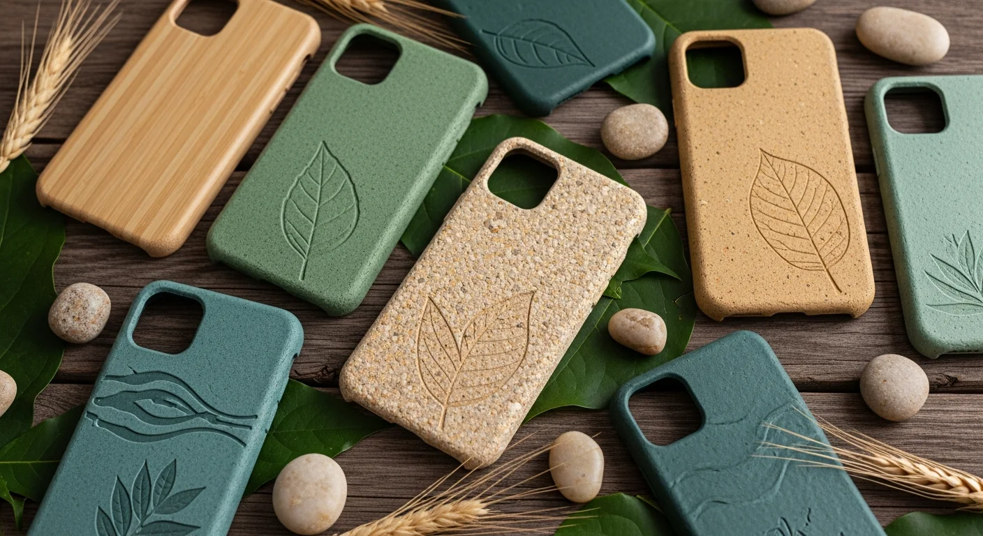
Vintage/Retro: weathered textures, muted color palettes, classic typography (slab serifs, script fonts), nostalgic imagery. Popular for personal cases and brands targeting millennial and Gen X audiences. Botanical/Nature: floral patterns, leaf motifs, earth tones, organic shapes. Trending strongly in 2025-2026, particularly in muted sage, dusty rose, and terracotta palettes. Geometric/Abstract: mathematical patterns, tessellations, gradients, and shape-based compositions. Works well for full-wrap designs where the pattern flows continuously around the case. For a broader look at what styles are trending this year, our 2026 design trends guide covers the latest movements in custom phone case aesthetics.
Common Phone Case Design Mistakes and How to Avoid Them
Even experienced designers make mistakes when transitioning to phone case design for the first time, because the format introduces constraints that do not exist in print or web design. Here are the most common mistakes and their solutions. Using too-small text: text below 8 points disappears into the case texture, especially on matte-finish TPU cases. Solution: keep body text at 12 points minimum and headlines at 18 points or larger. Ignoring the camera cutout: placing important design elements directly adjacent to or behind the camera cutout area. Solution: design with the cutout template visible and maintain at least 2 millimeters of clearance.
Low-resolution images: using images below 300 DPI results in visible pixelation on the printed case. Solution: always work with source images of at least 300 DPI at final print size (approximately 2000 by 1000 pixels for most phone cases). Too many colors: using six or more colors creates visual noise on the small case surface. Solution: limit your palette to three to five colors with a clear 60-30-10 distribution. Not testing on case mockups: a design that looks great on a flat canvas may reveal issues — text crossing the curved edge, patterns misaligning at the sides, colors shifting on the case material — that only become visible on a 3D mockup. Solution: always preview your design on a case mockup before ordering, and order a single proof before placing a large batch.

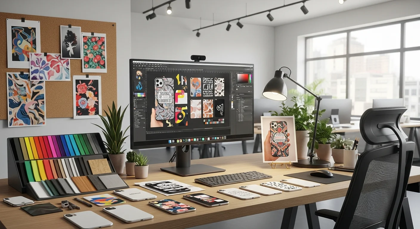
Free Design Tools for Custom Phone Case Creation
You do not need expensive software to create professional-quality phone case designs. Several free tools provide everything you need to design, preview, and prepare artwork for custom case printing. Canva (Free Tier): offers thousands of templates, stock photos, and design elements that can be adapted for phone case dimensions. Create a custom canvas at 2000 by 1000 pixels and design within a phone case template. GIMP: a free, open-source image editor with professional-grade tools for photo editing, layer composition, and file export in print-ready formats. Figma (Free Tier): a vector design tool ideal for creating clean logos, typography layouts, and geometric patterns that scale perfectly to phone case dimensions.
RareCustom's built-in design tool is specifically optimized for phone case design. It automatically loads the correct template for your selected phone model (including camera cutout positions and button guides), provides a real-time 3D preview of your design on the case, and exports print-ready files at the correct resolution and color profile. Unlike general-purpose design tools, it handles the phone case-specific constraints — safe zones, camera clearance, edge wrap calculations — automatically, so you can focus on the creative aspects of your design rather than the technical requirements.
Start Designing Your Custom Phone Case
Great phone case design combines the right typography, a cohesive color palette, thoughtful layout composition, and awareness of the phone case's unique form factor constraints. The fonts, colors, and layout rules in this guide give you a framework for creating designs that print cleanly, look professional, and stand out in a market flooded with generic options. Whether you are creating a minimalist monogram for yourself, a bold branded case for your business, or a whimsical design for an event, these principles apply universally across all case materials and printing methods.
Ready to put these principles into practice? Open the design tool, select your phone model, and start experimenting with the fonts, palettes, and layouts covered in this guide. Preview your design in 3D, order a proof, and see how your screen design translates to a physical custom phone case you can hold in your hand.
Related Articles
Share this article
Written by
Camille Dupont
Creative Director at RareCustom. BFA from RISD with 9+ years in graphic design. Camille's typography expertise has been featured in Communication Arts and Print Magazine.