Best Fonts for Custom Crewneck Sweatshirt Designs: Typography That Pops on Fleece
Discover the best fonts for custom crewneck sweatshirts. Learn which typefaces work for printed and embroidered designs, plus font pairing rules and sizing minimums for fleece.
Camille Dupont
Creative Director at RareCustom. BFA from RISD with 9+ years in graphic design. Camille's typography expertise has been featured in Communication Arts and Print Magazine.
Typography can make or break a custom crewneck sweatshirt design. The font you choose communicates your brand's personality before anyone reads a single word. But what works on a screen does not always translate to fleece fabric, and understanding which typefaces perform best on sweatshirts saves you from costly misprints and disappointing results.
Sweatshirt fabric has a texture that thinner fabrics lack. That nap interacts with ink and thread in ways that can either enhance or diminish your typography. This guide covers the top fonts for both printed and embroidered crewnecks, along with practical sizing rules that ensure readability at every scale.
Why Font Choice Matters More on Sweatshirts
On a smooth cotton t-shirt, even delicate script fonts with hairline strokes reproduce cleanly. On sweatshirt fleece, those same thin strokes can get lost in the fabric texture. The nap of the fleece creates micro-shadows and irregularities that swallow fine details. This means fonts for custom sweatshirts need slightly more weight and presence than their t-shirt counterparts.
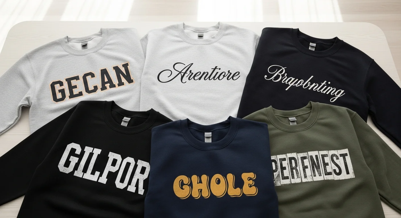
Top 10 Fonts for Printed Crewnecks
1. Helvetica Bold
The timeless workhorse. Clean, professional, and endlessly readable on any sweatshirt color. Its consistent stroke width reproduces perfectly in screen printing and DTG.
2. Futura
Geometric precision with a modern edge. Futura's clean circles and straight lines translate beautifully to fleece. The bold and extra-bold weights are particularly effective.
3. Bebas Neue
Tall, narrow, all-caps display font that commands attention. Perfect for single-word statements and acronyms on center-chest or full-front designs.
4. Oswald
Condensed sans-serif that fits more text into tight spaces without sacrificing readability. Excellent for taglines beneath a main graphic.
5. Playfair Display
Elegant serif with high contrast between thick and thin strokes. Works best in larger sizes where the thin strokes maintain visibility on fleece.
6. Montserrat
Versatile geometric sans-serif with multiple weights. The semi-bold and bold weights are ideal for body text on sweatshirts.
7. Impact
Ultra-bold, compressed, and impossible to miss. Perfect for single-word statements where visual weight matters more than subtlety.
8. Raleway
Clean and modern with a slight elegance. The medium and bold weights handle fleece texture well for both headings and body copy.
9. Righteous
Retro-inspired display font with rounded forms that feel friendly and approachable. Excellent for vintage-themed and casual brand designs.
10. Lato
Warm humanist sans-serif that balances professionalism with approachability. A reliable choice for any design context from corporate to casual.

Top 5 Fonts for Embroidered Crewnecks
Embroidery uses thread stitches rather than ink, which means fonts need to account for stitch direction, density, and the physical limitations of needle work. Fonts with consistent stroke widths and open letterforms embroider most cleanly.
1. Arial Bold
The gold standard for embroidered logos. Consistent stroke width and open counters (the enclosed spaces in letters like O and P) allow clean stitch patterns at small sizes.
2. Century Gothic
Geometric but slightly softer than Futura. Its rounded forms embroider smoothly without sharp corners that can bunch thread.
3. Times New Roman Bold
When you need a serif for embroidery, TNR Bold has enough stroke weight to maintain its serifs at small embroidery sizes. Avoid the regular weight.
4. Block Letter Sans
Simple, uniform letterforms designed specifically for embroidery. Every stroke is the same width, producing the most consistent stitch density.
5. Script MT Bold
The exception to the "avoid script for embroidery" rule. Script MT Bold has enough stroke weight to handle satin stitching without thin lines disappearing.

Font Pairing Rules for Crewneck Designs
When combining fonts, limit yourself to two typefaces maximum. Pair a bold display font for the headline with a clean sans-serif for supporting text. Contrast is key: pair thick with thin, serif with sans-serif, or decorative with simple. Avoid pairing two fonts that are similar but not identical, as this looks like a mistake rather than a design choice.
Font Sizing Minimums for Fleece
For screen printing on fleece, maintain a minimum of 14-point text for body copy and 24-point for headlines that need to be readable from a few feet away. For embroidery, the absolute minimum is typically 0.25 inches in letter height for uppercase block letters. Script and serif fonts need at least 0.35 inches for clean results.
For guidance on matching your font choices with the right t-shirt font strategies, our companion guide covers the same principles adapted for lighter fabrics.
Frequently Asked Questions
Can I use any font on a custom crewneck?
You can use any font you have the license to use commercially. However, not every font reproduces well on fleece. Avoid fonts with very thin strokes, extreme contrast between thick and thin elements, or overly decorative details that will be lost in the fabric texture.
What about script fonts for embroidery?
Most script fonts are too thin for clean embroidery at small sizes. If you want a script look, choose a bold or heavy-weight script, size it generously (at least 0.35 inches in height), and test with a sample stitch before committing to a full order.
What is the minimum text size for readability on a crewneck?
For screen printing, 14-point is the practical minimum for readable body text on sweatshirt fleece. For embroidery, letters need to be at least 0.25 inches tall. When in doubt, go bigger because text on a sweatshirt is viewed from farther away than text on a screen.
Share this article
Written by
Camille Dupont
Creative Director at RareCustom. BFA from RISD with 9+ years in graphic design. Camille's typography expertise has been featured in Communication Arts and Print Magazine.