25 Best Fonts for Custom T-Shirt Designs (With Visual Examples)
Discover the 25 best fonts for custom t-shirt designs. Font pairing tips, readability rules, and visual examples for every style. Free design tool inside.
Camille Dupont
Creative Director at RareCustom. BFA from RISD with 9+ years in graphic design. Elena's typography expertise has been featured in Communication Arts and Print Magazine.
Typography can make or break a custom t-shirt design. The font you choose communicates just as much as the words themselves, setting the tone, establishing the style, and determining whether your message is read from across a room or completely overlooked. A bold block font screams confidence and energy. A delicate script whispers elegance and sophistication. Choosing the wrong font for your message creates a disconnect that undermines even the most creative concepts.
This guide presents twenty-five of the best fonts for custom t-shirt designs, organized by style category with specific recommendations for different use cases. You will also learn the rules of font pairing for t-shirts, readability guidelines for printed apparel, and what you need to know about font licensing before sending your design to production.
Why Font Choice Makes or Breaks Your Design
T-shirt typography operates under different constraints than digital or print design. Your text needs to be legible from ten feet away on a moving surface that bends, folds, and wrinkles throughout the day. It needs to look good in multiple sizes, from a bold headline on the front to smaller supporting text on the back. And it needs to resonate emotionally with the wearer's personal style because, unlike a poster or a website, a t-shirt is worn on someone's body as an expression of identity.
The font you select establishes the personality of your entire design within milliseconds. Research shows that people make subconscious judgments about typography in less than a second, associating certain font characteristics with specific traits. Rounded fonts feel friendly and approachable. Angular fonts feel aggressive and edgy. Serif fonts feel traditional and trustworthy. Understanding these associations helps you choose custom t-shirt fonts that amplify your message rather than contradicting it.
Beyond personality, practical considerations matter enormously. Some beautiful fonts that look stunning on screen become illegible when screen printed at small sizes because their thin strokes disappear during the printing process. Others use excessive font weight that causes ink to bleed or fill in on certain fabrics. The best shirt design fonts balance aesthetic appeal with real-world printability.
Font color contrast against the shirt color is the final piece of the puzzle. Even the perfect font becomes invisible if its color does not create sufficient contrast against the garment. Light fonts on light shirts and dark fonts on dark shirts are the most common readability mistakes in t-shirt typography. Always test your font choices against your actual shirt color before finalizing your design.
Bold and Modern Sans-Serif Fonts

Sans-serif fonts are the workhorses of t-shirt design. Their clean lines, even strokes, and minimal ornamentation make them highly legible fonts at any size and distance. For bold, confident designs that demand attention, sans-serif fonts deliver.
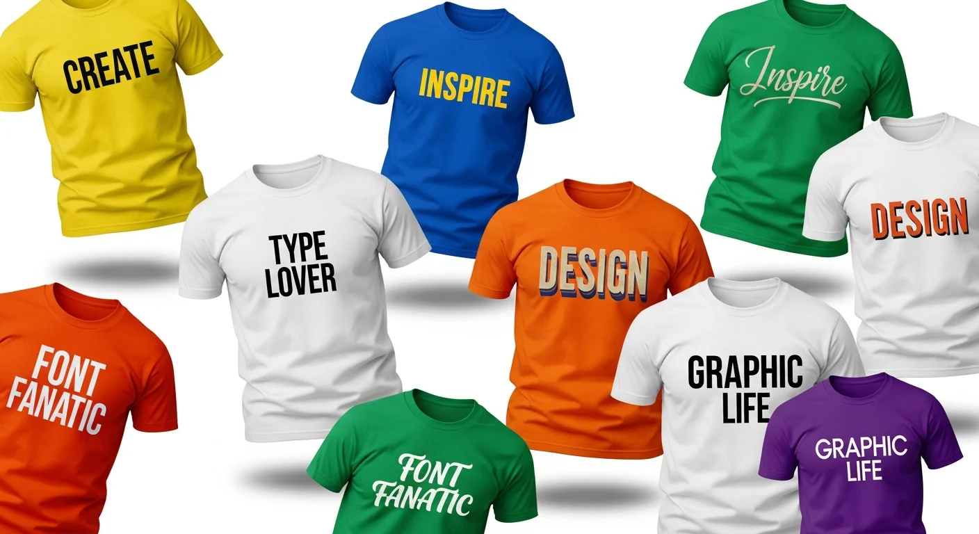
1. Montserrat. Inspired by urban typography from the Montserrat neighborhood of Buenos Aires, this Google Fonts favorite features geometric shapes with subtle optical adjustments that improve readability. Its extensive weight range from thin to extra bold gives you tremendous flexibility in creating typography hierarchy on your shirt. Montserrat works beautifully for event shirts, business branding, and modern statement tees.
2. Bebas Neue. A tall, narrow display font with all-caps styling that creates an instantly iconic look. Bebas Neue is one of the most popular bold fonts for t-shirt headlines because its condensed proportions allow you to fit more text without sacrificing impact. It pairs exceptionally well with a lighter-weight body font for supporting text beneath the headline.
3. Futura. A geometric sans-serif designed in 1927 that has never gone out of style. Futura's perfect circles and even proportions give it a timeless, authoritative quality that works for everything from corporate logos to athletic apparel. The bold weight creates clean, powerful headlines, while the book weight is excellent for longer text passages.
4. Oswald. Another condensed sans-serif that maximizes the impact of text in limited horizontal space. Oswald's slightly narrower proportions compared to standard sans-serifs make it ideal for designs where you need a lot of text to fit without wrapping. It maintains excellent readability in apparel even at smaller sizes, making it versatile for both primary and secondary text elements.
5. Raleway. An elegant sans-serif with a sophisticated feel that bridges the gap between casual and formal. Raleway's distinctive characters, particularly its unique W, add personality without sacrificing legibility. It works particularly well for fashion-forward graphic tee designs, boutique branding, and designs that need to feel polished without being stuffy.
Classic Serif Fonts

Serif fonts bring a sense of tradition, authority, and refinement to t-shirt designs. The small decorative strokes at the ends of each letter, called serifs, create a classic appearance that is associated with established brands, literary references, and vintage aesthetics.
6. Playfair Display. A high-contrast serif with dramatic thick-thin strokes that creates visual tension and elegance. Playfair Display is perfect for designs that need to feel luxurious or editorial, like fashion brands, anniversary celebrations, and upscale event shirts. Use it for headlines and pair it with a clean sans-serif for body text.
7. Merriweather. Designed specifically for screen readability, Merriweather translates beautifully to print with its generous x-height and open letter forms. This makes it one of the most legible fonts in the serif category for t-shirt applications, especially when used at medium sizes for quotes, taglines, or event details.
8. Lora. A well-balanced serif with subtle calligraphic qualities that add warmth and personality without feeling overly decorative. Lora works well for designs that need to convey authenticity, craftsmanship, or heritage. It is an excellent choice for brewery merchandise, artisan brand shirts, and family reunion designs with a classic sensibility.
9. Rockwell. A slab serif font with sturdy, blocky serifs that create a bold, grounded appearance. Slab serif fonts are particularly well-suited for screen printing because their thick, uniform strokes reproduce cleanly at any size. Rockwell is ideal for athletic teams, construction companies, and any design that needs to project strength and durability.
Script and Handwritten Fonts

Script fonts and handwritten fonts add a personal, organic quality to t-shirt designs that no other font category can replicate. They evoke feelings of authenticity, creativity, and individuality. However, script fonts require careful handling on apparel because their flowing connections and thin strokes can create readability challenges at small sizes.
10. Pacifico. A brush script with a casual, surf-culture vibe that feels effortlessly cool. Pacifico is one of the most widely used script fonts for t-shirt designs because it is readable at moderate sizes while maintaining the flowing character that makes scripts appealing. It works beautifully for beach themes, vacation shirts, and laid-back lifestyle brands.
11. Great Vibes. An elegant, flowing script with beautiful connecting strokes that create a sophisticated, calligraphic appearance. Great Vibes is best suited for special occasion shirts like weddings, anniversaries, and formal events where elegance is the primary goal. Use it sparingly for short phrases or names rather than long sentences to maintain readability.
12. Permanent Marker. A handwritten font that captures the authentic look of thick marker lettering on paper. Permanent Marker feels spontaneous, edgy, and unfiltered, making it perfect for protest shirts, punk-inspired designs, and anything that needs to feel DIY and rebellious. Its thick strokes ensure it prints well with both screen printing and DTG methods.
13. Sacramento. A monoline script with consistent stroke width throughout each letter. Unlike traditional scripts with thick-thin contrast, Sacramento's uniform lines make it more readable at smaller sizes and more predictable in printing. It is an excellent choice for feminine designs, boutique branding, and subtle accent text on multi-element compositions.
14. Amatic SC. A handwritten font with a narrow, condensed structure and quirky character that feels artistic and playful. Amatic works well for creative projects, art fair merchandise, and designs that want to project an artisanal, hand-crafted quality. Its condensed proportions make it effective for fitting longer phrases into limited space.
Retro and Vintage Fonts

Retro fonts tap into nostalgia and create instant visual appeal by referencing specific design eras. The vintage t-shirt fonts category has exploded in popularity as consumers gravitate toward designs that feel authentic, weathered, and timeless. These fonts pair exceptionally well with distressed textures and aged color palettes.
15. Righteous. A rounded, groovy font that channels 1970s psychedelic poster art. Righteous is bold, fun, and instantly recognizable as a retro design choice. It works wonderfully for music merchandise, festival shirts, and any design that wants to capture the free-spirited energy of the disco era.
16. Bungee. A chromatic display font inspired by urban signage from the mid-twentieth century. Bungee's blocky, architectural letterforms create an immediate sense of vintage Americana. It is available in several styles including inline and shade variants that allow you to create dimensional typographic effects without needing advanced graphic design skills.
17. Abril Fatface. A display serif with extremely thick strokes and dramatic contrast that references nineteenth-century advertising posters. Abril Fatface creates bold, commanding headlines that feel both historical and contemporary. It is particularly effective for anniversary shirts, commemorative designs, and brands that want to project established heritage.
18. Press Start 2P. A pixel font that replicates the bitmap typography of 1980s arcade games and early personal computers. This font is perfectly suited for gaming events, tech-themed shirts, retro arcade merchandise, and designs that celebrate digital nostalgia. Because of its fixed-width pixel structure, it maintains consistent readability across all sizes.
Athletic and Sports Fonts

Athletic fonts are designed to project speed, power, and competitive energy. They feature dynamic angles, italic leans, and aggressive proportions that feel at home on jerseys, team warm-up shirts, and sports event merchandise. These fonts work best for designs that want to feel active and energetic.
19. Anton. A reworking of traditional sans-serif advertising fonts with slightly condensed proportions and a commanding presence. Anton delivers impact in large sizes and maintains clarity at smaller scales, making it a versatile choice for team names, event titles, and motivational phrases on athletic shirts.
20. Teko. A narrow sans-serif with a modern, technical feel that suggests precision and performance. Teko's condensed width allows for larger text in smaller spaces, which is particularly useful for team roster names on the back of jerseys. Its even stroke width ensures clean screen printing reproduction.
21. Black Ops One. A military-inspired stencil font with bold, aggressive proportions. Black Ops One communicates toughness, discipline, and determination, making it ideal for fitness brands, obstacle course race shirts, and military-themed events. The stencil gaps add visual interest while maintaining full readability.
22. Russo One. A sans-serif with a slightly squared, geometric structure that feels both athletic and modern. Russo One bridges the gap between sports typography and contemporary design, making it appropriate for designs that need to feel active without being overly aggressive. It works well for recreation leagues, school sports, and casual athletic branding.
Display and Statement Fonts
Display fonts are designed to make an impact in large sizes. They sacrifice versatility for personality, creating memorable impressions that stick with viewers long after they have looked away. On a t-shirt, display fonts work best for short phrases, single words, or standalone typographic compositions.
23. Lobster. A bold script with connected letterforms and flowing curves that create a friendly, energetic feel. Lobster has become one of the most recognizable display fonts in modern design, appearing on everything from restaurant signage to custom apparel. Its thick strokes ensure excellent printability across all methods.
24. Bangers. An exuberant comic book font with thick, slightly irregular letterforms that practically shout from the page. Bangers is perfect for humorous shirts, party themes, children's events, and any design that needs to feel loud, fun, and unapologetically playful. It pairs well with more reserved secondary fonts to create contrast.
25. Alfa Slab One. A slab serif display font with massive proportions and powerful visual weight. Alfa Slab One commands attention with its ultra-thick serifs and confident posture. It is ideal for bold statement tees, motivational quotes, and designs where the text itself is the entire design. A single word in Alfa Slab One can fill a shirt front and create a striking graphic impact.
Font Pairing Rules for T-Shirts

Font pairing is the art of combining two or more fonts in a single design to create visual interest and typographic hierarchy. The right pairing elevates a design from amateur to professional, while the wrong pairing creates visual confusion that undermines your message. For t-shirt designs, simplicity is paramount: two fonts is ideal, three is the absolute maximum.
The fundamental principle of font pairing for t-shirts is contrast with cohesion. Your paired fonts should be different enough to create visual distinction but similar enough to feel like they belong together. Pairing a bold sans-serif headline font with a lighter sans-serif body font creates contrast through weight alone. Pairing a serif headline with a sans-serif body creates contrast through structure. Both approaches work when the fonts share similar proportions and sensibilities.
Avoid pairing fonts that are too similar. Two sans-serifs with nearly identical proportions and weights create a look that feels inconsistent rather than intentionally designed. The viewer senses that something is different but cannot immediately identify what, which creates subconscious discomfort. If you use two fonts from the same category, make sure they differ significantly in weight, width, or style.
Some reliable pairing formulas that work consistently for t-shirt designs include: Bebas Neue (headline) with Montserrat (body), Playfair Display (headline) with Raleway (body), Permanent Marker (headline) with Oswald (body), and Abril Fatface (headline) with Lora (body). These combinations create clear hierarchy while maintaining visual harmony across the design. For more design fundamentals, read our complete beginner's design guide.
Readability and Size Guidelines

Readability is the most overlooked aspect of t-shirt typography. A font that looks perfect at arm's length on your computer screen may be completely illegible on a shirt across a room. Following proven font size for printing guidelines ensures your message communicates effectively at real-world viewing distances.
For primary headlines on the front of a shirt, use a minimum height of one inch for the tallest characters. At this size, most fonts remain readable from fifteen to twenty feet away, which covers typical social interaction distances. Headlines using condensed or narrow fonts may need to be slightly larger to compensate for their reduced horizontal space.
Secondary text, such as event details, dates, or supporting messages, should be at least half an inch tall. Text smaller than this becomes difficult to read at conversational distance and may lose fine details during the printing process, especially with screen printing methods that can cause thin strokes to fill in.
Letter spacing, also known as kerning, plays a critical role in readability at distance. Increasing letter spacing slightly beyond the default improves legibility because it prevents letters from visually merging when viewed from afar. Uppercase vs lowercase choices also affect readability: all-uppercase text is easier to read at distance because the uniform height creates a cleaner silhouette, but mixed case text feels more natural and approachable for longer phrases.
Font weight matters more for apparel than for most other applications. Thin and light font weights that look elegant on screen can disappear on fabric because the narrow strokes do not hold enough ink to create sufficient contrast. For DTG fonts and screen printing fonts alike, medium to bold weights generally produce the most consistent, readable results. Reserve thin weights for very large headline text where the letter forms are big enough to maintain visibility.
Font Licensing: What You Need to Know
Font licensing is an often-overlooked consideration that carries real legal and financial implications for anyone creating t-shirts for sale. Just because you have a font installed on your computer does not mean you have the right to use it on commercial products. Understanding the difference between personal use and commercial use fonts protects your business from potential copyright infringement issues.
Google Fonts is the safest starting point for t-shirt designers because every font in the library is released under open-source licenses that permit commercial use at no cost. This includes using the fonts on products you sell, which makes Google Fonts the ideal source for custom t-shirt fonts that need commercial licensing clearance. Many of the fonts recommended in this guide, including Montserrat, Oswald, Playfair Display, and Bebas Neue, are available through Google Fonts.
Premium font marketplaces like Adobe Fonts, MyFonts, and Creative Market offer extensive libraries with varying license terms. Some include commercial product licensing in their standard price, while others require an extended license for merchandise applications. Always read the license agreement carefully before using a purchased font on t-shirts you plan to sell.
If you are creating shirts for personal use, non-commercial events, or internal company use, licensing restrictions are generally less stringent. Most font licenses permit personal and non-commercial use without additional fees. However, if there is any possibility that the shirts might be sold or distributed commercially, securing proper commercial use fonts licensing from the outset avoids potential legal complications down the road.
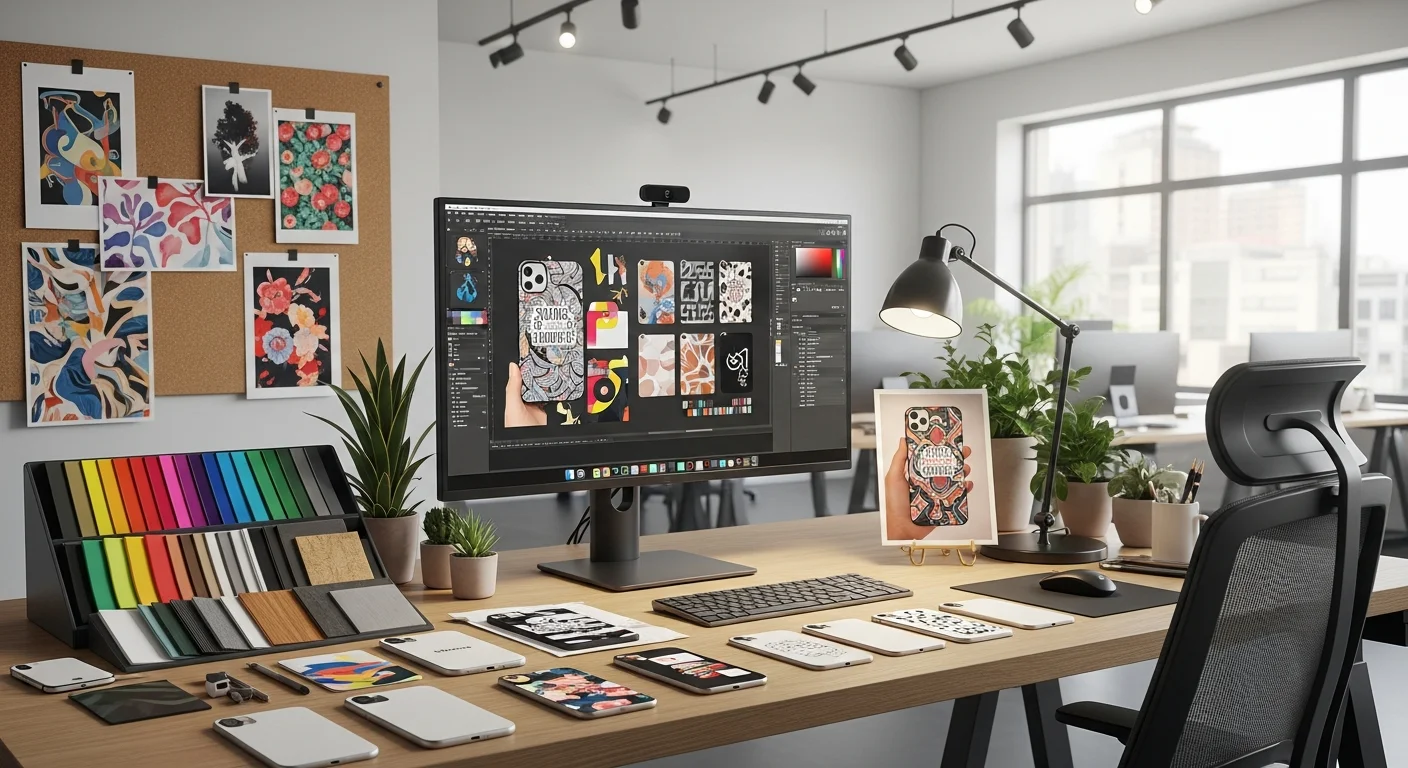
Try These Fonts in the RareCustom Design Tool
The best way to evaluate a font for your t-shirt design is to see it on an actual shirt mockup, and the RareCustom design tool makes that possible in seconds. Our free online designer includes a library of hundreds of fonts spanning every category covered in this guide, allowing you to experiment with different typefaces and see exactly how they look on your chosen shirt style and color.
Type your text, select a font, adjust the size and color, and instantly preview the result on a realistic t-shirt mockup. Switch between fonts with a single click to compare options side by side. Test readability by zooming out to simulate how your design will appear at a distance. This hands-on approach eliminates guesswork and ensures your font choice works in the real world, not just on paper.
Once you have found the perfect font, combine it with images, graphics, or additional text elements to complete your design. Our tool supports uploading your own artwork in PNG, SVG, and JPG formats, so you can integrate custom illustrations or logos with your chosen t-shirt typography for a truly unique finished product.
Every order of custom t-shirts from RareCustom includes free shipping with no minimum quantity. Whether you are printing a single statement tee for yourself or outfitting an entire team, you get the same professional quality and the same free delivery. Learn more about how printing methods affect font reproduction in our screen printing vs DTG comparison guide.
Related Articles
Share this article
Written by
Camille Dupont
Creative Director at RareCustom. BFA from RISD with 9+ years in graphic design. Elena's typography expertise has been featured in Communication Arts and Print Magazine.