Best Logo & Text Design Tips for Custom Golf Balls
Master golf ball logo and text design with expert tips on print area sizing, font selection, color contrast, and layout. Avoid common mistakes and create stunning custom golf balls.
Camille Dupont
Creative Director at RareCustom. BFA from RISD with 9+ years in graphic design. Camille's typography and layout expertise ensures every golf ball design looks professional.
Designing for a golf ball is unlike designing for any other surface. You are working with a curved, dimpled sphere measuring just 1.68 inches (42.67mm) in diameter, where the usable print area is a circle roughly 25mm in diameter — about the size of a US quarter coin. Every design choice you make, from logo sizing and font weight to color selection and white space, must account for this uniquely constrained canvas. Get it right and your custom golf balls become memorable keepsakes that recipients proudly tee up. Get it wrong and your brand's first impression is a blurry, illegible smudge on a dimpled surface.
This guide covers the essential principles of golf ball logo design and golf ball text design — the rules that separate professional-looking custom golf balls from amateur attempts. Whether you are designing for a corporate event, a wedding, or a personal gift, these tips will help you create designs that look sharp, read clearly, and survive the rigors of on-course play.
Understanding the Golf Ball Print Area
The first step in effective golf ball logo sizing is understanding exactly how much space you have to work with. A regulation golf ball has a diameter of 1.68 inches (42.67mm), but the printable area on one pole is a circle approximately 25mm in diameter — roughly 20% of the ball's total surface area. This printable circle is where your entire design must fit, including any text, logos, borders, or decorative elements.

The golf ball print area size is further complicated by the ball's dimple pattern. Most golf balls have between 300 and 500 dimples covering the surface, and these dimples create texture that can interfere with fine lines, small text, and detailed artwork. The print head must deposit ink into the valleys of each dimple, which means thin lines may appear broken or inconsistent where they cross dimple boundaries. Designs with bold strokes, filled shapes, and generous spacing handle golf ball dimple interference much better than intricate filigree or hairline details.
For two-pole design golf ball layouts, each pole has its own 25mm print circle on opposite hemispheres. The two print areas are separated by the ball's equator, so there is no visual overlap — each side is a completely independent design canvas. Two-pole printing is popular for corporate balls (logo on one side, event name and date on the other) and for alignment aids (custom putting line on one side, brand mark on the other).
Logo Design Rules for Golf Balls
Translating a full-size logo to a golf ball logo design requires thoughtful simplification. Logos that look stunning on a business card, website, or hat may not translate to a 25mm circle on a dimpled surface. The golden rule is to simplify, enlarge, and bold-ify every element of your design for golf ball use.
Start with a vector logo golf ball file (AI, EPS, SVG, or high-resolution PDF) whenever possible. Vector files scale without quality loss and allow precise control over line weights, which is critical for small-format printing. If you only have a raster image golf ball file (PNG, JPG), ensure the resolution is at least 300 DPI at the actual print size (25mm circle). A 300 DPI image at 25mm translates to approximately 295 × 295 pixels — small, but sufficient for clean output on modern UV printers.
Eliminate fine details that will not reproduce at golf ball scale. Thin outlines under 0.5pt, detailed gradients with subtle transitions, and decorative elements with features smaller than 1mm will be lost to dimple interference and ink spread. If your logo includes a tagline or secondary text line, consider removing it for the golf ball version and using only the icon/mark. Many of the best golf ball logo designs are simplified versions of the full brand identity — recognizable but optimized for the small, curved format.
For guidance on the full design and ordering process from start to finish, review the beginner's guide to custom golf balls.
Font Selection — What Reads Best on a Curve
Golf ball font selection is one of the most impactful decisions you will make. The wrong font renders text illegible at golf ball scale, while the right font remains crisp and readable even at 8pt equivalent size on a curved, dimpled surface. The key variables are font weight, serif vs sans-serif style, letter spacing, and x-height.

Bold font golf ball choices consistently outperform light and regular weight fonts. A bold or semi-bold weight ensures that each letterform has enough visual mass to remain legible across dimple patterns. Avoid thin, light, or ultra-light weights — strokes under 0.5pt wide will disappear into the dimples at normal viewing distance.
The serif vs sans-serif golf ball debate has a clear winner for most applications: sans-serif fonts perform better at small sizes on curved surfaces. Sans-serif typefaces like Helvetica Bold, Futura Bold, Arial Black, Montserrat Bold, and Gotham Bold have uniform stroke widths and open letterforms that maintain readability in the 6–10pt range. Serif fonts (Times New Roman, Garamond) can work for monograms and single initials but become problematic for multi-word text because the small serifs and variable stroke widths create visual noise at miniature scales.
Letter spacing (tracking) should be slightly increased from default settings for golf ball typography. Adding 10–20% extra tracking prevents letters from visually merging at small sizes, especially on dimpled surfaces where ink spread can fill narrow gaps between characters. All-caps text with generous tracking is one of the most reliable text treatments for golf ball readability.
Color Contrast and Visibility
Golf ball color contrast directly determines how visible your design is on the course. The most effective custom golf ball designs use high-contrast color combinations that remain distinguishable from 3–5 feet away — the typical distance at which golfers read their ball marks during play.

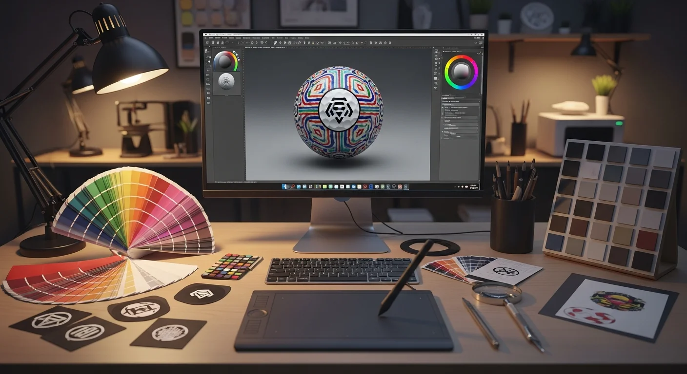
On white golf balls, the highest-contrast ink colors are black, navy blue, dark green, and dark red/maroon. These dark tones create maximum differentiation against the white surface and remain visible under all lighting conditions. Golf ball PMS color matching ensures brand-accurate hues — specify your brand's Pantone color for pad printing, or provide golf ball CMYK color values for UV printing, to achieve consistent results across orders.
Medium-contrast combinations — royal blue, forest green, medium red, and purple on white — work well but may be harder to read at distance or in overcast conditions. Low-contrast combinations to avoid include yellow on white, light gray on white, and pastel tones on white balls. These pairings look invisible from more than 2 feet away and negate the entire purpose of personalization.
For colored golf balls (yellow, orange, pink), the contrast rules invert. Dark ink colors remain strong choices, but some medium tones that work on white (like royal blue) may clash with certain ball colors. Always request a golf ball mock-up preview to evaluate your specific color combination before committing to production. The printing method also affects color output — for a complete comparison of how colors render on UV vs pad printing, read the printing methods comparison guide.
Designing Text-Only Golf Balls
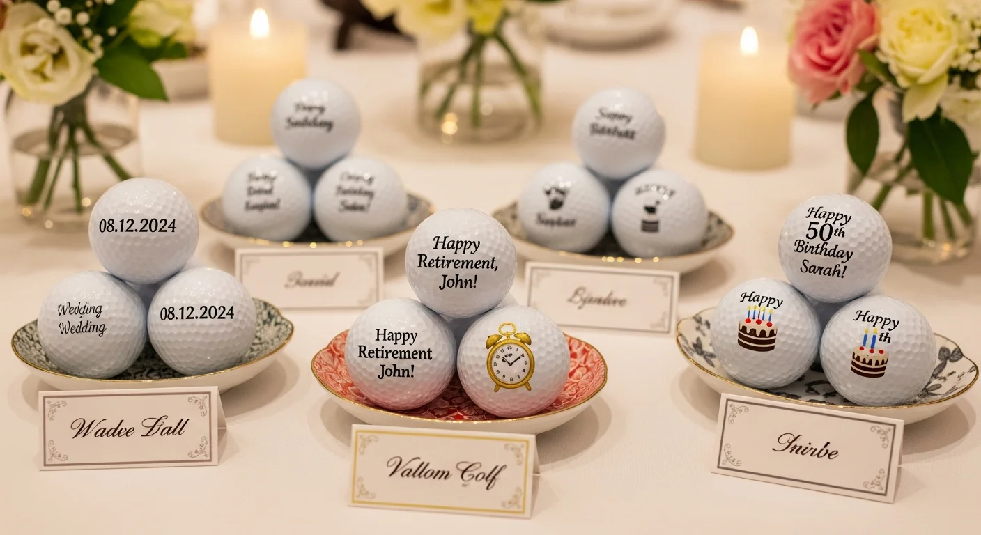
Text-only designs are among the most popular custom golf ball design approaches, used for golf ball monograms, golf ball initials, golf ball date inscriptions, names, and golf ball funny text or golf ball message ideas. The absence of a graphic element puts even more emphasis on typography and spacing, making font selection and layout particularly critical.
Golf ball monogram designs typically feature 1–3 initials in a large, bold serif or decorative font centered in the print area. Single initials can be as large as 15–18mm tall, filling the majority of the 25mm circle and creating a bold, elegant appearance. Two- and three-letter monograms should maintain a minimum letter height of 8mm to ensure legibility. Classic monogram fonts include Bodoni, Didot, and Copperplate, which work well at these large sizes because the individual letters have enough visual weight.
Golf ball message ideas and golf ball funny text require more careful layout planning because multi-word messages need to fit within the 25mm circle while remaining readable. The most effective approach is to use 1–3 short lines of text, centered vertically, with the primary message on the largest line and secondary information (date, name) on smaller lines below. Popular funny text designs include "I'd rather be golfing," "Nice shot (not your ball)," "Do not throw in water," and personalized humor that references inside jokes.
Golf ball date inscription is a popular element for wedding balls, tournament commemoratives, and milestone gifts. Dates work best in a clean numeric format (06.15.2026 or June 15, 2026) positioned below the primary text or logo. Use a consistent font weight for the date line that is slightly smaller than the main text — typically 60–75% of the primary text size.
Combining Logo + Text
Many custom golf ball design projects require both a logo and text within the same 25mm print area. The challenge is allocating space between graphic and typographic elements without overcrowding the design. Successful logo-plus-text layouts follow a clear hierarchy: the logo dominates the upper portion of the print area, and supporting text occupies the lower portion.
The three most effective layout approaches for combined golf ball logo design and text are: (1) stacked vertical layout with logo on top and text below, (2) logo centered with curved text arcing above and/or below, and (3) logo and text side-by-side for horizontally oriented marks. Of these, the stacked vertical layout is the most reliable because it naturally divides the circular print area into two zones with clear visual separation.
When combining elements, golf ball white space is your most important design tool. Leave at least 1–2mm of clear space between the logo and text, and maintain a 1mm minimum margin from the edge of the print area to any design element. This golf ball border design buffer prevents elements from appearing cramped and reduces the risk of edge clipping during printing. Overcrowding the print area is the single most common mistake in combined logo-and-text designs.
Alignment Aids and Custom Marks
Beyond branding and personalization, custom golf ball printing can serve a practical purpose through golf ball alignment marks. Custom alignment aids — printed lines, arrows, or aiming graphics — help golfers line up putts more accurately and identify their ball quickly on the course. Many golfers draw alignment lines by hand with permanent markers; custom printing offers a cleaner, more precise, and more professional alternative.
Popular golf ball alignment mark styles include a single thin line running across the top of the ball (for putting alignment), a triple-line system (center aim line with two parallel reference lines), an arrow pointing toward the target, and custom crosshair patterns. These functional elements can be combined with logos or text on the same pole or placed on the opposite pole using two-pole design golf ball printing.
The golf ball icon design space also extends to personal symbols and small graphic marks that serve as quick identification aids. Golfers playing in groups often need to distinguish their ball from partners' identical models — a small custom icon (a star, a pet silhouette, a sports team logo) printed alongside the ball number provides instant identification from the fairway.
Design Inspiration Gallery
Looking for golf ball design inspiration? The most popular design categories for personalized golf balls fall into several distinct styles, each with its own design principles:
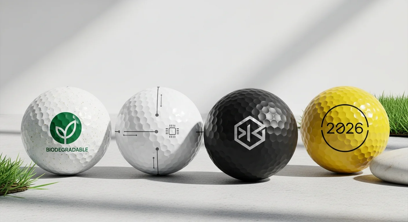
Minimalist designs use a single element — one icon, one monogram, or one short phrase — centered in the print area with generous white space. Golf ball minimalist design is trending in 2026, reflecting broader design preferences for clean, uncluttered visuals. A simple brand icon in a single dark color on a white ball exemplifies this approach.
Corporate designs follow golf ball brand guidelines closely, reproducing the company logo with precise PMS color matching. The best corporate designs resist the temptation to add taglines, URLs, and phone numbers to the already-small print area. The logo alone is sufficient for brand recognition; additional information can be included on packaging or accompanying materials.
Photo-realistic designs leverage UV printing to reproduce full-color photographs on the ball surface. Popular subjects include faces, pets, landscapes, and artistic images. For detailed guidance on preparing photos for golf ball printing, see the photo golf ball tips guide.
Humorous and novelty designs use bold text, cartoon graphics, and pop-culture references. These designs prioritize entertainment value over brand consistency and are popular for birthday gifts, bachelor parties, and casual golf outings.
Common Design Mistakes to Avoid
Understanding the most frequent golf ball design mistakes helps you sidestep problems that ruin otherwise well-intentioned projects. These mistakes are especially common among first-time custom golf ball buyers who apply standard graphic design principles to this non-standard format.

Mistake 1: Too much detail. Intricate logos with golf ball fine detail — thin lines, small text, complex gradients, and photographic elements below 300 DPI — fail on the dimpled surface. Solution: simplify the design to its essential elements and increase stroke weights to a minimum of 0.5pt.
Mistake 2: Ignoring the curved surface. Designs created on flat digital canvases look different when wrapped onto a sphere. Straight horizontal lines appear to curve, and elements near the print area edges distort more than center elements. Golf ball curved surface design considerations require testing your layout on a spherical mock-up before production. Solution: use a golf ball template or mock-up tool that simulates the curvature.
Mistake 3: Low-resolution images. Raster image golf ball files below 300 DPI produce pixelated, blurry prints. At the 25mm print size, pixelation is clearly visible even at arm's length. Solution: always provide images at 300+ DPI at print size, or supply vector files.
Mistake 4: Poor color contrast. Light-colored designs on white balls (yellow, light gray, pastels) are invisible from typical viewing distance. Solution: choose dark, high-contrast ink colors and test visibility using a digital mock-up.
Mistake 5: Overcrowding. Attempting to fit a logo, tagline, website URL, date, and decorative border into a 25mm circle results in an illegible mess. Solution: prioritize the one or two most important elements, and use the second pole (two-pole printing) for secondary information.
Tools for Designing Your Golf Ball
Several tools and resources make the golf ball design tool process more accessible, even for non-designers. RareCustom's free online design tool allows you to upload logos, add text, select fonts and colors, and preview your design on a realistic 3D golf ball mock-up — all within your browser, with no software to download.
For designers working in professional software, Adobe Illustrator and Photoshop are ideal for preparing golf ball template files. Create your design within a 25mm circle at 300 DPI, and use the golf ball's dimple pattern overlay (available from most print providers) to check how your design interacts with the surface texture. Canva and Figma also work well for simpler designs, though they lack the precise vector control of Illustrator.
When preparing files for submission, the key technical specifications are: file format (PNG, PDF, AI, SVG, or EPS), resolution (300+ DPI for raster images), color mode (CMYK for pad printing, RGB or CMYK for UV printing), and design dimensions (25mm diameter circle, or 295 × 295 pixels at 300 DPI). Providing your design in the correct golf ball print file format eliminates art preparation delays and ensures your print matches your digital preview exactly.
Create Your Design Now
Ready to put these design principles into practice? Our free online design tool walks you through the entire process — from logo upload and text customization to color selection and 3D preview. You will see exactly how your design looks on your chosen ball model before placing your order, eliminating guesswork and ensuring professional results every time.
Browse our complete selection of custom golf balls to choose your base ball, upload your design, and start creating. Whether you are designing a sleek corporate logo ball, a funny text gift, or a photo-printed keepsake, the right design approach transforms a simple golf ball into something truly personal.
Related Articles
Share this article
Written by
Camille Dupont
Creative Director at RareCustom. BFA from RISD with 9+ years in graphic design. Camille's typography and layout expertise ensures every golf ball design looks professional.