Custom Blanket Design Tips: Layouts, Colors & Typography That Work
Master custom blanket design with expert tips on layouts, color schemes, typography, and composition. Create professional-looking personalized blankets every time.
Jordan Reeves
Brand Experience Strategist at RareCustom. BFA in Graphic Design from Parsons School of Design with 8+ years helping brands craft visual identities. Specialist in color theory, layout composition, and design systems.
The difference between a custom blanket that looks professionally designed and one that feels amateurish comes down to a handful of fundamental design principles. Layout composition, color harmony, typography choices, and spatial balance determine whether your personalized blanket becomes a stunning centerpiece or a well-intentioned but visually cluttered disappointment. The good news is that you do not need to be a graphic designer to create a beautiful blanket — you just need to understand the core principles that guide effective blanket design tips and apply them to your project.
This guide breaks down every visual element of custom blanket design into actionable advice you can follow step by step. Whether you are creating a photo collage blanket, a text-based monogram design, a graphic pattern blanket, or a combination layout, these principles will help you make confident design decisions that result in a blanket you are proud to give or keep. From custom blanket layout fundamentals to advanced blanket typography techniques, you will find everything you need to create a professional-quality personalized blanket every time.
Understanding Blanket Design Fundamentals
Every successful blanket design starts with understanding the unique constraints and opportunities of the medium. Unlike designing for a flat screen or a printed page, a blanket is a three-dimensional textile that gets folded, draped, and crumpled in everyday use. This means your design needs to work when the blanket is fully spread out and when only a portion is visible — folded over a couch arm, bunched up on a bed, or wrapped around someone's shoulders.
The blanket safe zone is the most critical concept in blanket design. The safe zone is the inner area of the blanket — typically 2 to 3 inches inside each edge — where important design elements should be placed. Content near the absolute edges of the blanket may be trimmed or folded under during hemming, so names, faces, and essential text must stay within the safe zone. The blanket bleed area extends beyond the safe zone to the actual cut edge, and this area should contain only background colors or patterns that can be safely trimmed without losing critical content.
Blanket composition refers to how all visual elements — photos, text, borders, backgrounds — are arranged to create a cohesive, visually balanced design. Strong composition draws the viewer's eye to the most important element first (the blanket focal point), then guides it naturally through supporting elements. Without a clear focal point and intentional hierarchy, a blanket design feels scattered and unfocused regardless of how beautiful the individual elements are.
Blanket design resolution is foundational to output quality. For sublimation-printed blankets, images should be at least 150 DPI at the blanket's full dimensions, with 300 DPI preferred for the sharpest results. A 50 by 60 inch throw blanket at 150 DPI requires an image that is at least 7,500 by 9,000 pixels. Lower resolution files will produce visible pixelation — a blurry, blocky appearance that no amount of clever layout can compensate for.
Single Image vs Multi-Photo Layouts
Choosing between a single image blanket design and a multi-photo layout is the first major design decision, and it should be driven by the story you want the blanket to tell and the quality of your available images.

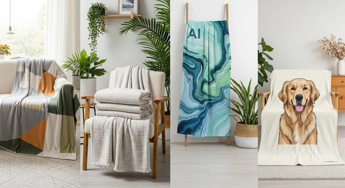
A single image blanket design creates maximum visual impact with one stunning photograph or graphic that fills the entire blanket surface. This layout works best when you have a single outstanding image — a professional portrait, a breathtaking landscape, a cherished family photo, or a piece of original artwork. The single-image approach produces the most dramatic, gallery-quality result because the design has no competing elements. The blanket becomes a wearable canvas where one image takes center stage.
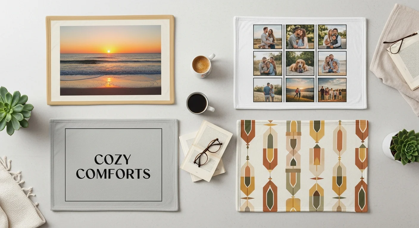
Multi-photo layouts — including grids, collages, and scattered arrangements — tell richer stories by combining multiple images into a cohesive composition. A photo blanket layout with 4, 6, 9, or 12 photos can document a relationship timeline, a vacation journey, a child's growth milestones, or a collection of family memories. The tradeoff is that individual photos are smaller, so each image needs to be strong enough to work at a reduced size. Close-up portraits and images with clear subjects work better in collage layouts than wide-angle scenes with distant details.
The blanket aspect ratio of your design should match the blanket dimensions. A standard throw blanket is roughly 5:6 (50 by 60 inches), which is a portrait orientation. If you are using landscape-oriented photos for a single-image layout, consider whether rotating the design to blanket landscape vs portrait orientation better serves the composition. Grid collages in even numbers (4, 6, 8) naturally fit the portrait orientation, while odd-number grids may require creative spacing to maintain balance.
Collage Layout Templates and Grid Options
Collage blanket design templates provide a structured framework that ensures visual balance without requiring advanced design skills. Most blanket design tools offer pre-built templates with defined photo slots, but understanding the principles behind effective collage composition helps you customize templates or create original layouts with confidence.
Symmetrical grid layouts — evenly sized and evenly spaced photo cells — create clean, organized compositions that work universally. A 3-by-3 grid of nine photos is one of the most popular blanket design template options because it accommodates enough images to tell a story while keeping each photo large enough to appreciate individually. Ensure consistent spacing between cells — typically 0.25 to 0.5 inches — and maintain uniform photo orientation within the grid (all landscape or all portrait) for the most polished result.
Asymmetrical collages — featuring a mix of large and small photo cells — create more dynamic, visually interesting compositions. Place your strongest, most important image in the largest cell to establish a clear focal point, then surround it with smaller supporting images. The blanket visual hierarchy created by varying cell sizes naturally guides the viewer's eye from the primary image to secondary content without the viewer needing to consciously decide where to look first.
Masonry-style layouts mimic the staggered arrangement of bricks and are particularly effective for combining landscape and portrait photos without wasted space. This layout style feels more casual and organic than rigid grids, making it ideal for vacation memory blankets, friendship collages, and pet photo compilations where a scrapbook aesthetic complements the content. For more photo-specific guidance, read the photo blankets tips for stunning prints guide.
Color Theory for Blanket Design
Color is the single most impactful design element on a blanket because of the product's large surface area. A poor color choice is amplified across 50 by 60 inches of fabric, making it impossible to ignore. Conversely, a well-chosen blanket color scheme elevates even simple designs to a professional, polished level.

The blanket background color is the foundational color decision. Dark backgrounds (navy, charcoal, black, deep green) provide elegant contrast for light-toned photos and white text, creating a dramatic, premium feel. Light backgrounds (white, cream, pale pink, soft blue) create airy, fresh compositions that work well with vibrant photos and dark text. Avoid mid-tone gray backgrounds — they tend to make photos appear flat and washed out by reducing contrast.
Blanket color contrast between foreground elements (photos, text) and the background is essential for readability and visual impact. High contrast — dark text on a light background or white text on a dark background — ensures text is legible from across the room. Low contrast between background and foreground elements is the number one cause of blanket designs that look "muddy" or "busy." Always squint at your design preview from a distance to verify that all elements remain visually distinct.
Complementary colors blanket designs use colors from opposite sides of the color wheel (blue and orange, purple and yellow, red and green) to create vibrant, high-energy compositions. Analogous color schemes — colors adjacent on the color wheel (blue, teal, green or red, orange, yellow) — create harmonious, soothing designs. Monochromatic schemes use variations of a single hue (light blue, medium blue, navy) for sophisticated, unified compositions that never clash.
When working with photos, let the dominant colors in your images guide your background and accent color choices. If your photos feature warm tones (golden hour lighting, autumn foliage, indoor warmth), complement them with warm background options. If your photos lean cool (ocean scenes, winter landscapes, overcast skies), cool-toned backgrounds will create a cohesive palette.
Typography and Font Selection
Blanket typography is more challenging than screen-based typography because text must remain legible at a much larger physical scale while being viewed from varying distances and angles. A font that looks beautiful on a computer monitor may lose its charm when printed at 60 inches across a fleece blanket.

Blanket font selection should prioritize readability above all else. Sans-serif fonts (Helvetica, Montserrat, Open Sans, Futura) are the safest choice for blankets because their clean lines reproduce clearly on fabric textures. Serif vs sans serif blanket comparisons consistently show that serif fonts (Times New Roman, Garamond, Playfair Display) add elegance and formality but can lose thin stroke details on textured materials like sherpa or woven blankets. Reserve serif fonts for smooth fleece surfaces where fine details are preserved.
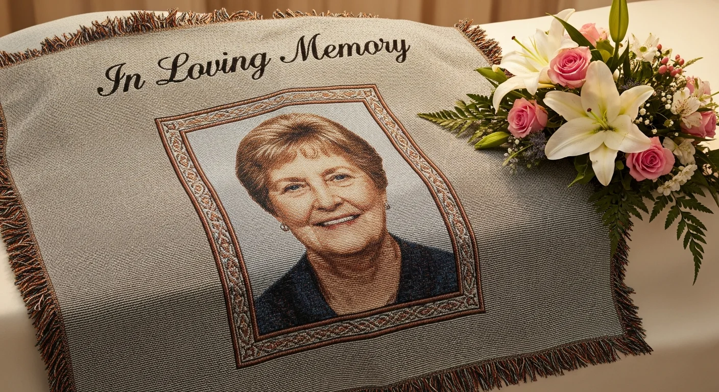
Script font blanket designs are popular for romantic, celebratory, and memorial blankets — occasions where visual elegance matters. Script fonts require careful sizing: the blanket text size minimum for script fonts is at least 2 inches tall for readability, compared to 1 inch for sans-serif fonts. Highly connected, heavily looped scripts (like Edwardian Script) can become illegible at smaller sizes or on textured surfaces, so opt for open, cleanly spaced script fonts (like Great Vibes or Allura) when designing for blankets.
Blanket font pairing — using two complementary fonts together — adds visual interest while maintaining readability. The classic pairing formula is one decorative or display font for the headline (a name, date, or short phrase) and one clean, simple font for supporting text (a longer quote, location, or secondary message). Never use more than two fonts on a single blanket design — three or more fonts create visual chaos that undermines the professional quality of the piece.
Text Placement and Hierarchy
Where you position text on a blanket is just as important as which font you choose. Blanket text placement should work in harmony with other design elements — photos, borders, patterns — rather than competing with them for attention.
For photo-centric blankets, text works best in dedicated spaces: a strip above or below the photo grid, integrated into the border area, or placed in a designated text block within the collage layout. Avoid overlaying text directly on complex photos — the visual busyness of the photo background makes text difficult to read. If text must overlap an image, use a semi-transparent color overlay behind the text to create contrast and ensure legibility.
Blanket visual hierarchy determines the order in which the viewer processes information. The primary element — typically a name, photo, or headline — should be the largest and most visually prominent element on the blanket. Secondary elements (dates, locations, supporting quotes) should be noticeably smaller. Tertiary elements (decorative text, fine print, captions) should be the smallest. This clear hierarchy prevents the "everything is equally important" problem that makes designs feel cluttered and overwhelming.
Blanket monogram design is a specialized text-placement style where initials are arranged in a specific order (typically First-Last-Middle with the last name initial largest in the center). Monograms are traditionally centered on the blanket and work exceptionally well as single, bold design elements on solid-color backgrounds. For beginners, the custom blankets beginner's guide covers the full ordering process including text customization.
Border and Frame Design Options
Blanket border design frames your content and finishes the edges of your composition. Borders serve both a practical purpose — defining the safe zone and preventing important content from being trimmed — and an aesthetic purpose — adding a polished, intentional frame to the overall design.

Solid-color borders are the simplest and most universally effective option. A 1 to 3 inch border in a complementary color frames the design cleanly and provides a natural margin of safety for edge trimming during production. White borders create a gallery-print aesthetic, while dark borders (navy, black, charcoal) add elegance and weight to the design. Match the border color to the dominant accent color in your design for a cohesive appearance.
Patterned borders — stripes, dots, geometric patterns, floral motifs — add decorative interest without overwhelming the primary design. Keep patterns subtle and small-scale so they complement rather than compete with the central content. Patterned borders work particularly well for baby blankets, seasonal gifts, and celebratory occasion blankets where a festive frame enhances the theme.
Frameless designs — where the image or pattern extends to the very edge of the blanket with no border at all — create a bold, modern aesthetic. Full-bleed designs require careful attention to the bleed area: extend your background color or pattern at least 0.5 inches beyond the final cut line to ensure no unintended white edges appear after trimming. This approach works best for single-image blankets and all-over pattern designs.
Background Patterns and Textures
Blanket pattern design backgrounds transform plain blankets into visually rich compositions, even without photos. Geometric patterns (chevron, herringbone, polka dots, quatrefoil), organic patterns (floral, botanical, paisley), and abstract patterns (watercolor washes, marble effects, gradients) each create a distinct visual personality for your blanket.
A blanket gradient background — a smooth transition between two or more colors — adds depth and visual interest without the complexity of a full pattern. Gradients work particularly well behind centered text or monograms, creating a subtle backdrop that makes the text pop. Radial gradients (color fading outward from the center) naturally draw the eye to the central design element. Linear gradients (color transitioning from top to bottom or left to right) create a sense of direction and flow.
Blanket texture overlay effects — linen, canvas, paper, or fabric textures digitally applied to the background — add tactile depth to the printed design. These overlays make solid-color backgrounds feel richer and more dimensional without introducing pattern complexity. Use texture overlays subtly — heavy textures can interfere with photo clarity and text readability if applied too aggressively.
Common Design Mistakes to Avoid
Even experienced designers make blanket design mistakes when they fail to account for the unique characteristics of blanket printing. Identifying and avoiding these common pitfalls will save you time, money, and disappointment.

Overcrowding is the most frequent design mistake. Attempting to include too many photos, too much text, or too many decorative elements on a single blanket creates visual chaos. As a general rule, blanket whitespace — the empty space between design elements — should comprise at least 20 to 30 percent of the total design area. White space gives each element room to breathe and allows the viewer's eye to rest, making the overall design feel polished rather than frantic.
Using low-resolution images is the second most common mistake, and it is the hardest to fix after the fact. Always check blanket design file format requirements before starting your design. A photo that looks sharp on a phone screen may be only 72 DPI — perfectly fine for a 4-inch display but devastatingly blurry when printed at 50 inches across a blanket. Verify resolution before committing to your layout.
Ignoring color contrast between text and background makes names, dates, and quotes illegible from anything more than arm's length. Always place light text on dark backgrounds and dark text on light backgrounds. If your design features a photo background, use a semi-transparent overlay strip behind any text to guarantee readability regardless of the photo's color variation.
Forgetting about the fold is a practical mistake unique to blanket design. Most blankets are displayed folded — over a couch arm, on a shelf, or in a blanket basket. Design your blanket so that the most important element (a face, a name, a logo) is visible when the blanket is folded in the most natural manner. Typically, the upper third of the blanket is the most visible area when folded.
Using the Design Tool Effectively
Modern blanket design software and online design tools have made professional-quality blanket design accessible to everyone, regardless of graphic design experience. RareCustom's free online design tool provides a drag-and-drop interface with pre-built templates, photo upload, text customization, and real-time blanket mockup preview so you can see exactly how your finished blanket will look before placing your order.
Start with a template if you are unsure about layout composition. Templates are designed by professionals with proper spacing, alignment, and proportion already built in — you just need to drop in your photos and customize the text. Once you are comfortable with the tool, you can modify templates or start from a blank canvas for fully custom designs.
Use the preview function extensively. View your design at full size, at reduced size (simulating how it looks from across a room), and in the folded mockup view. Check that text is readable, photos are sharp, colors are accurate, and all important content falls within the safe zone. Take advantage of the proof approval process — never skip it. The digital proof is your last chance to catch and correct issues before production begins.
The blanket print area displayed in the design tool shows the exact printable surface. Elements outside this area will be trimmed or folded under. Always keep critical design elements — faces, names, complete words — comfortably inside the print area boundaries. For comprehensive material guidance, see the fleece vs sherpa vs woven custom blanket materials comparison.
Create Your Perfectly Designed Blanket
Ready to put these design principles into action? RareCustom's free online design tool makes it easy to create beautiful custom blankets using professional templates, intuitive photo upload, and real-time preview. Choose from fleece, sherpa, or woven materials in throw, twin, and queen sizes, then personalize with your photos, text, monograms, and custom color schemes.
Every blanket includes a free digital proof for your approval before production begins. No minimum order requirements mean you can create a single personalized blanket as a gift or order matching sets for an entire family. Our production team ensures accurate color reproduction, crisp text rendering, and vibrant photo printing on every blanket — so your carefully crafted design translates perfectly from screen to fabric.
Related Articles
Share this article
Written by
Jordan Reeves
Brand Experience Strategist at RareCustom. BFA in Graphic Design from Parsons School of Design with 8+ years helping brands craft visual identities. Specialist in color theory, layout composition, and design systems.