Best Fonts, Colors, and Layouts for Custom Mug Design
Master mug design with expert guidance on font pairing, color contrast on ceramics, layout composition for curved surfaces, and common design mistakes that ruin otherwise great mugs.
Camille Dupont
Creative Director at RareCustom. BFA from RISD with 9+ years in graphic design. Camille's typography expertise has been featured in Communication Arts and Print Magazine.
The difference between a custom mug that becomes someone's favorite daily companion and one that gets pushed to the back of the cabinet often comes down to three design decisions: the font, the color palette, and the layout composition. On a standard 11-ounce mug, the printable surface area is approximately 3.5 by 8 inches — roughly the size of a postcard wrapped around a cylinder. Every design element is fighting for attention in a small, curved space, which means each choice needs to be intentional. The wrong font shrinks to illegibility, the wrong color disappears against the ceramic, and the wrong layout wastes precious print area on empty space or cluttered compositions.
This guide covers the typography, color theory, and layout principles specific to mug design — not generic graphic design advice, but practical guidance calibrated for the unique constraints of printing on cylindrical drinkware. Whether designing a text-only quote mug, a branded corporate mug, a photo mug with text overlays, or a pattern-based decorative mug, these principles ensure the finished product looks polished, professional, and purposeful. For first-time creators, the beginner's guide covers the broader ordering process.
Font Selection for Custom Mugs
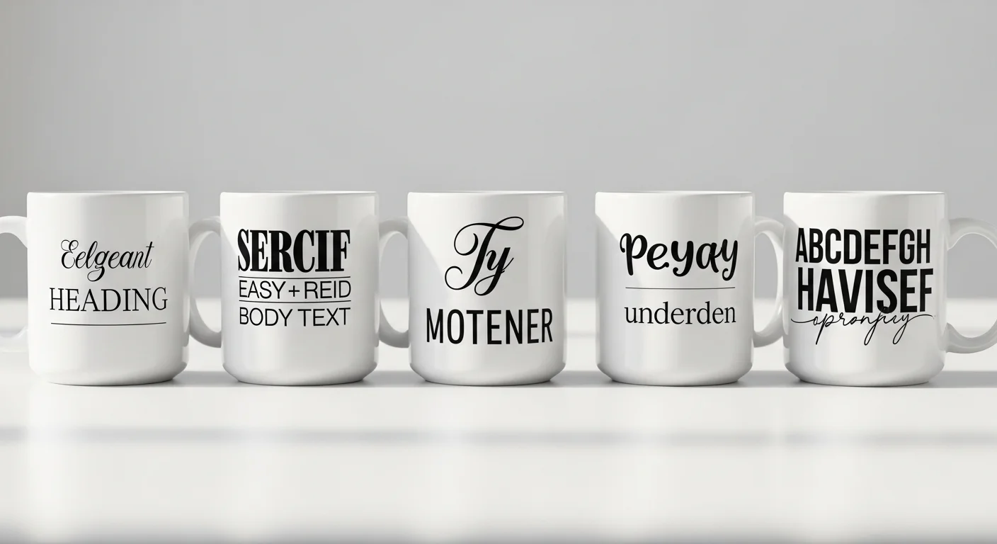
Sans-serif fonts are the safest choice for mug text. Fonts like Montserrat, Open Sans, Lato, Poppins, and Raleway produce clean, legible text at every size that works on a mug — from large headlines to smaller secondary text. The uniform stroke width of sans-serif letterforms maintains consistency when wrapped around the mug's curved surface, ensuring that the letters look the same on the front face as they do on the sides. Sans-serif fonts are recommended for 80 percent of custom mug designs, including corporate logos, funny quotes, names, and informational text.
Serif fonts add elegance for formal occasions. Fonts like Playfair Display, Merriweather, Lora, and Georgia convey sophistication and tradition — ideal for wedding mugs, anniversary gifts, memorial keepsakes, and premium brand positioning. The thin strokes and decorative details (serifs) of these fonts require slightly larger minimum sizes on mugs (0.30 inches / ~22 point minimum) because the fine details can become indistinct on a curved, textured ceramic surface. Reserve serif fonts for headlines, names, and short phrases rather than body text.
Script and handwritten fonts for personality. Fonts like Pacifico, Dancing Script, Great Vibes, Sacramento, and Caveat add warmth, playfulness, and personal touch to mug designs. However, script fonts are the most challenging to use effectively on mugs because their connected letterforms and varying stroke widths can become illegible when small or when the text wraps around the curve. Best practice: use script fonts for a single word or short name (3 to 5 words maximum), at a minimum height of 0.40 inches, and pair them with a sans-serif font for any supporting text.

Font Pairing Rules for Mugs
Pair no more than two fonts per mug design. Using three or more fonts creates visual chaos on the limited mug surface area. The standard approach: one font for the primary text (name, headline, quote) and one font for secondary text (date, subtitle, tagline). Choose fonts from different categories (one sans-serif paired with one serif, or one sans-serif paired with one script) to create clear visual contrast between the two text levels.
Five effective mug font pairings: (1) Montserrat Bold + Playfair Display — bold modern headline with elegant serif subtitle, ideal for wedding and anniversary mugs. (2) Bebas Neue + Open Sans Light — impactful all-caps headline with clean, readable body text, perfect for corporate and promotional mugs. (3) Poppins Bold + Dancing Script — contemporary bold headline with playful script accent, great for birthday and gift mugs. (4) Raleway + Caveat — minimalist sans-serif with casual handwritten accent, suited for inspirational quote mugs. (5) Impact + Lora — maximum-impact headline with classic serif detail, strong for funny quote mugs where the punchline needs to hit hard.
Color Theory for Mug Printing
White is the dominant base for custom mugs because sublimation printing requires a white or light-colored surface to display colors accurately. This white base provides maximum contrast for any design color and acts as built-in white space that prevents the design from feeling cramped. Working with a white base simplifies color decisions — virtually any ink color will be visible and vibrant against white ceramic.
Dark colors for text on white mugs. Black, dark navy, dark charcoal, and dark brown provide the highest contrast and best readability for text on white mugs. Pure black (#000000) is the standard choice for maximum legibility. Dark colors ensure text remains readable at any size and at arm's length — critical for mugs that are held, set on desks, and viewed from multiple angles. Avoid light colors (yellow, light gray, pastel tones) for small text because they lack sufficient contrast against the white ceramic surface.
Accent colors for emphasis. Use a single accent color to highlight key words, graphic elements, or decorative borders. The accent color should contrast strongly with both the white background and the primary text color. Red, teal, navy blue, forest green, and warm gold are popular accent colors for mugs because they are visible, distinctive, and photograph well for social media sharing. Limit accent colors to one or two — more than that creates visual noise on the small mug surface.

How Sublimation Affects Color Appearance
Sublimation tends to deepen tones compared to the on-screen preview. Colors that appear bright and airy on an LCD screen may print 5 to 15 percent darker on ceramic because the heat transfer process intensifies pigment saturation. This effect is most noticeable on skin tones in photographs (which may shift warmer) and on pastel colors (which may lose their lightness). The correction is to increase brightness by 5 to 10 percent in the source file before uploading — the photo mug tips guide covers color correction in detail for photographic designs.
Gradients reproduce well in sublimation but require attention to the transition zone. Smooth gradients from one color to another print beautifully on ceramic — this is one of sublimation's strongest capabilities compared to screen printing. However, very subtle gradients (transitioning between two similar shades) may appear as a flat color on the printed mug because the tonal shift is too minor to survive the heat transfer process. Use gradients with at least 30 percent brightness or hue difference between the start and end colors for clearly visible transitions.
Layout Composition for Curved Surfaces
The "golden zone" is the center of the mug's front face — the area directly opposite the handle, approximately 3 inches wide. This is the primary viewing area when the mug sits on a desk or is held in the right hand (for right-handed drinkers, who represent 90 percent of the population). Place the most important design element — a face in a photo, the key word in a quote, the primary logo — in this golden zone for maximum visibility and impact.
Single-side vs full-wrap layout. Single-side designs concentrate the artwork on the front face (opposite the handle) and leave the back and sides blank or with minimal elements. This is the most common layout for text-based mugs, logos, and single photos. Full-wrap designs extend artwork around the entire circumference, creating a seamless 360-degree experience — ideal for panoramic photos, repeating patterns, and collage designs. Full-wrap designs must account for the handle interruption zone (1 to 1.5 inches on each side of the handle) where the design is partially hidden.
Vertical centering is critical. Text and graphic elements should be vertically centered in the printable area (between the top and bottom trim lines). Elements placed too high appear to be "climbing" the mug, while elements placed too low feel like they are sinking. Most mug design templates include center guides — use them. For multi-line text, center the text block as a whole rather than centering each line individually, which can create an uneven, ragged appearance on the curved surface.

White Space and Design Breathing Room
White space is a design feature, not wasted space. On a mug, white space (the unprinted white ceramic visible around and between design elements) serves a critical function: it creates visual breathing room that makes the printed elements stand out. A mug completely filled edge-to-edge with text, photos, and graphics feels overwhelming and reduces the readability and impact of every individual element. The most professional-looking custom mugs use 40 to 60 percent of the available print area, leaving the rest as white space.
Minimum margins from print area edges: Keep all important content at least 0.25 inches inside the safe zone boundary on all four sides. This margin accounts for minor alignment variations during the sublimation process and prevents text or critical design elements from being cut off at the top, bottom, or sides. Background colors and patterns should extend to the bleed zone (beyond the trim line) to prevent white edges from appearing if the print shifts slightly.
Common Design Mistakes That Ruin Mugs
Too many elements. The most frequent mistake is cramming too many photos, text blocks, icons, and decorative elements onto the small mug surface. Each additional element competes for attention and reduces the impact of every other element. A clean design with one focal point (a single photo, a bold quote, a clear logo) almost always looks more professional than a collage of five photos with overlaid text and border graphics. Follow the "one hero" rule: identify the single most important element and make it the dominant visual.
Text too small to read. Text below 0.25 inches (18 point) is difficult to read on a curved ceramic surface at arm's length. This is especially problematic for subtitle text, taglines, and secondary messages that designers make small to fit more content. If text cannot be read comfortably when the mug is held at chest height, it is too small. Reduce the word count rather than reducing the font size.
Low-contrast color combinations. Yellow text on a white mug, light gray logos on a cream background, and pastel-on-pastel color schemes produce mugs where the design is barely visible. Always verify that the contrast ratio between the text/design color and the mug surface color is sufficient for comfortable readability. Black, navy, dark green, and dark red on white ceramic provide the best results.
Ignoring the handle. Designs that do not account for the handle position may place important text or the focal point of a photo directly behind or adjacent to the handle, where it is hidden when the mug is held or displayed. Always check the 3D preview in the design tool to verify that key elements are visible from the primary viewing angle (front face, opposite the handle).
Design Tool Best Practices
The RareCustom free online design tool provides mug-specific templates with accurate print area boundaries, font libraries, color pickers, image upload and positioning, and 3D mug preview. To get the best results: upload artwork at the highest available resolution (PNG or SVG for logos, high-resolution JPEG for photos); use the template's safe zone guides to position elements within the guaranteed print area; preview the design on the 3D mockup at multiple angles to verify front-face visibility and handle clearance; and save the design to the account for future editing or reordering.
Frequently Asked Questions
What is the best font for custom mug text?
Bold sans-serif fonts like Montserrat, Poppins, and Bebas Neue provide the best readability on ceramic mugs at all sizes. For elegant occasions (weddings, formal gifts), Playfair Display and Merriweather are excellent serif options. Pair a maximum of two fonts per design — one for the primary text and one for secondary elements. Minimum recommended text height is 0.25 inches for sans-serif and 0.30 inches for serif fonts.
How do I make text readable on a photo mug?
Add a semi-transparent dark overlay (50 to 70 percent opacity) behind the text area, or position text on a naturally simple area of the photo (clear sky, solid background). Use white or light-colored text on dark overlays, and choose a bold sans-serif font at a minimum height of 0.30 inches. Avoid placing small text over busy, detailed areas of a photograph.
Why does my mug print look darker than the screen preview?
Sublimation printing tends to deepen tones by 5 to 15 percent compared to screen displays because screens emit light while ceramic reflects it. To compensate, increase brightness by 5 to 10 percent in the source image before uploading. This adjustment is especially important for photographs with skin tones and for pastel color palettes. Order a sample mug for critical color verification before large orders.
Related Articles
Share this article
Written by
Camille Dupont
Creative Director at RareCustom. BFA from RISD with 9+ years in graphic design. Camille's typography expertise has been featured in Communication Arts and Print Magazine.