Best Fonts, Colors & Layouts for Custom Tumbler Design: A Visual Guide
Master tumbler typography, color palettes, and layout composition for stainless steel, plastic, and glass tumblers. Practical design rules for sublimation, laser engraving, and UV printing.
Camille Dupont
Creative Director at RareCustom. BFA from RISD with 9+ years in graphic design. Camille's typography expertise has been featured in Communication Arts and Print Magazine.
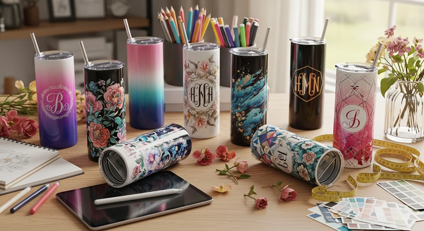
A custom tumbler is only as good as the design printed, engraved, or sublimated onto its surface — and designing for a curved, tapered cylinder is fundamentally different from designing for flat media like paper, screens, or even custom mugs. Tumbler typography must remain readable when wrapped around a narrowing surface. Color palettes must account for the base material — metallic stainless steel reflects light differently than matte plastic or transparent glass. Layout composition must respect taper angles, seam lines, and print area margins that vary by tumbler size and shape. This visual guide breaks down the best fonts for drinkware, the color combinations for tumblers that produce striking results, and the tumbler layout composition principles that separate professional-looking designs from amateur ones.
Whether the project is a full-wrap sublimation design for a 20oz skinny tumbler, a laser-engraved monogram on a 30oz powder-coated model, or a UV-printed corporate logo on a matte black 40oz hydration tumbler, the typography, color, and layout decisions covered here apply universally. This guide is organized by design element — fonts first, then color, then layout — with specific recommendations for each decoration method. For a broader overview of the entire tumbler customization process, see the beginner's guide to custom tumblers. For method-specific production details, read the decoration methods comparison.
Why Typography Is Critical on Tumblers
Typography is arguably the most important design element on a custom tumbler because text is the first thing most viewers read — and it is the first thing that looks wrong when it fails. Unlike flat surfaces where letterforms maintain consistent proportions, text on a tumbler wraps around a cylinder that tapers from top to bottom. This taper causes horizontal distortion: letters at the wider top of the tumbler appear slightly stretched compared to letters at the narrower base. Professional tumbler design software compensates for this automatically, but understanding the principle helps designers make smarter font choices.
Readability is the non-negotiable standard. A tumbler is typically viewed from arm's length (18 to 24 inches away) while sitting on a desk, in a cupholder, or carried in hand. At that distance, fine serif details, thin hairline strokes, and tightly kerned script fonts can blur together, especially on textured surfaces like powder-coated stainless steel. The best fonts for drinkware prioritize open letterforms, consistent stroke widths, and generous spacing that maintain clarity at the typical viewing distance and print size.
Top 10 Fonts That Work on Tumblers
The following fonts consistently produce excellent results across all three major decoration methods — sublimation, laser engraving, and UV printing. They represent a range of styles from clean sans-serifs to elegant scripts, all tested for readability on curved tumbler surfaces.

Sans-serif tumbler fonts are the safest and most versatile choice for tumbler design. They feature uniform stroke widths and clean lines that render crisply on any surface.
- 1. Montserrat — A geometric sans-serif with excellent readability at all sizes. Its uniform stroke width makes it ideal for both large headlines and smaller supporting text on tumblers.
- 2. Poppins — A rounded geometric sans-serif that adds warmth without sacrificing legibility. Works beautifully for event tumblers and personal gifts.
- 3. Oswald — A condensed sans-serif that maximizes text within narrow tumbler print areas. Perfect for long names, quotes, and multi-line messages.
- 4. Bebas Neue — An all-caps display font with strong vertical presence. Ideal for bold statements and athletic-themed tumbler designs.
- 5. Lato — A humanist sans-serif that balances professionalism with approachability. A top choice for corporate tumbler branding.
Script fonts on curved surfaces require careful selection. Not all scripts work on tumblers — the key is choosing scripts with consistent stroke weight and generous letter spacing.
- 6. Great Vibes — A flowing script with thick enough strokes to remain readable when laser-engraved or sublimated. Popular for wedding and event tumblers.
- 7. Pacifico — A casual script with retro appeal. Its bold letterforms survive reduction better than thinner scripts, making it suitable for smaller tumbler sizes.
- 8. Sacramento — A refined, thin script that works best at large sizes (36-point and above) on sublimation wraps. Use sparingly for monograms and short phrases.
Monogram fonts are specifically designed for single-letter or three-letter initial displays.
- 9. Playfair Display — A transitional serif with high contrast that produces elegant monograms, especially when laser-engraved on dark powder-coated tumblers.
- 10. Cinzel — A classically inspired serif with strong capitals. Its Roman-column aesthetic adds gravitas to monogrammed corporate and wedding tumblers.
Font Pairing Rules for Drinkware
The cardinal rule of font pairing for tumblers is simple: maximum two fonts per design. Using more than two fonts creates visual chaos on the limited surface area of a tumbler, diluting the design's impact and making it harder to process at a glance. The ideal pairing combines a display font for the primary message (name, headline, or monogram) with a supporting font for secondary information (date, tagline, or subtitle).
Effective font pairing for tumblers follows the display font + body font model. A bold, attention-grabbing display font (Bebas Neue, Great Vibes, or Playfair Display) anchors the design, while a clean, neutral body font (Lato, Montserrat, or Poppins) provides supporting context without competing for attention. The two fonts should contrast in style — pairing two scripts or two bold sans-serifs creates visual monotony rather than hierarchy.
Avoid pairing fonts that are too similar in weight, style, or x-height. Two geometric sans-serifs (like Montserrat and Poppins) can look nearly identical at tumbler print sizes, defeating the purpose of using two fonts. Instead, pair across categories: a script headline with a sans-serif subtitle, or a bold condensed display font with a regular-weight humanist sans-serif. This contrast creates clear visual hierarchy that guides the viewer's eye naturally from the primary message to the secondary details.
Color Theory for Custom Tumblers
Color decisions on tumblers are influenced by a factor that does not exist in flat-surface design: the base material and finish. A stainless steel tumbler reflects light and creates a metallic undertone beneath translucent inks (sublimation). A matte powder-coated surface absorbs light and produces deeper, more saturated colors. A glossy plastic tumbler reflects light uniformly, producing the most accurate color reproduction of any tumbler material. Understanding these material interactions is the foundation of effective color theory for drinkware.
The three fundamental color relationships that work consistently on tumblers are complementary colors (opposite on the color wheel — blue and orange, purple and gold), analogous palette selections (adjacent on the color wheel — blue, teal, and green), and monochrome tumbler design (variations of a single hue with different saturations and values). Complementary colors on stainless tumblers create high-contrast designs that pop from a distance — ideal for promotional and branded drinkware. Analogous palettes produce harmonious, sophisticated results suited for wedding favors and premium gifts. Monochrome designs deliver a clean, minimalist tumbler aesthetic that aligns with current design trends.
Color Palettes That Pop on Stainless Steel
Stainless steel introduces a metallic element that interacts with printed colors in unique ways. On sublimation-coated white tumblers, colors print vivid and true because the white polymer base provides a neutral canvas. However, very light pastels can appear washed out on the glossy surface, so bumping saturation by 10 to 15 percent during the design phase compensates for the slight transparency of sublimation inks.

On powder-coated tumblers with laser engraving, the color palette is inherently limited to the coating color plus the silver metallic reveal. The most popular combinations are navy blue with silver, matte black with silver, forest green with silver, and burgundy with silver. The contrast on tumblers between the deep coating color and the bright stainless reveal creates a premium, executive aesthetic. Adding UV-printed accents to a laser-engraved design introduces color without sacrificing the elegance of the metallic reveal — a hybrid approach that is growing in popularity.
For UV-printed tumblers, virtually any color palette works because UV inks cure opaquely on any surface, including dark and metallic finishes. White ink serves as an underbase for printing vibrant colors on dark surfaces, enabling full-color photographic designs on matte black, navy, or olive tumblers. This flexibility makes UV printing the most versatile method for color-intensive designs.
Color Palettes for Plastic and Glass Tumblers
Plastic tumblers offer the broadest color accuracy because their smooth, non-metallic surface produces the most consistent ink absorption. For sublimation on white acrylic tumblers, colors appear exactly as they do on screen (assuming proper color management). On clear plastic tumblers, designs printed on an inner insert create a "floating" effect that adds depth and dimension — a unique aesthetic unavailable on metal or opaque surfaces.
Glass tumblers present a distinct challenge: the transparent or semi-transparent substrate means any printed design must either be opaque enough to stand on its own or designed specifically to interact with the glass's transparency. UV printing with white ink underbase is the standard approach for glass, producing vibrant, opaque colors that maintain clarity regardless of the tumbler's contents. Frosted glass tumblers provide a more forgiving canvas, with the matte surface diffusing ink colors into a softer, more muted palette that suits elegant and minimalist tumbler aesthetic preferences.
When selecting colors for any tumbler material, always consider the contrast on tumblers between the design and the base surface. The minimum recommended contrast ratio for readable text on drinkware is 4.5:1 — the same WCAG standard used in web design. Dark text on a light tumbler or light text on a dark tumbler meets this threshold easily. Medium-tone text on a medium-tone tumbler (such as gray text on a silver stainless surface) often falls below the threshold and becomes difficult to read at arm's length. When in doubt, increase contrast by going darker on the text or lighter on the background — subtlety in color is better reserved for full-wrap patterns where readability is not the primary concern.
Layout Composition on Tapered Surfaces
Tumbler layout composition requires thinking in three dimensions rather than two. The tapered cylindrical shape means a design that looks perfectly balanced on a flat template may appear slightly distorted when wrapped around the actual tumbler. Professional design software accounts for this by applying an inverse taper correction, but designers should visually verify the layout on a 3D preview before approving production.

The three primary layout approaches for tumblers are full-wrap seamless design, single-side tumbler design, and centered composition. A full-wrap tumbler layout covers the entire circumference with a continuous pattern, photograph, or illustration. This approach works best with sublimation printing, which can produce seamless 360-degree wraps. The key challenge is seam line avoidance — ensuring that the point where the wrap starts and ends does not create a visible line or pattern break. Panoramic tumbler art and continuous pattern wraps must be designed so the left and right edges align perfectly when joined on the tumbler surface.
Single-side designs concentrate the artwork on one face of the tumbler — typically the front — leaving the back either blank or with minimal secondary branding. This approach is the most common for corporate logos, monograms, and text-based designs because it creates a clear focal point without the complexity of full-wrap alignment. The tumbler safe zone for single-side designs should maintain print area margins of at least 0.5 inches from the top and bottom trim lines and 1 inch from the edges to avoid curvature distortion at the periphery.
Design Principles by Decoration Method
Each decoration method imposes specific design constraints and opportunities. Understanding these method-specific design rules prevents the common mistake of creating a design that looks stunning on screen but cannot be faithfully reproduced on the tumbler.

Sublimation design tips: Use RGB color mode (not CMYK). Design at 300 DPI or higher. Extend artwork 0.125 inches beyond the trim line for bleed. Avoid large areas of pure white — sublimation cannot print white, so white areas show the tumbler's base coating color. Full-color gradients, photographic imagery, and complex patterns are sublimation's strengths. Test designs on a proof before committing to a full production run.
Laser engraving design principles: Convert all designs to single-color vector format (SVG or AI). Minimum line thickness should be 0.5mm to ensure the laser produces a clean, visible etch. Avoid gradients — laser engraving is binary (engraved or not engraved) and cannot reproduce tonal variation. The metallic accent design aesthetic of laser engraving works best with bold, high-contrast compositions: thick lines, solid fills, and ample negative space.
UV print design rules: Design at 300 DPI minimum. Use CMYK color mode with a white underbase layer for dark surfaces. UV printing supports fine detail (text down to 6-point) and can reproduce both photographic imagery and solid vector graphics. The slightly raised texture of cured UV ink adds a tactile dimension that can be used intentionally — for example, printing a logo with a glossy UV finish on a matte surface creates a subtle contrast that viewers can feel.
Common Design Mistakes to Avoid
The following mistakes appear repeatedly in custom tumbler orders and are almost always preventable with a little advance knowledge. Avoiding these pitfalls saves time, money, and the frustration of receiving a tumbler that does not match expectations.

- Using more than two fonts: Three or more fonts on a tumbler surface creates visual clutter. Stick to one display font and one supporting font for maximum impact.
- Ignoring the seam line: Full-wrap designs must account for the seam where the wrap starts and ends. Placing critical design elements (faces, logos, text) directly on the seam line results in misalignment or cutting.
- Text too close to the edge: Text within 0.25 inches of the top or bottom trim line may be cut off or distorted during production. Always use the tumbler safe zone provided by the design template.
- Low-resolution images: Photos below 200 DPI appear pixelated on the final tumbler. Always use images at 300 DPI or higher at the final print size.
- Designing for the wrong color mode: Sublimation uses RGB; UV printing uses CMYK. Submitting artwork in the wrong mode causes color shifts that are difficult to predict and correct.
- Overcomplicating the design: The most striking tumbler designs are often the simplest. A single bold element — a monogram, a photograph, a clean logo — has more visual impact than a cluttered composition with multiple competing elements.
For personalized photo designs specifically, the photo tumblers guide covers resolution, cropping, and color correction in detail.
Design Your Custom Tumbler
Great tumbler design starts with understanding the canvas — the size, the material, the decoration method — and then making typography, color, and layout decisions that work within those constraints rather than against them. The principles in this guide apply to every tumbler project, from a single personalized gift to a 500-unit branded campaign.
Ready to put these principles into practice? Our free tumbler design tool provides real-time 3D preview, font library access, and color palette suggestions tailored to your chosen tumbler. Browse all custom tumbler styles to find the perfect canvas for your design, and order with confidence knowing that every tumbler is produced with the precision and quality your artwork deserves.
Related Articles
Share this article
Written by
Camille Dupont
Creative Director at RareCustom. BFA from RISD with 9+ years in graphic design. Camille's typography expertise has been featured in Communication Arts and Print Magazine.