Best Fonts for Custom Hoodie Designs: Typography That Pops on Fleece
Discover the best fonts for custom hoodie designs. Learn which typefaces work on fleece fabric, how to pair fonts, and typography tips for maximum readability.
Camille Dupont
Creative Director at RareCustom. BFA from RISD with 9+ years in graphic design. Camille's typography expertise has been featured in Communication Arts and Print Magazine.
Typography can make or break a custom hoodie design. The right font transforms a simple word into a statement piece, while the wrong one can make your hoodie look amateur or, worse, unreadable. Hoodies present unique challenges for typography because fleece fabric has texture that can soften fine details, and the curved drape of a worn hoodie distorts letter shapes differently than a flat surface.
This guide covers the best font categories for hoodie printing, specific recommendations for different project types, and practical tips for ensuring your text looks as sharp on fabric as it does on screen.
Why Font Choice Matters More on Hoodies
Compared to a flat poster or a stretched-tight t-shirt, hoodies introduce unique typography challenges:
- Fabric texture: Fleece and French terry have napped surfaces that can blur thin strokes and fine serifs
- Drape and movement: A hoodie folds and bunches when worn, which can distort letter spacing
- Print area size: Text often needs to be readable from a distance, especially on back prints
- Dark backgrounds: Most hoodies are dark-colored, requiring light text with strong contrast

Top Font Categories for Hoodies
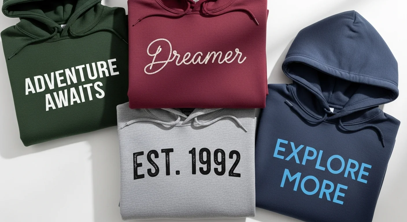
Bold Sans-Serif Fonts
These are the workhorses of hoodie typography. Their clean lines and uniform stroke widths survive the transition from screen to fabric beautifully.
- Montserrat Bold: Modern, geometric, and incredibly readable. Works for everything from team names to brand slogans.
- Bebas Neue: Tall, condensed, and bold. Perfect for single-word statements or short phrases that need to command attention.
- Oswald: A slightly condensed sans-serif that fits more text without sacrificing readability.
- Futura Bold: A timeless geometric font that looks premium on any hoodie color.
Display and Statement Fonts
For designs where typography is the primary visual element:
- Anton: Extremely bold and impactful. Makes single words or short names dominate the hoodie front.
- Archivo Black: A grotesque typeface with strong presence that works at any size.
- Rubik Mono One: A chunky, playful option for casual or youth-oriented designs.
Script and Handwritten Fonts
Use these sparingly and at larger sizes. Fine script details can get lost on textured fabric:
- Pacifico: A casual brush script that remains readable at medium to large sizes.
- Satisfy: An elegant connected script for sophisticated designs. Best used for short words or names.
- Permanent Marker: A hand-lettered look that adds personality without sacrificing legibility.
Vintage and Retro Fonts
Perfect for the trending vintage aesthetic in streetwear and college-style hoodies:
- Righteous: A retro-inspired font with rounded edges that feels both nostalgic and modern.
- Bungee: A display font designed for vertical and horizontal use with strong geometric shapes.
- Press Start 2P: A pixel-art inspired font for gaming or retro-themed designs.

Font Pairing Rules for Hoodies
If your design uses more than one font, follow these pairing principles:
- Contrast, not conflict: Pair a bold display font with a simple body font. Bebas Neue for the headline, Montserrat for smaller text.
- Limit to two fonts maximum: Three or more fonts on a hoodie creates visual chaos.
- Match the mood: Do not pair a serious corporate font with a playful script. Keep the tone consistent.
- Vary weight, not style: Using bold and regular weights of the same font family is always a safe pairing.
Size Guidelines for Hoodie Typography
Text on hoodies needs to be larger than you might think. Here are minimum recommended sizes:
- Primary headline: At least 2 inches tall for front designs, 3 inches for back designs
- Secondary text: At least 0.75 inches tall for front, 1 inch for back
- Fine print or taglines: At least 0.5 inches tall, and only with bold weights
- Embroidered text: Minimum 0.25 inches tall, using fonts with simple letterforms
When in doubt, go bigger. Text that looks large on screen often feels perfectly sized when printed on a hoodie and viewed from a normal distance.
Fonts and Printing Methods
Your printing method affects which fonts work best:
Screen printing handles bold, simple fonts excellently. Avoid fonts with very thin strokes or tight spacing, as ink can bleed slightly and close up small gaps.
DTG printing reproduces fine details well, so you have more freedom with font choices. Thin serifs and script fonts are more viable with DTG.
Embroidery requires the simplest letterforms. Stick to sans-serif fonts at a decent size. Script and thin fonts do not translate well to thread. Read more about choosing the right printing method.
Color Tips for Hoodie Text
For detailed guidance on choosing text colors that work on different hoodie colors, explore our color theory guide for hoodie design. The quick rule: white text on dark hoodies and dark text on light hoodies provides the strongest, most reliable contrast.
Frequently Asked Questions
What is the most readable font for custom hoodies?
Montserrat Bold and Oswald are consistently the most readable fonts across all hoodie colors and printing methods. Their clean letterforms and consistent stroke widths ensure legibility even on textured fleece fabric.
Can I use any font for embroidered hoodies?
No. Embroidery works best with simple, bold fonts that have uniform stroke widths. Script fonts, thin serifs, and fonts with very tight letter spacing do not embroider well because the needle cannot reproduce fine details. Stick to sans-serif fonts at sizes of 0.25 inches or larger.
Should I use all caps or mixed case on my hoodie?
All caps works best for short text like team names, slogans, or single words. For longer text or sentences, mixed case is easier to read. Avoid all lowercase for display text on hoodies as it can look unintentional rather than stylistic.
How do I preview how my font will look on a hoodie?
Use our free design tool to type your text directly onto a hoodie template and see a realistic preview. You can try different fonts, sizes, and colors before committing to your final design.
Share this article
Written by
Camille Dupont
Creative Director at RareCustom. BFA from RISD with 9+ years in graphic design. Camille's typography expertise has been featured in Communication Arts and Print Magazine.