Color Theory for Custom Hoodie Design: Choosing the Perfect Palette
Apply color theory to create stunning custom hoodie designs. Learn about complementary colors, contrast rules, ink on fabric interactions, and palette selection.
Jordan Reeves
Brand Experience Strategist at RareCustom. BFA in Graphic Design from Parsons School of Design with 8+ years helping brands craft visual identities. Specialist in color theory, layout composition, and design systems.
Color is the first thing people notice about a custom hoodie, even before they read any text or process any graphics. The combination of hoodie color and design colors creates an immediate emotional impression that can attract or repel in a fraction of a second. Understanding basic color theory transforms your hoodie designs from decent to outstanding.
You do not need an art degree to apply color theory effectively. This guide covers the practical principles that matter for custom hoodie design, with specific recommendations for common color combinations.
The Basics: Color Relationships
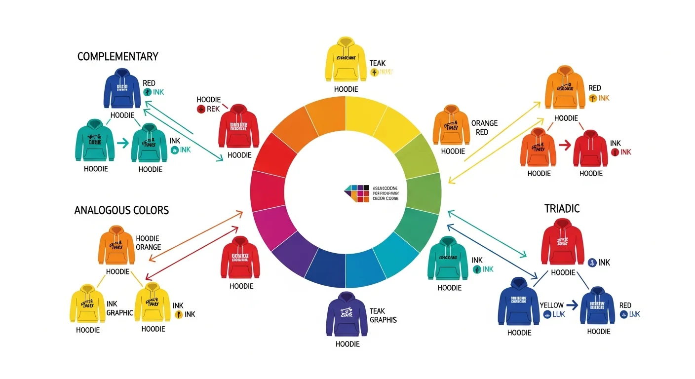
Complementary Colors
Colors opposite each other on the color wheel create maximum contrast and visual energy. Red and green, blue and orange, purple and yellow. Complementary combinations make designs pop and are ideal for designs that need to grab attention from a distance.
Analogous Colors
Colors adjacent on the color wheel create harmonious, cohesive palettes. Blue, blue-green, and green or red, orange, and yellow. Analogous schemes feel unified and are excellent for sophisticated, brand-forward designs.
Triadic Colors
Three colors equally spaced on the color wheel create vibrant, balanced designs. Red, yellow, and blue or orange, green, and purple. Use one as the dominant color and the other two as accents to prevent visual chaos.

Hoodie Color and Design Color Interactions
The hoodie fabric color acts as the background for your entire design. This interaction is the most important color relationship to get right.
Light Designs on Dark Hoodies
The most popular and reliable combination. White, cream, or light-colored designs on black, navy, charcoal, or dark green hoodies create strong contrast and excellent readability. This combination works with every printing method and virtually every design style.
Dark Designs on Light Hoodies
Black, navy, or dark-colored designs on white, heather grey, or cream hoodies also provide strong contrast. This combination tends to feel more casual and approachable than the dark-hoodie alternative.
Tone-on-Tone (Tonal) Designs
Subtle, sophisticated designs using colors very close to the hoodie color. A slightly lighter or darker shade of the hoodie color creates an understated, premium look. This trend is popular in streetwear and corporate branding. Tonal designs work best with embroidery, which adds texture to distinguish the design from the fabric.
Color Psychology for Hoodie Design
Colors carry emotional associations that influence how your hoodie is perceived:
- Black: Authority, sophistication, versatility. The most popular hoodie color for a reason.
- Navy: Trust, reliability, professionalism. Excellent for corporate and business branding.
- Red: Energy, passion, urgency. Powerful for sports teams and bold brand statements.
- Green: Growth, nature, calm. Natural choice for eco-friendly brands and outdoor organizations.
- Grey: Neutral, modern, versatile. Works with virtually any design color palette.
- White: Clean, fresh, minimalist. Requires careful handling to stay looking clean.

Ink Colors on Different Fabrics
How ink colors appear on fabric differs from how they appear on screen:
Screen Printing Color Considerations
- On dark fabrics, a white underbase is printed first, then colors are layered on top. This can slightly alter the appearance of bright colors.
- Metallic and specialty inks create unique effects but may not match exact Pantone references.
- Discharge printing removes the fabric dye rather than adding ink, creating a softer feel with a vintage look.
DTG Color Considerations
- DTG on light fabrics produces the most color-accurate results because ink absorbs directly into the fabric.
- DTG on dark fabrics uses white ink as a base, which can give colors a slightly different appearance than on light fabric.
- Very light or pastel colors may appear slightly muted on dark hoodies with DTG.
Embroidery Color Considerations
- Thread colors are consistent regardless of hoodie color, making embroidery the most predictable method for color accuracy.
- Metallic threads add a premium shimmer effect.
- Thread color options are extensive but not infinite. Check available thread colors before finalizing your design palette.
Building Your Hoodie Color Palette
Follow this process to choose colors for your hoodie project:
- Start with the hoodie color. This is your background. Choose based on practicality, brand alignment, and target audience.
- Choose your primary design color. This should have strong contrast with the hoodie color. It will be the dominant ink or thread color in your design.
- Add one accent color. This supports the primary color and adds visual interest. Keep it to one accent for clean, professional results.
- Preview before committing. Use our design tool to see your color choices on the actual hoodie template. What looks good in a color picker may look different on fabric.
Frequently Asked Questions
What is the safest color combination for custom hoodies?
White ink or thread on a black hoodie is the most universally reliable combination. It provides maximum contrast, works with every printing method, and appeals to the broadest audience. It is the default choice for a reason.
Can I match my exact brand colors on a custom hoodie?
Screen printing can match Pantone colors precisely using custom-mixed inks. DTG comes close but may vary slightly due to fabric absorption. Request a physical sample before bulk ordering to verify color accuracy, especially if exact brand color matching is critical.
How many colors should I use in my hoodie design?
For screen printing, one to three colors keeps costs manageable and designs clean. For DTG, color count does not affect price, but limiting to three or four colors still produces the most visually effective designs. More colors does not mean better design.
Will my design colors look the same on different hoodie colors?
No. The same ink colors will appear different on a black hoodie versus a white hoodie due to how the fabric color interacts with the ink. Always preview your design on each hoodie color you plan to offer. This is especially important for lighter ink colors that may appear washed out on light-colored hoodies.
Share this article
Written by
Jordan Reeves
Brand Experience Strategist at RareCustom. BFA in Graphic Design from Parsons School of Design with 8+ years helping brands craft visual identities. Specialist in color theory, layout composition, and design systems.