Best Fonts for Custom Jersey Designs: Numbers, Names & Team Typography
Choose the right fonts for your custom jersey numbers and names. Explore athletic, modern, retro, and sport-specific font styles with readability and distance visibility tips.
Camille Dupont
Creative Director at RareCustom. BFA from RISD with 9+ years in graphic design. Camille's typography expertise has been featured in Communication Arts and Print Magazine.
Typography on a custom jersey serves a fundamentally different purpose than typography on a poster or website. Jersey fonts must be legible from 50 feet away, readable at high speed as players move across the field or court, and distinctive enough to give your team a unique identity. The wrong font choice can make numbers impossible to read during gameplay or give your team an unintentionally amateurish look.
Unlike choosing fonts for custom sweatshirts or t-shirts, where decorative and script fonts can work well, jersey typography demands boldness, clarity, and legibility above all else. Here are the font categories that work for athletic jerseys and when to use each one.
Athletic Block Fonts
Block fonts are the workhorses of jersey design. They feature thick, uniform strokes with minimal ornamentation, making them instantly readable from any distance. Block fonts work across every sport and every level of competition, from youth recreational leagues to professional teams.
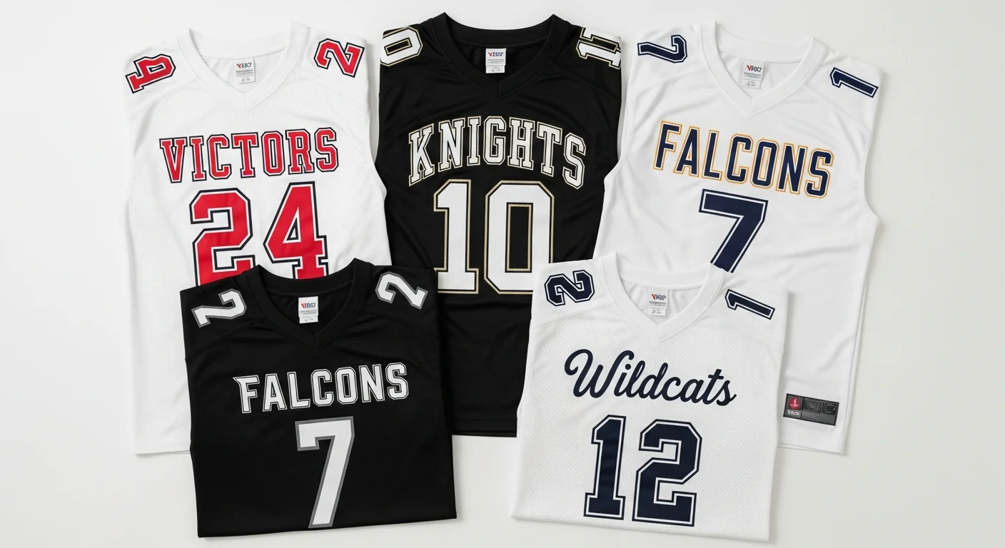
The classic block font — think traditional basketball or football jersey numbers — uses squared-off terminals and consistent stroke widths. Numbers are designed to be unambiguous: the number 6 cannot be confused with an 8, and the number 1 does not look like a 7. This clarity is not just aesthetic — it is functional. Officials need to identify player numbers quickly during fast-paced play.

Modern Sans-Serif Fonts
Modern sans-serif fonts offer a cleaner, more contemporary look than traditional blocks. They feature slightly thinner strokes and more refined proportions. These fonts work well for soccer, volleyball, and esports jerseys where a sleek, modern aesthetic is valued.
When using modern sans-serif fonts for numbers, ensure the stroke width is heavy enough to read at distance. A font that looks elegant on screen may become invisible at 30 yards on the field. Test your font choice by viewing the design at 10% of its actual size on screen — if you can still read the numbers clearly, the font works.
Retro and Slab-Serif Fonts
Retro fonts draw inspiration from the golden eras of sports — 1970s baseball, 1980s basketball, or 1990s football. Slab-serif fonts with heavy, squared-off serifs evoke tradition and heritage. These work beautifully for teams that want a classic, established feel.
Baseball teams in particular gravitate toward slab-serif and script fonts that reference the sport's long typographic history. If your team identity leans nostalgic, retro fonts paired with vintage color schemes create a powerful aesthetic. See our jersey design trends post for more on the retro revival movement.
Script and Italic Fonts
Script fonts can work for team names across the front chest of baseball jerseys — a tradition dating back over a century. However, script fonts should never be used for numbers or player last names because they sacrifice readability for style. An ornate script "3" is nearly impossible to read from the stands at speed.
If you want a script element, limit it to the team name on the front and use a complementary block or sans-serif font for numbers and player names on the back.
Sport-Specific Font Recommendations
Basketball
Bold block fonts with angular details. Basketball jerseys are viewed from close proximity in indoor arenas, so you can get slightly more creative with font styling. Angular cuts and modern geometric shapes work well.
Football
Heavy block fonts with maximum stroke width. Football is viewed from greater distances in large outdoor stadiums. Prioritize weight and boldness over style. Avoid any font where numbers could be misread during high-speed play.
Baseball
Script for team names (front chest), block or slab-serif for numbers (back). Baseball has the richest typographic tradition of any sport, and fans expect a classic aesthetic. Arched team names are standard.
Soccer
Modern sans-serif or condensed geometric fonts. Soccer jerseys tend toward a cleaner, more international design sensibility. Many professional soccer leagues use custom-commissioned fonts, but clean sans-serif alternatives work well for custom team orders.

Number-Specific Design Tips
Beyond font choice, how you style your numbers affects readability. Always add a contrasting outline or shadow to numbers, especially on patterned or gradient jersey backgrounds. A two-pixel outline in white or black around each number ensures it pops against any background color. For color guidance, check our team colors guide.
Avoid placing numbers directly on top of complex sublimation patterns without a solid backing panel or outline treatment. The most readable jerseys maintain clear separation between the number and the background, even if the overall design is intricate.
Pairing Fonts for Team Name and Numbers
Your jersey typically uses two typefaces: one for the team name and one for numbers and player names. These should complement each other without competing. A script team name pairs well with a simple block number font. A bold geometric team name pairs with a matching geometric number font. Avoid using more than two typefaces on a single jersey — it creates visual clutter.
Frequently Asked Questions
What font do professional sports teams use on their jerseys?
Most professional teams use custom-designed proprietary fonts. However, fonts like Varsity, College, and Block Standard closely replicate the look of professional jersey typography and are available for custom orders.
What is the best font for basketball jersey numbers?
Bold athletic block fonts with angular details work best. They are readable from anywhere in the arena and convey the energy and intensity of basketball. Avoid thin or decorative fonts that lose legibility at a distance.
Can I use a custom font on my team jerseys?
Yes, as long as you own the font license and can provide the font file to your jersey provider. Most sublimation printers can use any TrueType or OpenType font. Verify licensing terms to ensure the font is approved for commercial use on merchandise.
How big should the team name text be on the front?
Team name text on the front chest typically ranges from two to four inches tall, spanning most of the chest width. Arched formatting is common for baseball. Straight horizontal text works for basketball and football. Size the text to fill the available space without crowding the logo or front number.
Share this article
Written by
Camille Dupont
Creative Director at RareCustom. BFA from RISD with 9+ years in graphic design. Camille's typography expertise has been featured in Communication Arts and Print Magazine.