Team Colors for Custom Jerseys: Choosing Home, Away & Alternate Colorways
Build a winning team color palette for your custom jerseys. Learn how to choose home and away colorways, ensure number contrast, use gradients effectively, and coordinate a full uniform set.
Priya Shankar
Customer Success Lead at RareCustom. CCXP certified with 6 years in education. Priya helps teams and schools build cohesive color palettes for their custom jersey programs.
Color is the first thing anyone notices about a custom jersey. Before they read the team name, spot the logo, or identify a player number, they see color. Your team's palette defines your identity on the field and in the stands, so choosing the right colors — and using them correctly across home, away, and alternate jerseys — is one of the most important decisions in the jersey design process.
Jersey color strategy goes well beyond picking your favorite shade. You need to consider opponent contrast rules, number readability, how colors appear under different lighting conditions, and how your palette extends across the full uniform including shorts, socks, and warm-ups.
Choosing Your Primary and Secondary Colors
Start with two core colors: a primary color that dominates your home jersey and a secondary color used for accents, numbers, and the away jersey. The most iconic team color palettes in sports history use just two colors (navy and white, red and black, royal blue and gold). Adding a third accent color is fine but rarely necessary.
When selecting colors, consider what your opponents commonly wear. If every team in your league wears navy blue, choosing navy means constant color conflicts at away games. Standing out with a less common primary color (forest green, maroon, teal, burnt orange) ensures your team is always visually distinct.

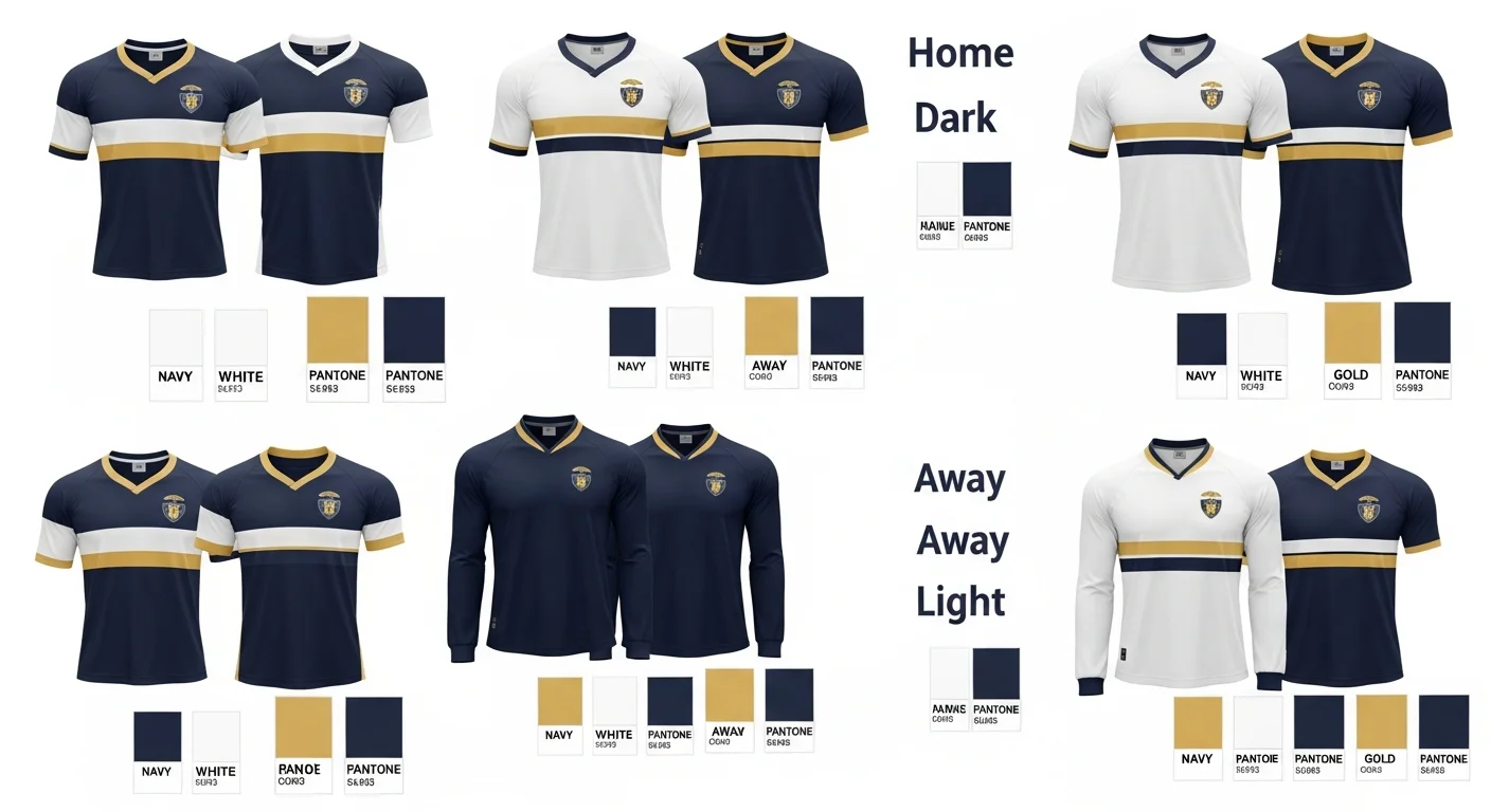
Home vs. Away Colorway Rules
In most sports leagues, the home team wears their dark (primary color) jersey and the away team wears their light (white or light-colored) jersey. This convention exists so officials and fans can easily distinguish the two teams. Some leagues reverse this convention, and some recreational leagues have no formal policy.
Your home jersey should feature your primary color as the body with white or light-colored numbers. Your away jersey should use a white or light body with your primary color for numbers and accents. This creates a clear visual flip while maintaining team identity through consistent logo placement, font choices, and design patterns.
Number Contrast Requirements
The most critical color decision on any jersey is the contrast between the number and the jersey body. Numbers must be immediately readable from the stands and by officials. As a rule, light numbers on dark backgrounds and dark numbers on light backgrounds provide the necessary contrast. Many leagues require a contrasting outline around numbers (a white outline on a dark number, or vice versa) for additional visibility.
Test your contrast by viewing the design in grayscale. If the numbers disappear into the background when color is removed, your contrast is insufficient. For font and number styling tips, read our best fonts for jerseys guide.
Using Gradients and Patterns
Gradient color transitions — from dark navy to electric blue, crimson to sunset orange — are a major trend in 2026 jersey design. Sublimation printing handles gradients effortlessly since there are no per-color charges. However, gradients create a challenge for number readability because the background color shifts across the jersey surface.
If using a gradient, place numbers in the area where the background is most consistent (usually the upper back) and add a solid backing panel or thick outline to ensure readability regardless of the underlying gradient position.
Color Psychology in Sports
Research shows that team colors influence perceptions of aggression, speed, and professionalism. Red and black combinations project power and intensity. Blue and white suggest professionalism and trust. Green conveys energy and freshness. Gold and navy imply tradition and prestige. While color psychology should not be your only factor, it is worth considering how your palette aligns with the identity your team wants to project.

Coordinating the Full Uniform Set
Your jersey is only one piece of the uniform. Shorts (or pants), socks, warm-up jackets, and practice jerseys should all draw from the same two or three team colors. The most polished team looks use consistent color assignments: if the home jersey is dark with light numbers, the matching shorts use the same dark color with light accents.
Create a team color standards document that lists your exact color values (Pantone codes or hex values) and specifies how they are used across each uniform piece. This prevents color drift when ordering from different suppliers or in different seasons.
Colors That Sublimate Best
Sublimation printing produces the most vivid results on white or light-colored base fabric because the inks are translucent. Bright reds, royal blues, emerald greens, and deep purples all sublimate beautifully. Very dark colors like black require extra ink saturation to avoid looking washed out. Neon and fluorescent colors are achievable but may vary slightly between production runs.
Frequently Asked Questions
How many colors should a team jersey have?
Two to three colors is the sweet spot. A primary body color, a contrasting number and accent color, and optionally a third accent for details like stripes or piping. More than three colors tends to look busy and unfocused.
How do I pick home and away colors?
Your home jersey uses your primary team color as the body with light-colored numbers. Your away jersey flips this: white or light body with your primary color for numbers and accents. This ensures both versions are distinctly yours while providing the contrast needed for gameplay.
Do gradient jerseys look professional?
Yes, when executed well. Sublimation makes gradients smooth and vibrant. The key is maintaining number readability against the shifting background. Use outlines, backing panels, or solid zones for numbers to keep them legible on gradient designs.
What if our team colors conflict with an opponent's colors?
This is exactly why teams need both a home and away set. If both teams' home jerseys are similar colors, the away team switches to their light-colored alternate. Some leagues also allow a third alternate jersey for additional flexibility.
Share this article
Written by
Priya Shankar
Customer Success Lead at RareCustom. CCXP certified with 6 years in education. Priya helps teams and schools build cohesive color palettes for their custom jersey programs.