Color Theory for Custom Sweatshirt Design: Choosing the Perfect Palette
Master color theory for custom sweatshirt design. Learn how base colors affect prints, create harmonious palettes, and choose seasonal colors that connect with your audience.
Jordan Reeves
Brand Experience Strategist at RareCustom. BFA in Graphic Design from Parsons School of Design with 8+ years helping brands craft visual identities. Specialist in color theory, layout composition, and design systems.
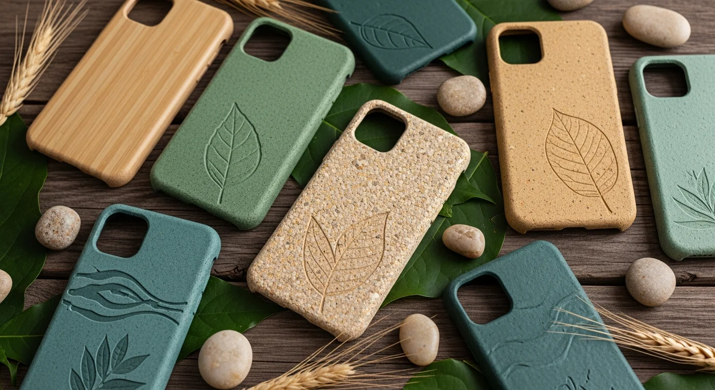
Color is the first thing people notice about a custom sweatshirt, and the right palette can make the difference between a crewneck that gets worn weekly and one that collects dust. Understanding basic color theory, and specifically how colors behave on fabric, helps you make design choices that look intentional, harmonious, and visually compelling.
This guide covers color theory fundamentals applied to sweatshirt design, including how your base garment color interacts with print or embroidery colors, how to create palettes that work across seasons, and how to match brand colors accurately on fleece fabric.
Why Color Theory Matters on Sweatshirts
Sweatshirt fabric interacts with ink and thread differently than paper or a digital screen. The base color of the garment acts as a filter that affects how every other color in your design is perceived. A red logo on a navy sweatshirt looks dramatically different than the same red on a white crewneck. Understanding this interaction prevents surprises and ensures your design looks exactly as intended on the final product.

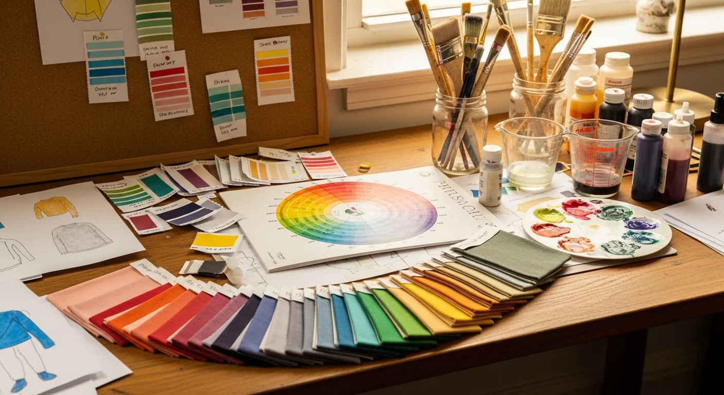
Color Wheel Basics for Apparel Design
Complementary colors sit opposite each other on the wheel (red and green, blue and orange, purple and yellow). These combinations create maximum contrast and visual energy. They work well when you want a design that pops aggressively, like sports team crewnecks or event merchandise that needs to be noticed from a distance.
Analogous colors sit next to each other on the wheel (blue, blue-green, green). These combinations feel harmonious and cohesive. They work beautifully for brands, corporate merchandise, and any design where sophistication matters more than visibility.
Triadic colors are evenly spaced around the wheel (red, yellow, blue). These palettes feel balanced and vibrant without being as intense as complementary pairs. They work well for playful, energetic designs aimed at younger audiences.
How Base Color Affects Print Perception
On light-colored sweatshirts (white, heather grey, cream), prints appear vibrant and true to the original design file. The fabric acts as a clean canvas that does not interfere with ink colors. DTG printing excels on light bases because there is no need for a white under-base layer, resulting in softer-feeling prints with accurate colors.
On dark-colored sweatshirts (black, navy, forest green), prints require a white under-base for DTG, which slightly mutes colors and adds a subtle rigidity to the print area. Screen printing on dark garments uses opaque inks that cover the base completely, producing vibrant colors regardless of the base. Embroidery thread appears the same on any base color since it sits on top of the fabric.

Heathered and Garment-Dyed Color Behavior
Heathered fabrics blend two fiber colors (typically grey and white, or grey and a color) to create a textured, marled appearance. Prints on heathered bases take on a slightly vintage quality because the uneven fiber tones show through lighter areas of the print. This can be a feature rather than a bug, especially for retro-inspired and casual designs.
Garment-dyed sweatshirts have slightly unpredictable color results because the dyeing process is inherently variable. Prints on garment-dyed blanks take on a naturally aged quality that many brands actively seek. Just be aware that the exact base color may vary slightly from batch to batch.
Seasonal Color Palettes
Fall: Earth tones dominate. Rust, terracotta, olive, mustard, burgundy, and warm browns. These colors feel cozy and pair naturally with heavyweight fleece. Gold and copper embroidery thread complements fall palettes beautifully.
Winter: Rich jewel tones and classic neutrals. Deep navy, emerald, plum, charcoal, and black. Metallic accents (gold, silver) in embroidery or specialty inks add festive energy to winter designs.
Spring: Pastels and fresh neutrals. Dusty rose, sage, sky blue, lavender, and cream. These colors work best on lighter-weight crewnecks and French terry fabrics.
Summer: Bright, saturated colors and clean whites. Coral, teal, bright yellow, and vivid green. Bold contrasts between base and print colors create the energetic feel summer designs demand.
Brand Color Matching on Fabric
Matching specific brand colors (Pantone, hex, RGB) on fabric is achievable but requires awareness of fabric limitations. Screen printing can match Pantone colors accurately by mixing custom inks. DTG printing converts digital color values to CMYK ink mixtures, which may shift slightly from the screen version. Embroidery thread comes in predefined colors that approximate but may not exactly match your brand Pantone.
For critical brand color matching, always request a physical swatch or sample before approving the full order. Screen-to-fabric color perception can vary depending on thread type, ink formulation, and fabric texture. For parallel color guidance on custom hoodie designs, our companion guide covers hoodie-specific color considerations.
Frequently Asked Questions
Can I match exact brand colors on a custom sweatshirt?
Screen printing can match Pantone colors closely with custom ink mixing. DTG approximates brand colors but may shift slightly. Embroidery thread comes in set color ranges. For critical color accuracy, request a sample before committing to your custom sweatshirt order.
Why do prints look different on fabric than on screen?
Computer screens emit light (RGB) while fabric absorbs light (CMYK). This fundamental difference means colors will always look slightly different on fabric. Additionally, fabric texture, base color, and ink type all influence the final appearance. Calibrated monitors and physical samples help bridge this gap.
What are the best sweatshirt colors for embroidery?
Dark sweatshirts (navy, black, charcoal) provide the most contrast for light-colored embroidery thread, making logos and text pop. However, embroidery works well on any base color since the thread sits on top of the fabric. The key is choosing thread colors that have sufficient contrast against the base.
Share this article
Written by
Jordan Reeves
Brand Experience Strategist at RareCustom. BFA in Graphic Design from Parsons School of Design with 8+ years helping brands craft visual identities. Specialist in color theory, layout composition, and design systems.