Custom Rug Design Tips: Layouts, Colors & Patterns That Work
Master custom rug design with expert tips on color theory, pattern selection, typography, layout composition, and common mistakes. Create rugs that look professional.
Jordan Reeves
Brand Experience Strategist at RareCustom. BFA in Graphic Design from Parsons School of Design with 8+ years helping brands craft visual identities. Specialist in color theory, layout composition, and design systems.
Designing a custom rug is fundamentally different from designing a poster, a t-shirt, or a digital graphic. Rugs live on the floor — viewed from above, at oblique angles, and from across the room. They compete with furniture, wall art, and ambient lighting for visual attention. They endure foot traffic, furniture weight, and daily wear. A design that looks perfect on screen may fall flat on fabric if it ignores the unique constraints and opportunities of floor-level presentation. This guide covers the core custom rug design principles — from establishing a focal point and choosing colors to selecting patterns, arranging typography, and avoiding the mistakes that undermine even the best creative intentions.
Whether you are creating a personalized rug for your living room, a branded mat for a storefront, or a photo rug for a gift, the design decisions you make determine whether your finished piece looks professionally crafted or hastily assembled. The good news is that following proven rug layout principles and color strategies dramatically improves the quality of any design, regardless of artistic skill level. Every tip in this guide applies directly to the custom rug design process, and most can be implemented using RareCustom's free online design tool.
Start with a Clear Focal Point
Every effective rug design begins with a single, clear rug focal point — the element that draws the eye first and anchors the entire composition. Without a focal point, a design feels scattered and purposeless, competing with its own elements for the viewer's attention. With one, the design communicates instantly and confidently.
A focal point can be a logo centered on a branded mat, a photograph dominating a photo rug, a bold geometric shape anchoring an abstract design, or a block of text delivering a message. The key is that one element must be visually dominant — larger, bolder, more colorful, or more centrally positioned than everything else. All other design elements (borders, background patterns, secondary text, decorative accents) should support and frame the focal point rather than compete with it.
Position your focal point based on how the rug will be viewed. For rugs placed in the center of a room, center-weighted designs work best because the rug is seen from all sides equally. For rugs positioned against a wall or under furniture where one edge is hidden, shift the focal point toward the visible portion. Entryway mats are viewed primarily from one direction (as visitors approach), so orient the design to read correctly from that angle. Thinking about viewing perspective before you start designing prevents orientation mistakes that waste time and materials.
Rug visual balance around the focal point is what separates amateur designs from polished ones. Balance does not require perfect rug symmetry — asymmetrical compositions can be highly effective — but the visual weight of all elements should feel intentionally distributed rather than accidentally lopsided. If your focal point is positioned off-center, counterbalance it with a secondary element (a border, a pattern field, or a color block) on the opposite side. If you are unsure about balance, the simplest path to a professional result is a centered focal point with uniform margins — a reliable composition that works in virtually every room and context.
Color Theory for Custom Rugs
Color is the single most powerful tool in custom rug design. It sets the mood, defines the visual hierarchy, and determines whether a rug harmonizes with or disrupts its surrounding environment. Understanding basic rug color theory empowers you to make intentional color choices rather than relying on guesswork.

The color wheel organizes hues into relationships that predict which combinations will look harmonious. Rug complementary colors — those opposite each other on the wheel (blue and orange, red and green, yellow and purple) — create vibrant, high-energy contrast. Analogous colors — those adjacent on the wheel (blue, blue-green, green) — produce calm, cohesive palettes. Triadic schemes use three evenly spaced colors for a balanced but dynamic look. Each approach creates a distinctly different mood, so choose the scheme that matches the room's intended atmosphere.
Rug color psychology influences how a space feels. Warm tone rug palettes (reds, oranges, yellows, terracotta) energize a room and create a cozy, inviting atmosphere — ideal for living rooms, dining areas, and social spaces. Cool tone rug palettes (blues, greens, purples) promote calm and focus, making them excellent for bedrooms, offices, and meditation spaces. A neutral rug palette (beiges, grays, whites, taupes) provides versatility, anchoring a room without competing with other décor elements. Earth tone rug palettes (olive, rust, sand, charcoal) blend warmth and neutrality for a sophisticated, organic feel.
Rug color coordination with the existing room is critical. Before designing your rug color palette, photograph the room where the rug will live and identify the dominant colors — wall paint, upholstery, curtains, wood tones. Your rug should either complement these colors (choosing harmonious hues from the same family) or intentionally contrast them (introducing an accent color not present elsewhere). What it should never do is clash unintentionally — a mistake that makes the rug look like an afterthought rather than an intentional design element.
When in doubt, start with a monochromatic rug approach — multiple shades and tints of a single hue. Monochromatic designs are inherently harmonious and nearly impossible to execute poorly. They work in every room, with every décor style, and at every rug size. As your confidence grows, experiment with two-color and three-color palettes, always grounding the design in one dominant color that accounts for 60–70 percent of the rug's surface area.
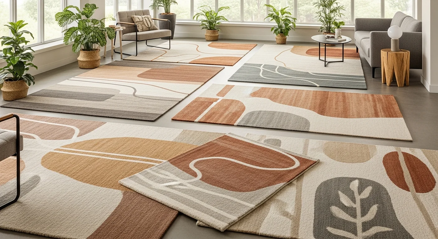
Pattern Selection Guide
Patterns transform a flat color field into a textured, dynamic design that adds visual interest and personality to a rug. The pattern you choose should align with the room's style, the rug's purpose, and the overall rug design contrast you want to achieve.

Geometric rug pattern designs — stripes, chevrons, hexagons, diamonds, grid lines — convey precision and order. They work beautifully in modern and contemporary interiors where clean lines and structured forms dominate. Geometric patterns are forgiving of minor color mismatches because the strong structural lines carry the visual weight. They also scale well across rug sizes, looking equally intentional on a doormat as on an eight-by-ten area rug.
Abstract rug design approaches — freeform shapes, painterly brushstrokes, color field compositions, splatter effects — inject artistic energy into a space. Abstract patterns suit creative environments, eclectic interiors, and rooms where the rug serves as the primary art piece. Because abstract designs have no repeating structure, they offer maximum creative freedom but also require more careful attention to balance and color harmony to avoid visual chaos.
A minimalist rug design strips the composition down to essentials — one or two colors, ample negative space, a simple icon or text element, clean lines. Minimalism is trending strongly in 2026 and pairs naturally with Scandinavian, Japanese-inspired, and contemporary interiors. The beauty of minimalist rug design lies in restraint — every element present must earn its place. If you are new to custom rug design, minimalism is an excellent starting point because fewer elements mean fewer opportunities for mistakes.
A boho rug style embraces pattern mixing, rich colors, fringe details, and global design influences. Boho patterns often incorporate mandala motifs, paisley elements, tribal geometrics, and layered border designs. These patterns create warm, eclectic, personality-rich spaces and pair well with rattan furniture, houseplants, and natural textures. Boho designs require a confident approach to color and pattern density — the style intentionally pushes beyond minimalism into expressive territory.
Modern rug design sits between minimalism and maximalism, combining clean structure with bold color or pattern choices. A modern rug might feature a single oversized geometric form in a striking color against a neutral background, or a gradient color field that shifts from one hue to another across the rug surface. Modern designs read as sophisticated and intentional, making them safe choices for professional environments and formal living spaces. To explore what is trending right now, check the custom rug design trends 2026 guide.
Layout and Composition Rules
Rug layout principles determine how the individual elements of your design relate to each other and to the rug's physical boundaries. Good composition creates visual flow, guides the viewer's eye through the design in an intentional sequence, and ensures no area of the rug feels empty or overcrowded.

The rule of thirds — dividing the rug surface into a 3×3 grid and placing key elements along the grid lines or at their intersections — applies to rug design just as it does to photography. Designs that follow this grid feel naturally balanced and visually engaging. For centered compositions (logos, monograms, single focal images), the center third serves as the primary design zone while the outer thirds provide breathing room and border space.
Rug negative space — the empty or background areas of the design — is not wasted space. It frames the active design elements, prevents visual clutter, and gives the eye places to rest. A common mistake among first-time rug designers is filling every square inch with pattern, text, or imagery, which creates an overwhelming, busy result. Professional designs typically allocate 30–50 percent of the rug surface to negative space, depending on the complexity of the focal elements.
Margins matter. Keep all critical design elements at least one to two inches away from the rug edges at production scale. This margin serves two purposes: it prevents important elements from being cut off during edge finishing, and it creates a natural frame that gives the design room to breathe. For rug designs that include a rug border design, the border itself provides the frame, but there should still be a consistent gap between the border and the interior design elements.
Hierarchy directs the viewer through the design in a deliberate order. The focal point should be the first element the eye encounters. Secondary elements (supporting text, decorative patterns, accent graphics) should be progressively smaller or less visually prominent. If everything in the design is the same size and visual weight, nothing stands out, and the design reads as a uniform texture rather than a composed piece.
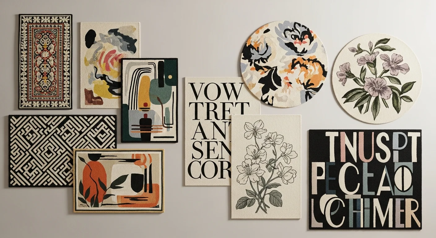
Typography on Custom Rugs
Rug typography introduces unique challenges that screen-based design does not present. Text printed on fabric and viewed from standing height must be significantly larger than text designed for paper or screen reading distances. The fabric texture interacts with thin strokes and fine serifs, potentially softening letter forms below the threshold of legibility.

Rug font selection should prioritize readability over decorative appeal. Bold sans-serif fonts (Montserrat, Futura, Raleway, Oswald) reproduce with the highest clarity on rug surfaces because their uniform stroke widths and clean letterforms maintain legibility at floor-level viewing distances. Script fonts add elegance for formal applications (wedding rugs, memorial pieces) but must be used at generous sizes — two inches minimum letter height — to prevent the thin connecting strokes from disappearing into the fabric weave.
Rug text placement should consider both readability and design integration. Centered text works for welcome mats and monogram designs. Left-aligned text suits informational layouts where the rug includes a logo above and a tagline below. Avoid placing text diagonally unless the angle is dramatic enough to be clearly intentional — slight angles look like printing errors. Never place critical text within half an inch of the rug edge, as edge finishing processes may trim into the text zone.
Limit the number of typefaces per design. One font for headlines and one for body text is the professional standard. Using three or more fonts on a single rug creates visual discord and makes the design feel uncoordinated. Vary weight (bold, regular, light) and size within a single font family to create hierarchy without introducing additional typefaces.
Background Color Strategy
The rug background color — the dominant field behind your focal elements — has an outsized impact on the overall look and feel of your custom rug. Background color accounts for 40–70 percent of the visible surface area, making it the largest single design decision by visual weight.
Dark backgrounds (black, navy, charcoal, deep burgundy) create drama, formality, and contrast that makes lighter foreground elements pop. They hide minor stains and foot traffic marks better than light colors, making them practical choices for high-use areas. Dark-background rugs anchor a room visually and pair well with light-colored flooring (hardwood, light tile, pale carpet).
Light backgrounds (white, cream, pale gray, soft pastels) create an airy, open, gallery-like effect that makes the rug feel modern and spacious. They showcase colored elements and photographs beautifully but show dirt and stains more readily, making them better suited for low-traffic decorative areas. Light-background rugs pair naturally with darker flooring and contemporary interiors.
Mid-tone backgrounds (medium gray, tan, sage, dusty blue) offer the best of both worlds — enough rug design contrast to frame foreground elements without the high-maintenance visibility of light colors. Mid-tones are versatile, working across décor styles from traditional to modern, and they coordinate easily with diverse furniture and wall colors. When in doubt about background color, a warm mid-gray or taupe is the safest choice for a rug that needs to integrate into a room without dominating it.
Border and Frame Design
A well-designed rug border design serves as the visual equivalent of a picture frame — it contains the interior design, defines the rug's perimeter, and adds a layer of polish that distinguishes custom work from generic prints. Borders are optional, but when included, they elevate the overall quality of the design noticeably.
Simple single-line borders in a contrasting color provide clean, modern framing. Double borders — a thin inner line and a wider outer band — add depth and formality. Decorative borders incorporating repeating motifs (Greek key, braided rope, floral vine, geometric chain) suit traditional and ornate design styles. The border width should be proportional to the rug size — typically 5–10 percent of the rug's shorter dimension. A border that is too narrow looks like an afterthought, while one that is too wide compresses the interior design space.
Color choices for borders follow the same contrast principles as the rest of the design. A border that matches the background color provides subtle definition through line weight alone. A border in the focal point's accent color ties the composition together. A border in a contrasting neutral (black border on a light rug, white border on a dark rug) adds bold, gallery-style framing. Avoid borders in colors that do not appear anywhere else in the design — they will feel disconnected and arbitrary.
For rug designs without borders, ensure that the background color extends fully to the edge without leaving any unprinted white gaps. Edge-to-edge printing with generous bleed margins (0.5 inch minimum) ensures the finished rug has a clean, intentional edge even without a formal border element.
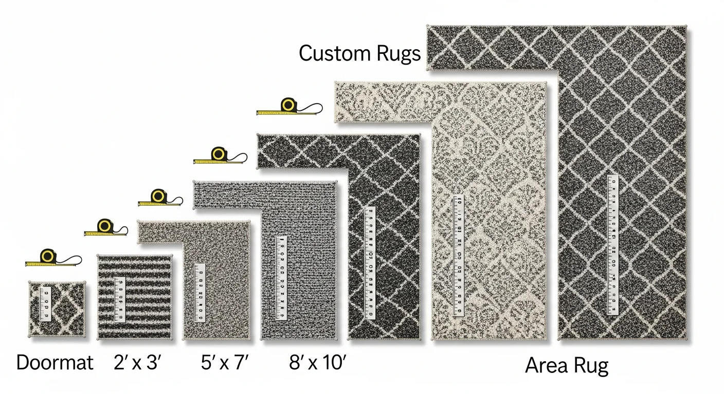
Designing for Different Shapes
Most custom rugs are rectangular, but round, oval, runner, and custom-cut shapes each require specific design considerations. A composition that works perfectly on a 5×7 rectangle may need significant adjustment to succeed on a 6-foot circle or a 2×8 runner.
Round rugs naturally suit radial compositions — designs that radiate outward from a center point. Mandala patterns, circular monograms, bullseye color rings, and centered logos all work exceptionally well on round rugs. Avoid designs with strong horizontal or vertical orientation on round formats because the lack of defined top and bottom edges can make directional elements feel disoriented.
Runner rugs (2×6, 2.5×8, or longer) require designs that work in an elongated horizontal format. Repeating patterns, gradient color transitions, directional text ("Welcome" running along the length), and sequential image collages suit the runner format well. Avoid centering a single small element on a long runner — the excess negative space on either side creates an unfinished look. Either repeat the design along the length or stretch the composition to fill the runner proportionally.
Custom-cut shapes (hexagons, stars, semicircles, irregular outlines) demand that the design file precisely match the cut template. Any misalignment between the printed design and the physical cut line results in lopsided margins or cropped elements. When designing for non-standard shapes, always work from the manufacturer's cut template and keep all critical elements well inside the shape boundary.
Common Design Mistakes to Avoid
Even talented designers stumble when transitioning to rug design for the first time. These rug design mistakes are the most frequently reported issues — and the most preventable with advance awareness.

Overcrowding the design is the number one mistake. Filling every square inch with text, images, patterns, and decorative elements creates a visually exhausting rug that no amount of color harmony can save. Embrace negative space, prioritize one focal point, and resist the urge to add more elements. The strongest designs are often the simplest.
Ignoring the viewing distance is the second most common error. A rug is viewed from standing height (five to six feet) and from across the room (ten to twenty feet). Fine details, thin lines, and small text that look crisp on screen become invisible at those distances. Design your rug as if it will be viewed from ten feet away — if the primary message and visual impact are clear at that distance, the design will work beautifully up close as well.
Mismatching the design style to the room context creates visual dissonance. A neon-colored abstract rug in a traditional living room, or a formal damask pattern in a children's playroom, creates a jarring disconnect between the rug and its environment. Before designing, photograph the room and identify its dominant style (modern, traditional, eclectic, industrial, minimalist) — then design within that aesthetic framework.
Skipping the rug mockup tool preview before ordering is a mistake born of impatience. The mockup shows how your design will appear on the actual rug material, at the actual proportions, with realistic color representation. Spending five minutes reviewing the mockup can prevent expensive reprints and design regret. Always preview, zoom in on critical details (text legibility, photo sharpness, edge alignment), and make adjustments before confirming production.
Design Your Custom Rug with RareCustom
Every design principle covered in this guide can be applied directly in RareCustom's free online design tool. Upload your images, select colors, choose fonts, arrange elements, and preview your custom rug in a realistic mockup — all without needing professional design software or prior experience. The drag-and-drop interface makes it simple to experiment with layouts, swap colors, and refine your composition until it matches your vision.
Whether you are starting from a blank canvas or customizing one of our pre-built templates, the design tool guides you through material selection, sizing, and production-ready file preparation. No minimums, free shipping, and quality-guaranteed printing on every order. Start your custom rug design today and see how professional-quality results are just a few clicks away.
FAQ
What is the best color scheme for a living room rug?
Neutral palettes (warm grays, taupes, creams) work in virtually every living room because they complement existing furniture and wall colors without competing for attention. If your room needs an energy boost, a warm tone rug in terracotta, rust, or golden yellow adds warmth without overwhelming the space.
Can I use multiple patterns on one rug?
Yes, but limit yourself to two patterns maximum, and ensure they share at least one common color. Pair a bold primary pattern (like stripes or chevrons) with a subtle secondary pattern (like a fine dot or linen texture) to create depth without clutter.
How do I know if my font is large enough?
A safe minimum is two inches of letter height at the rug's actual printed size. For welcome mats viewed from a few feet away, this is sufficient. For large area rugs viewed from across a room, increase to three or four inches for primary text. When in doubt, preview in the mockup tool and imagine reading the text from standing height.
What file format should I use for my rug design?
PNG is preferred for raster designs (photos, illustrations). SVG is ideal for vector graphics (logos, text, geometric patterns). Both formats preserve quality at the resolutions needed for rug printing. Avoid JPEG if possible, as its compression can introduce artifacts visible on large prints. For detailed file preparation guidance, read the beginner's guide to custom rugs.
Related Articles
Share this article
Written by
Jordan Reeves
Brand Experience Strategist at RareCustom. BFA in Graphic Design from Parsons School of Design with 8+ years helping brands craft visual identities. Specialist in color theory, layout composition, and design systems.