Best Fonts, Patterns & Graphics for Custom Sock Designs
Master typography, repeat patterns, and graphic placement on custom socks. Learn which fonts stay readable on cuffs, how to build seamless tile patterns, and how to adapt logos for the sock canvas.
Camille Dupont
Creative Director at RareCustom. BFA from RISD with 9+ years in graphic design. Camille's typography expertise has been featured in Communication Arts and Print Magazine.
Designing for custom socks presents a unique creative challenge. The canvas is small, cylindrical, and divided into distinct zones — cuff, leg panel, heel, foot, and toe — each with different visibility, stretch behavior, and print constraints. A font that looks crisp on a custom jersey back panel may become illegible on a 1.5-inch sock cuff. A logo that prints perfectly on a flat t-shirt can distort when wrapped around a curved ankle. Understanding how typography, patterns, and graphics behave on the sock form is essential for producing designs that look professional and intentional.
This guide covers the technical and aesthetic considerations for each design element type, providing specific measurements, file specifications, and best practices drawn from thousands of production runs. For foundational design principles, the beginner's guide to designing custom socks covers the basics before diving into the advanced techniques below.
Typography on Socks: Cuff Text, Leg Panel, and Sole Messages
Text placement on socks serves three distinct purposes depending on location. Cuff text is the most visible typography zone — it sits at the top of the sock, fully exposed above the shoe line when crew or mid-calf socks are worn. Brand names, team abbreviations, motivational phrases, and hashtags commonly occupy this space. The cuff wraps approximately 8 to 10 inches in circumference on an adult sock, providing a narrow band typically 1 to 2 inches tall for text placement.
Leg panel text occupies the larger canvas between the cuff and the ankle, running 4 to 6 inches vertically on crew socks. This zone accommodates larger typography, vertical text runs, and multi-line messages. Because the leg panel stretches when worn, text designed for this zone should be tested at 110% to 120% of its resting width to ensure readability when the sock is on a foot. Sole messages — hidden phrases printed on the bottom of the foot — are a playful detail popular for gifts and event socks. Sole text is only visible when shoes are off, making it a surprise element. Since the sole receives the most friction, sole text should use bold, simple fonts and be printed using sublimation for maximum durability.
Font Readability at Small Scale
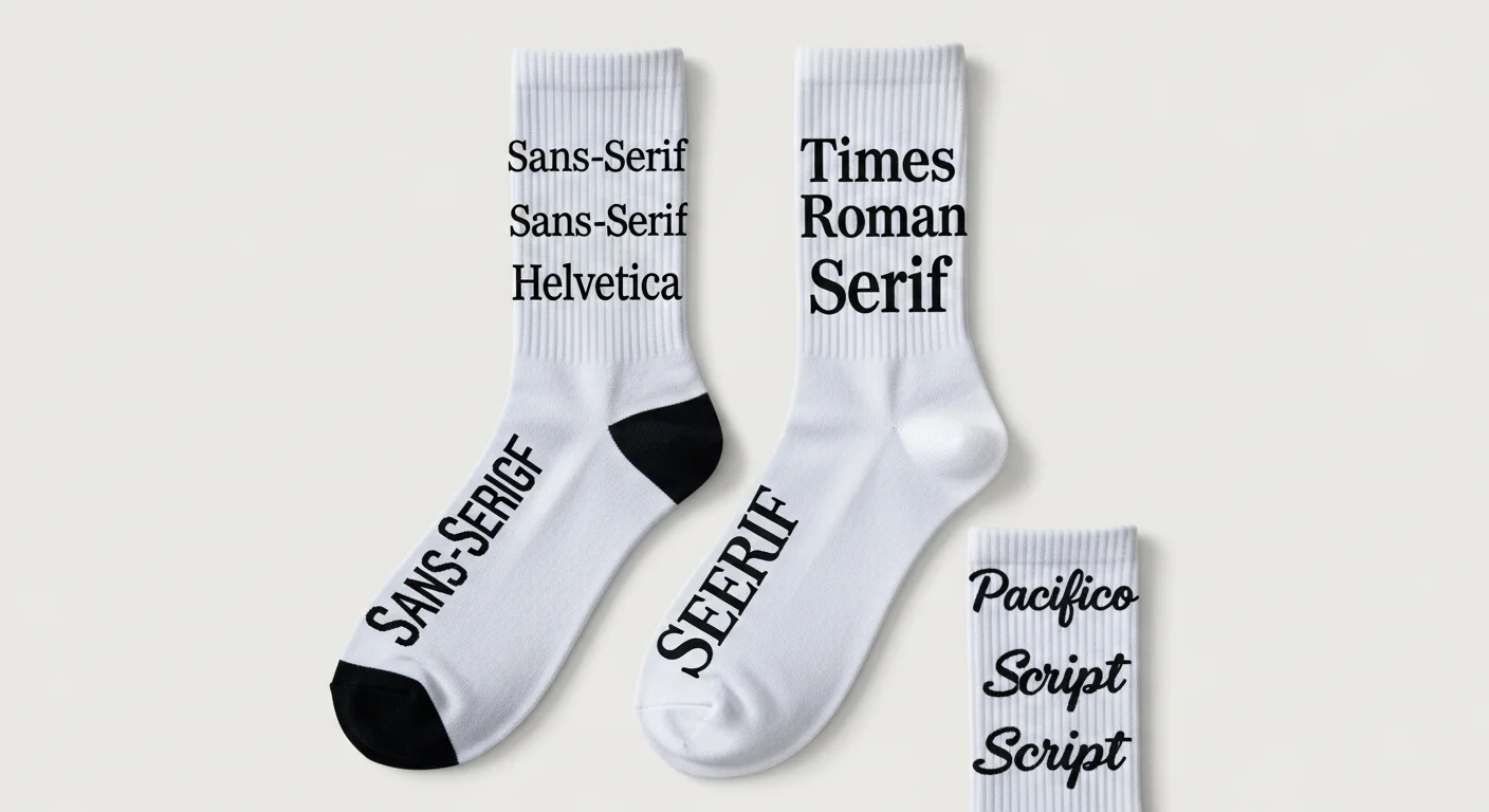
The minimum readable font size on socks depends on the printing method and the placement zone. For cuff text, the absolute minimum letter height is 0.5 inches (12.7 mm). Below this threshold, letter details blur together, especially for serif fonts with thin strokes. Sans-serif fonts with uniform stroke width — like Futura, Montserrat, Helvetica, or Gothic — perform best at small sizes because every stroke maintains consistent thickness regardless of scale.

For leg panel text, the minimum letter height increases to 1 inch (25.4 mm) because the fabric stretches more in this zone, thinning out the printed lines. Script and decorative fonts are viable on the leg panel at 1.5 inches or taller but should be avoided on the cuff entirely. Block fonts with heavy weight (Bold or Black variants) are the safest choice across all zones. Avoid fonts with hairline strokes, excessive serifs, or intricate detailing — these elements disappear when printed on textured sock fabric.
For jersey designers transitioning to socks, the best fonts for custom jerseys guide covers many of the same typeface families, but size minimums are larger on socks due to the smaller print surface and fabric texture. A font that reads clearly at 2 inches on a smooth jersey back panel may need to be 3 inches on a textured knit sock to achieve the same clarity.
Pattern Types: Stripes, Polka Dots, Argyle, Geometric, and All-Over Repeat
Horizontal stripes are the simplest sock pattern and work with every printing method. Stripe widths of 0.25 to 0.5 inches produce a classic athletic look. Varying stripe widths creates visual rhythm — a common approach uses alternating thick (0.5 inch) and thin (0.125 inch) stripes. Stripes wrap naturally around the cylindrical sock form without distortion, making them beginner-friendly.
Polka dots require careful sizing. Dots smaller than 0.25 inches in diameter can blur on knit fabrics, while dots larger than 0.75 inches feel disproportionate on the narrow sock surface. The optimal range is 0.3 to 0.5 inches with spacing equal to or slightly greater than the dot diameter. Argyle patterns use diamond shapes typically 1.5 to 2 inches tall, overlaid with thin diagonal lines. Argyle has experienced a revival in 2026 as part of the broader retro trend documented in the 2026 sock design trends forecast.
Geometric all-over patterns — triangles, hexagons, chevrons, tessellations — create the most visually striking socks but require precise template alignment. The pattern must tile seamlessly around the sock circumference (8 to 10 inches for adult sizes) and vertically along the leg (6 to 12 inches depending on length). Any misalignment at the back seam creates a visible break in the pattern that looks like a production error.
Creating Seamless Repeat Patterns
A seamless repeat is a rectangular tile that, when duplicated in all directions, creates an unbroken pattern with no visible seams. For socks, the tile must repeat cleanly in two critical dimensions: horizontally around the circumference and vertically along the length.
The ideal tile width divides evenly into the sock circumference. For a sock with a 9-inch circumference, effective tile widths are 1.5 inches (6 repeats), 1.8 inches (5 repeats), 2.25 inches (4 repeats), or 3 inches (3 repeats). Tiles that do not divide evenly result in a partial repeat at the back seam that disrupts the pattern flow. Tile height is more flexible because the top and bottom of the sock can accommodate partial repeats without visible disruption — the cuff and toe naturally terminate the pattern.
Design the tile in a vector program (Illustrator, Affinity Designer) at the final print resolution. Use the program's pattern preview mode to verify seamless tiling before exporting. Export the full sock template with the pattern applied, not just the tile, so the supplier can verify alignment during prepress. For knit-in construction, convert the vector pattern to a pixel grid where each pixel equals one stitch — typically 100 to 120 pixels wide for the sock circumference.
Logo Adaptation for the Sock Canvas
Most logos were designed for flat, rectangular applications — business cards, websites, building signage. Adapting a logo for the curved, narrow sock surface requires simplification and strategic placement. The most common placement zones for logos are the outer calf (the outward-facing side of the leg, visible when standing), the cuff band (repeated around the top), and the sole (hidden message area).
Logo simplification follows a three-step process. First, remove fine details that will not resolve at sock scale — thin outlines, small text within the logo, intricate patterns. Second, increase stroke weights so all remaining elements maintain visibility at the target print size (minimum 1-point stroke at final size). Third, test the simplified logo at actual print size by printing it on paper and viewing from arm's length — if any element is hard to distinguish, simplify further.
For logos wider than 3 inches in their original aspect ratio, consider a stacked or icon-only version for the sock. A text-heavy logo that reads beautifully on a 12-inch jersey chest panel becomes a compressed jumble on a 2-inch sock panel. Many brands maintain a separate "sock-optimized" logo mark specifically for small-format applications.
Color Contrast for Maximum Readability
Contrast is even more critical on socks than on larger apparel because the viewing distance and scale amplify any readability issues. The minimum recommended contrast ratio between text or logo elements and the background is 4.5:1 — the same standard used for web accessibility (WCAG AA). Dark text on light backgrounds and light text on dark backgrounds achieve this easily. Problems arise with mid-tone combinations: medium gray text on a medium blue background, or dark green text on a navy background, for example.
Test contrast by converting the design to grayscale — if text and background blend into the same shade of gray, contrast is insufficient. For multi-color patterns, ensure that any overlapping elements maintain contrast at their intersection points. The printing methods guide details how each production method affects color saturation and contrast, which influences design decisions.
Design File Preparation and Common Pitfalls
Submit design files in the format specified by the sock supplier — typically Adobe Illustrator (.ai), PDF, or high-resolution PNG at 300 DPI. Include a flat template view showing the complete sock surface unrolled, with clear markings for the cuff, leg, heel, foot, and toe zones. Color specifications should use Pantone codes for knit-in construction or CMYK values for sublimation printing.
The five most common design file pitfalls are: (1) submitting RGB files for CMYK printing processes, causing color shifts — particularly in blues and greens; (2) placing critical design elements too close to the heel seam where distortion occurs during construction; (3) using fonts that are not outlined or embedded, causing substitution errors during prepress; (4) designing at screen resolution (72 DPI) instead of print resolution (300 DPI), resulting in pixelated output; and (5) not accounting for fabric stretch — a design that looks perfect on a flat template may appear 10% to 15% wider when the sock is worn.
Frequently Asked Questions
What is the best font for custom sock cuffs?
Bold sans-serif fonts like Futura Bold, Montserrat Black, or Bebas Neue perform best on sock cuffs due to their uniform stroke width and clean geometry. These fonts remain readable at the 0.5-inch minimum height required for cuff text. Avoid script, thin serif, or decorative fonts on cuffs — they lose definition at small sizes on textured fabric.
How many colors can a custom sock design use?
Sublimation and DTG printing support unlimited colors at no additional cost since the design is printed as a single full-color image. Knit-in construction is limited by the number of yarn feeds on the machine — typically 4 to 6 colors maximum. Each additional knit-in color beyond the base two adds approximately $0.25 to $0.50 per pair in yarn and setup cost.
Can photographic images be printed on socks?
Yes, sublimation printing reproduces photographic images with high fidelity on polyester socks. The image should be at least 300 DPI at actual print size and optimized for the sock template to avoid distortion around the heel and toe. DTG also supports photo printing but with slightly less vibrancy on sock fabrics compared to sublimation. Knit-in construction cannot reproduce photographs — it is limited to patterns with distinct color blocks.
What file format should sock designs be submitted in?
Vector formats (AI, EPS, SVG, PDF) are preferred for patterns, logos, and typography because they scale without quality loss. Raster formats (PNG, TIFF) at 300 DPI minimum are acceptable for photographic or complex gradient designs. Always submit files in the color space appropriate to the printing method: CMYK for sublimation, and the supplier's specific pixel grid format for knit-in construction.
Share this article
Written by
Camille Dupont
Creative Director at RareCustom. BFA from RISD with 9+ years in graphic design. Camille's typography expertise has been featured in Communication Arts and Print Magazine.