Color Theory for T-Shirt Design: Choosing Colors That Pop
Master color theory for custom t-shirt design. Learn complementary, analogous, and triadic color schemes. Plus shirt color and ink color pairing tips.
Jordan Reeves
Brand Experience Strategist at RareCustom. BFA in Graphic Design from Parsons School of Design with 8+ years helping brands craft visual identities. Specialist in color theory, layout composition, and design systems.
Color is the first thing people notice about a t-shirt, long before they read the text or study the illustration. The right color combination can make a design feel energetic, sophisticated, playful, or authoritative. The wrong combination can make even the best artwork look muddy, clashing, or amateurish. Understanding the fundamentals of color theory gives you the power to choose palettes that look intentional and professional every single time you design a custom t-shirt.
This guide breaks down color theory into practical, actionable advice specifically for t-shirt design. You will learn how the color wheel works, how to use classic color schemes, how to pair ink colors with shirt colors for maximum impact, and how to leverage color psychology to communicate the right message through your apparel.
Color Theory Basics: The Color Wheel
Every conversation about color starts with the color wheel. Developed from Isaac Newton's original experiments with light, the modern color wheel organizes colors in a circle that reveals their relationships. Understanding these relationships is the shortcut to creating harmonious palettes without guesswork.
Primary colors (red, blue, yellow) are the foundation. They cannot be created by mixing other colors. Secondary colors (orange, green, purple) result from mixing two primaries. Tertiary colors (red-orange, yellow-green, blue-violet, and so on) fill the gaps between primaries and secondaries, creating a continuous spectrum of twelve hues.
Beyond hue, every color has two additional properties. Saturation describes how vivid or muted a color appears, from electric neon to dusty pastel. Value (also called lightness) describes how light or dark a color is, from nearly white tints to deep shades. Manipulating saturation and value is just as important as choosing the right hue when designing for fabric.
Complementary Color Schemes

Complementary colors sit directly opposite each other on the color wheel: red and green, blue and orange, yellow and purple. When placed side by side, complementary pairs create maximum contrast, making each color appear more vibrant. This is why sports teams so frequently use complementary combinations, they are impossible to ignore.
For t-shirt design, complementary schemes work best when one color dominates and the other serves as an accent. A navy blue shirt with orange text creates a bold, eye-catching look. A forest green tee with a burgundy red illustration feels rich and seasonal. The key is avoiding a fifty-fifty split, which can feel visually aggressive. Aim for roughly seventy percent dominant color and thirty percent accent.
Split-complementary schemes offer a softer variation. Instead of using the direct opposite, you use the two colors adjacent to the complement. For example, instead of pairing blue with orange, you would pair blue with red-orange and yellow-orange. This creates contrast with slightly more nuance and is an excellent choice for designs with multiple elements.
Analogous Color Schemes
Analogous colors sit next to each other on the wheel: blue, blue-green, and green, or red, red-orange, and orange. These combinations feel naturally harmonious because they share underlying hues. Analogous schemes are perfect for designs that need to feel cohesive, calming, or sophisticated.
On a t-shirt, an analogous palette might include a teal shirt with sky blue and emerald green ink. Or a coral shirt with peach and dusty rose print elements. The result is a design that feels effortlessly put together. Analogous schemes are particularly effective for typography-focused designs where you want the text to feel integrated rather than stamped on.
The risk with analogous palettes is low contrast. If all your colors are too similar in value, the design may lack punch and become difficult to read from a distance. Counter this by varying the saturation and value within your analogous range. Use a dark shade of one color alongside a light tint of its neighbor to maintain readability.
Triadic Color Schemes
Triadic schemes use three colors equally spaced around the wheel: red, yellow, and blue, or orange, green, and purple. These combinations are inherently balanced and vibrant, making them popular for playful, energetic designs such as event shirts, children's apparel, and festival merchandise.
The challenge with triadic schemes is managing three strong colors without creating visual chaos. The solution is the same as with complementary schemes: let one color dominate (sixty percent), use the second as a supporting color (thirty percent), and reserve the third as a small accent (ten percent). This hierarchy prevents the design from feeling like a color explosion.
Warm vs Cool Colors for Mood
Colors carry emotional associations that transcend cultural boundaries. Warm colors (reds, oranges, yellows) evoke energy, passion, urgency, and excitement. Cool colors (blues, greens, purples) evoke calm, trust, professionalism, and serenity. Understanding this spectrum helps you match your color choices to the mood you want your shirt to communicate.
A charity run shirt might use warm reds and oranges to convey excitement and urgency. A corporate team building shirt might use cool blues and greens to project professionalism and unity. A summer festival tee might combine warm and cool colors for a balanced, approachable vibe. When in doubt, start with the emotion you want the wearer to feel and work backward to the color family.
Shirt Color and Ink Color Contrast Guide

The single most important factor in t-shirt color design is the contrast between the ink and the garment. A brilliant design will fail if the ink color does not have enough separation from the shirt color. Here are the essential rules:
| Shirt Color | Best Ink Colors | Avoid |
|---|---|---|
| White | Black, navy, dark green, burgundy, any dark shade | Yellow, light gray, pastel tones |
| Black | White, bright yellow, gold, neon colors, light pastels | Dark navy, dark green, brown |
| Navy Blue | White, cream, gold, light gray, coral | Black, dark purple, dark green |
| Heather Gray | Black, white, navy, dark red, forest green | Silver, light yellow, medium gray |
| Red | White, cream, black, gold | Orange, dark brown, burgundy |
The general rule is simple: dark ink on light shirts, light ink on dark shirts. But "dark" and "light" are relative. A medium-tone shirt like heather gray or olive can work with both light and dark inks as long as the value contrast is significant enough to maintain legibility at arm's length.
Dark vs Light Garment Printing Differences
The color of the garment affects not just the visual outcome but the printing process itself. Light garments typically receive direct ink application, which means the ink soaks into the fibers and produces a soft, breathable print. Dark garments require an additional white underbase layer beneath the colored ink, which can create a slightly thicker hand feel.
This distinction matters most for DTG (direct-to-garment) printing. On white or light shirts, DTG produces vibrant colors with minimal ink layers. On dark shirts, the white underbase adds opacity but can slightly alter color vibrancy. To learn more about how different printing methods handle color, see our comparison of printing techniques for beginners.
When designing for dark garments, increase the saturation of your colors slightly to compensate for the underbase effect. Also consider that fine details and thin lines may appear slightly differently on dark shirts because the underbase extends slightly beyond the colored ink layer. Testing with a sample print is always recommended for critical color accuracy.
Color Psychology in Apparel
Every color carries psychological associations that influence how the wearer is perceived and how they feel. Here is a quick reference for the most common t-shirt colors and their psychological impact:
- Red: Energy, passion, urgency, excitement. Ideal for event shirts, sales team apparel, and cause-driven campaigns.
- Blue: Trust, reliability, calm, professionalism. The most universally liked color and a safe choice for corporate branding and team shirts.
- Green: Growth, nature, health, sustainability. Perfect for eco-friendly brands, wellness companies, and outdoor events.
- Yellow: Optimism, creativity, warmth, attention. Works well as an accent color but can be overwhelming as a primary shirt color.
- Black: Sophistication, power, elegance, versatility. The best-selling shirt color across all demographics and design styles.
- White: Simplicity, cleanliness, minimalism. Excellent for full-color designs and photography-based prints.
- Purple: Luxury, creativity, wisdom, uniqueness. Popular for artistic brands, creative teams, and premium merchandise.
- Orange: Enthusiasm, adventure, friendliness, energy. Great for sports teams, adventure brands, and youth-oriented designs.
Seasonal Color Palettes
Aligning your t-shirt colors with seasonal palettes creates timely designs that feel relevant and fresh. Spring designs benefit from soft pastels and fresh greens. Summer calls for vibrant brights, tropical hues, and sun-bleached tones. Autumn embraces warm rusts, burnt oranges, deep burgundies, and olive greens. Winter favors cool blues, icy whites, deep jewel tones, and rich metallics.
Seasonal palettes are especially valuable for businesses that release merchandise collections throughout the year. A seasonal approach keeps your custom t-shirt lineup feeling curated and intentional rather than random. It also encourages repeat purchases from customers who want the latest colorway.
Brand Color Consistency
If you are designing shirts for a brand or business, color consistency is non-negotiable. Your brand colors should translate faithfully from screen to fabric, which requires understanding how RGB (screen) colors translate to CMYK or Pantone (print) colors. Slight shifts are inevitable, but significant drift can undermine brand recognition.
Request a Pantone color match from your printer for critical brand colors. Pantone Matching System (PMS) colors provide a standardized reference that ensures your blue is the same blue whether printed on a business card or a t-shirt. Most professional printers can match Pantone colors for screen printing, and DTG printers can get close with proper color profiling. For more on staying on-brand, see our guide on design trends and brand consistency.
Common Color Mistakes to Avoid
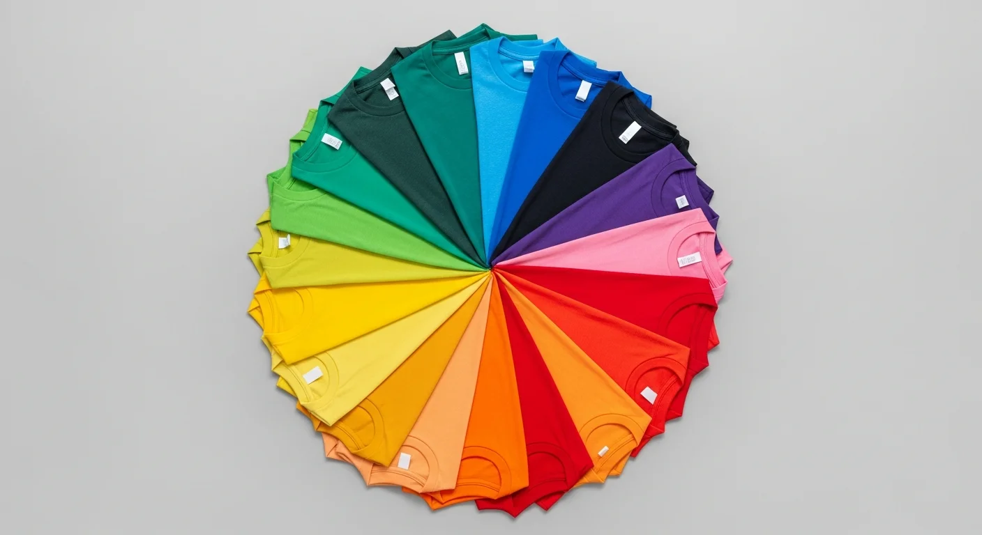
- Too many colors: Limit your palette to two or three colors per design. Each additional color adds complexity and cost, especially for screen printing where each color requires a separate screen.
- Low contrast text: If you cannot read the text from six feet away, the contrast is too low. Always prioritize legibility over aesthetic subtlety for text-heavy designs.
- Ignoring the shirt color: Your design does not exist in isolation. Always preview your artwork on the actual shirt color before finalizing. A design that looks great on a white background may disappear on a cream shirt.
- Neon overload: Neon and fluorescent colors attract attention but fatigue the eye quickly. Use them as accents rather than primary colors unless the goal is maximum visibility like safety vests or race bibs.
- Forgetting dark mode: The same design may need different color treatments for light and dark garments. Create separate versions optimized for each rather than using a one-size-fits-all approach.
Tools for Choosing Color Palettes
You do not need to be a trained designer to build beautiful color palettes. Several free tools make the process intuitive. Adobe Color (color.adobe.com) lets you explore color harmonies on an interactive color wheel. Coolors (coolors.co) generates random harmonious palettes with a single spacebar press. And the RareCustom design tool includes a built-in palette selector that shows how your chosen colors will look on the actual garment in real time.
Start with one color you love, whether it is your brand color, your favorite team's color, or simply a shade that feels right for the occasion, and use these tools to build a harmonious palette around it. Within minutes you will have a professional color scheme that makes your custom t-shirt design look polished, intentional, and impossible to ignore.
Frequently Asked Questions
What is the most popular t-shirt color for custom printing?
Black is consistently the best-selling shirt color for custom printing across all demographics. It is versatile, slimming, and provides excellent contrast for both light and bright ink colors. White is a close second because it allows for the widest range of design colors and typically produces the most vibrant prints since no white underbase is needed.
How many ink colors should I use in my t-shirt design?
For most designs, two to three colors produce the best results. This range provides enough visual interest without overwhelming the design or inflating printing costs. Screen printing charges per color, so limiting your palette also keeps your budget in check. If you need a full-color photographic print, DTG printing handles unlimited colors at a flat rate per shirt.
Can I match my exact brand color on a t-shirt?
Yes, but it requires a Pantone color match. Provide your printer with the specific Pantone (PMS) number for your brand colors, and they can mix inks to match. Screen printing offers the most precise Pantone matching. DTG printers use CMYK to approximate Pantone colors and can get very close with proper color profiling, though slight variations may occur. Always order a sample to verify color accuracy before committing to a full run.
Do colors look different on screen versus printed on a shirt?
Yes. Screens emit light using RGB (red, green, blue) color mixing, which produces a wider range of vivid colors. Printing uses CMYK (cyan, magenta, yellow, black) or spot inks, which have a narrower gamut. Highly saturated digital colors like electric blue or neon green will appear slightly muted when printed. Calibrate your expectations by requesting a physical proof or sample print before placing your full order.
What colors should I avoid printing on a dark shirt?
Avoid colors that are close in value to the shirt itself. Dark navy ink on a black shirt, dark green on a charcoal shirt, or brown on a maroon shirt will create insufficient contrast and the design will be nearly invisible from a distance. On dark shirts, stick to white, cream, bright yellows, neon shades, and metallics for maximum readability and visual impact.
Share this article
Written by
Jordan Reeves
Brand Experience Strategist at RareCustom. BFA in Graphic Design from Parsons School of Design with 8+ years helping brands craft visual identities. Specialist in color theory, layout composition, and design systems.