T-Shirt Design Color Combinations That Work: Proven Palettes for Custom Apparel
Discover the best t-shirt color combinations for custom printing. Our guide covers ink on fabric pairings, contrast ratios, seasonal palettes, and specialty inks for standout designs.
Tony Vu
Founder & President of RareCustom. Tony's years of evaluating print output across different ink and fabric combinations give him practical expertise in which color pairings deliver the best visual results.
Color is the first thing people notice about a t-shirt, even before they register the design, read the text, or evaluate the fit. The right t-shirt color combinations make a design pop off the fabric and demand attention from across a room. The wrong combinations bury your artwork in a muddy, unreadable mess that ends up at the bottom of a drawer. Whether you are designing for a brand, an event, a fundraiser, or personal expression, mastering color pairing for custom apparel is one of the most impactful skills you can develop.
Unlike designing for screens or paper, custom shirt color matching involves a unique variable that digital designers rarely consider: the fabric color itself becomes a foundational element of your palette. A design that looks vibrant on a white shirt might disappear on a heather gray, and a graphic that pops on black can look garish on yellow. Understanding how ink interacts with fabric is the key to creating custom t-shirts that look exactly the way you envisioned. This guide breaks down proven color pairings, contrast principles, and practical tips that transform good designs into head-turning apparel.
Why Color Matters More for T-Shirts Than Other Media
Designing for apparel is fundamentally different from designing for screens or print media, and color for t-shirt design carries unique challenges. On a screen, you control the background. On paper, you start with a white canvas. On a t-shirt, the background is determined by the garment color, and that color interacts with your ink in ways that can enhance or destroy your design.
T-shirts are also viewed in wildly unpredictable lighting conditions. A shirt that looks perfect under studio lights might wash out in bright sunlight, shift hues under fluorescent office lighting, or lose contrast in dim bar environments. Your color choices need to maintain readability and visual impact across all these scenarios, which means building in enough contrast to survive the worst-case lighting conditions while still looking refined in optimal conditions.
The physical texture of the ink adds another dimension. Screen printing deposits a layer of ink that sits on top of the fabric, creating a slight tactile difference between printed and unprinted areas. DTG printing absorbs into the fibers, producing a softer hand feel but sometimes a less vivid color. Sublimation bonds dye into the fibers for the smoothest finish but only works on polyester. Each method renders color differently, and your palette should account for the specific method you plan to use.
Color Theory Basics for Apparel Design
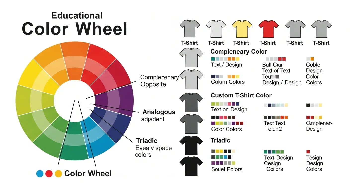
You do not need a fine arts degree to understand color theory for t-shirt design, but grasping a few foundational concepts will dramatically improve your color choices. The color wheel, developed from Isaac Newton's original experiments with light, organizes colors by their relationships: complementary colors sit opposite each other, analogous colors sit next to each other, and triadic colors form equilateral triangles.
For t-shirt design, the most reliable approach is using complementary color pairings for maximum contrast or analogous pairings for harmonious, cohesive designs. Complementary combinations like blue and orange, purple and yellow, or red and green create vibrant, energetic designs that grab attention. Analogous combinations like blue, teal, and green or red, orange, and yellow create flowing, natural-feeling designs that are easy on the eyes.
Warm colors (reds, oranges, yellows) advance visually, meaning they appear closer to the viewer and command immediate attention. Cool colors (blues, greens, purples) recede visually, creating depth and calm. Using this principle strategically helps you direct the viewer's eye to the most important elements of your design. Place warm-colored text or key graphics against cool backgrounds for maximum visual hierarchy. Our in-depth color theory guide explores these principles further.
Contrast Ratios for Maximum Readability
The single most important factor in t-shirt color readability is contrast, the difference in lightness and darkness between your ink color and your fabric color. High contrast combinations are readable from a distance and in poor lighting. Low contrast combinations require close inspection and often frustrate viewers who cannot decipher the design quickly.
The highest contrast combination available is white ink on a black shirt or black ink on a white shirt. These pairings are universally readable, work in every lighting condition, and serve as the safest choice for text-heavy designs. From there, contrast decreases as the lightness values of ink and fabric approach each other. Navy text on a royal blue shirt, for example, has very low contrast and should be avoided for anything that needs to be read quickly.
A practical rule of thumb: if you squint at your design mockup and can still read the text, your contrast is sufficient. If squinting causes the text to disappear into the background, you need more contrast. Our mockup preview guide helps you visualize contrast before committing to production.
Testing Contrast Digitally
Use the grayscale test to evaluate contrast objectively. Convert your mockup to grayscale, which removes color hue and saturation, leaving only lightness values. If your design elements are clearly distinguishable in grayscale, your contrast ratios are strong. If elements merge together, you need to adjust either the ink color, the fabric color, or both.
Best Ink Colors on Dark Shirts

Printing on dark-colored t-shirts requires different considerations than light shirt printing. Dark fabrics absorb light rather than reflecting it, which means your ink colors need to carry their own brightness rather than relying on the fabric to provide a reflective base. This is why white, cream, and light pastel inks are the workhorses of dark shirt printing.
White ink on black shirts is the gold standard of custom apparel for a reason: it offers maximum contrast, prints cleanly with every method, and delivers a modern, sophisticated look that works for brands, events, and personal designs alike. White on navy, charcoal, forest green, and burgundy is equally effective, offering high contrast with color variety.
Beyond white, metallic gold and silver inks create striking designs on dark fabrics. These specialty inks catch light and add a premium feel that elevates simple designs into luxury-looking merchandise. Neon yellow and neon pink also perform well on dark shirts, creating an energetic, eye-catching effect that works for concerts, festivals, and youth-oriented brands.
| Dark Shirt Color | Best Ink Colors | Mood / Style |
|---|---|---|
| Black | White, Gold, Neon Yellow, Red | Bold, modern, versatile |
| Navy | White, Light Blue, Gold, Coral | Classic, nautical, professional |
| Charcoal | White, Mint, Light Pink, Yellow | Urban, understated, contemporary |
| Forest Green | White, Cream, Gold, Tan | Natural, earthy, organic |
| Burgundy | White, Gold, Cream, Peach | Rich, elegant, vintage |
| Dark Purple | White, Lavender, Gold, Silver | Regal, creative, luxurious |
Best Ink Colors on Light Shirts
Light-colored shirts offer more ink color flexibility because the bright fabric reflects light through semi-transparent inks, maintaining color vibrancy without requiring an opaque base layer. This is why DTG printing, which uses water-based inks that absorb into fibers, performs best on light fabrics where ink transparency is an advantage rather than a limitation.
Black ink on white shirts delivers the sharpest possible print and is the most cost-effective combination for screen printing since it requires only a single screen pass. Dark blues, deep reds, forest greens, and rich browns also print beautifully on white, creating clean, professional designs that work for corporate apparel, event shirts, and everyday wear.
On light gray, heather, and cream shirts, your ink palette shifts to accommodate the slightly darker background. True black remains effective, as do navy, dark teal, burgundy, and chocolate brown. Medium-tone inks like medium blue or olive green may lose some definition against medium-tone fabrics, so test these combinations in your mockup before ordering.
Proven Color Pairings That Always Work

After thousands of custom t-shirt orders, certain color pairings have emerged as reliably effective across all design styles, audiences, and occasions. These combinations work because they balance contrast, emotional resonance, and aesthetic appeal in ways that feel natural rather than forced.
| Combination | Shirt Color | Ink Color(s) | Best For |
|---|---|---|---|
| Classic Contrast | White | Black | Typography, minimalist, corporate |
| Modern Bold | Black | White + Gold | Luxury, events, streetwear |
| Coastal Vibes | Light Blue | Navy + White | Beach events, nautical brands |
| Earth Tones | Tan / Sand | Dark Brown + Forest Green | Outdoor, organic, natural brands |
| Retro Energy | Yellow | Red + Black | Vintage, sports, food trucks |
| Royal Elegance | Navy | Gold | Schools, corporate, premium merch |
| Neon Pop | Black | Neon Pink + Neon Green | Concerts, clubs, Gen Z brands |
| Neutral Sophistication | Heather Gray | Burgundy | Lifestyle brands, cafes, bookstores |
These proven combinations serve as starting points. Adjust hues, add accent colors, and experiment with your specific design elements to create a palette that feels uniquely yours. The design tool at RareCustom's design studio lets you preview your color choices on real garment mockups before ordering.
Seasonal Color Palettes for Custom Apparel
Aligning your t-shirt color scheme with the season creates designs that feel current and contextually appropriate. Seasonal palettes tap into the collective mood shifts that occur throughout the year, making your shirts feel timely and relevant.
Spring palettes favor pastels and fresh greens: lavender, mint, blush pink, soft yellow, and sky blue on white or light gray shirts. These colors evoke renewal, optimism, and warmth, making them perfect for Easter events, spring fundraisers, and seasonal brand launches. Summer palettes go bolder with tropical colors: coral, turquoise, sunset orange, hot pink, and lime green on white, black, or navy shirts.
Fall palettes embrace warmth and richness: burnt orange, mustard, olive green, deep burgundy, and warm brown on tan, cream, or dark green shirts. These colors resonate with harvest festivals, back-to-school events, and cozy brand aesthetics. Winter palettes shift to cool elegance: icy blue, silver, deep red, forest green, and crisp white on black, navy, or charcoal shirts for holiday events and year-end celebrations.
Brand Color Integration for Custom Shirts
When creating branded custom t-shirts, your existing brand colors must translate accurately from digital and print media to fabric and ink. This translation is not always straightforward because fabric absorbs and reflects light differently than paper or screens, which means your brand blue on a shirt might look slightly different than your brand blue on a business card.
Request Pantone color matching from your printer if brand consistency is critical. Pantone colors provide a universal reference that custom printers can match precisely, ensuring your brand navy looks identical across every touchpoint. Most professional printers offer Pantone matching for screen printing, and some advanced DTG operations can approximate Pantone values through color profiling. For more on building brand consistency through apparel, read our small business branding guide.
When your brand palette includes colors that do not print well on certain fabric colors, create an approved color variation guide. Specify alternative color combinations for dark shirts, light shirts, and specialty fabrics so that every application maintains brand recognition even when exact color reproduction is not possible.
Neon and Specialty Inks
Neon inks and specialty finishes add a premium dimension to custom t-shirt design that standard CMYK cannot replicate. Neon colors fluoresce under UV light, creating an electric visual effect that is perfect for nightclub events, glow-in-the-dark parties, and brands that target youthful, energetic audiences.
Beyond neons, specialty ink options include metallic gold and silver for luxury appeal, puff ink that creates a raised three-dimensional texture, glow-in-the-dark ink that charges under light and emits a soft glow in darkness, and reflective ink that shines brilliantly when hit by flashlights or camera flashes. Each specialty ink adds unique visual and tactile interest that standard printing cannot achieve.
The tradeoff with specialty inks is cost and availability. Most specialty options are only available through screen printing, which means minimum order quantities apply. Neon and metallic inks also tend to be less opaque than standard inks, sometimes requiring an additional white base layer on dark shirts to achieve full vibrancy. Discuss specialty ink options with your printer early in the design process to understand capabilities and cost implications.
Color Limitations by Print Method
Your chosen print method directly affects which colors you can use and how accurately they reproduce on fabric. Understanding these limitations prevents disappointment and helps you design within the capabilities of your production process.
| Print Method | Color Capability | Best Color Applications | Limitations |
|---|---|---|---|
| Screen Printing | Spot colors, up to 8+ | Bold, solid colors, specialty inks | Each color = separate screen, gradients need halftones |
| DTG | Full CMYK + white | Photo prints, gradients, complex art | Less vivid on dark fabrics, limited specialty options |
| DTF Transfer | Full CMYK + white | Versatile, any fabric color | Slight texture on fabric, limited specialty inks |
| Sublimation | Full CMYK | All-over prints, vibrant gradients | Polyester only, no white ink |
| Vinyl/HTV | Single color per layer | Simple text, numbers, names | Multi-color requires layering, limited detail |
For detailed comparisons of printing methods, our screen printing vs DTG guide and heat transfer vs sublimation guide provide comprehensive breakdowns of each method's strengths and limitations.
Testing Colors Before You Order
Never commit to a large custom t-shirt order without testing your color combinations first. What looks perfect on a monitor often translates differently to fabric, and discovering a color mismatch after hundreds of shirts are printed is an expensive lesson.
The most reliable testing method is ordering a physical sample or proof from your printer. Most professional custom printers offer single-unit samples at a slightly higher per-unit cost, which is a small investment compared to the risk of an entire batch with incorrect colors. Hold the sample under different lighting conditions, at various distances, and next to the other garment colors in your order to evaluate the full range of viewing experiences.
If a physical sample is not feasible, use digital mockup tools that simulate fabric texture and lighting conditions. Our design studio provides realistic garment previews that approximate how your design will look on actual shirts. While digital previews cannot perfectly replicate physical color, they are vastly better than guessing based on your design file alone.
The Psychology of Color in Apparel
Color communicates emotion before the conscious mind has time to process content. The psychology of color in t-shirt design influences how people perceive your brand, message, and personality before they read a single word on your shirt.
Red communicates energy, passion, urgency, and excitement. It is the most attention-grabbing color and works well for sports teams, food brands, and calls to action. Blue conveys trust, stability, professionalism, and calm, making it the most popular color for corporate apparel and tech brands. Green signals nature, health, sustainability, and growth, ideal for eco-friendly brands and outdoor organizations.
Yellow radiates optimism, warmth, and creativity but can feel overwhelming in large quantities. Purple suggests luxury, creativity, and uniqueness, making it effective for boutique brands and artistic organizations. Orange combines the energy of red with the warmth of yellow, creating a friendly, approachable feel that works for youth programs, summer camps, and community organizations. Black communicates sophistication, power, and modernity, while white signals purity, simplicity, and clean design.
Use color psychology to reinforce your message rather than contradict it. A sustainability nonprofit should lean toward greens and earth tones, not aggressive reds. A high-energy fitness brand benefits from bold reds and oranges, not subdued pastels. Alignment between color and message creates subconscious credibility that makes your custom t-shirts more effective as communication tools.
Frequently Asked Questions
What is the most popular t-shirt color for custom printing?
Black and white remain the two most popular base colors for custom t-shirt printing. Black shirts paired with white ink offer high contrast and a modern aesthetic, while white shirts provide the widest range of ink color options and the most accurate color reproduction.
Can I print any color ink on any color shirt?
Technically yes, but not every combination produces good results. Light inks on light shirts and medium-tone inks on similar-tone fabrics lack the contrast needed for readability. Always test your specific combination before ordering in quantity, and remember that dark fabric printing usually requires a white base layer under colored inks.
Why do colors look different on screen versus on a printed shirt?
Screens emit light using RGB color space, while printed shirts use ink that absorbs and reflects light. This fundamental difference means screen colors will always appear brighter and more saturated than their printed counterparts. Fabric texture, ink opacity, and ambient lighting conditions further affect how printed colors appear. Order physical samples to evaluate color accuracy before large production runs.
How do I choose colors for a multi-color design?
Start with your primary brand or message color, then select one or two supporting colors using complementary or analogous relationships on the color wheel. Add black or white as needed for contrast and readability. Limit your palette to three or four colors maximum for the cleanest, most professional result.
Create Your Perfect Color Combination
The right t-shirt color combinations transform ordinary designs into standout custom apparel that communicates your message with impact and style. Whether you are ordering for a business, an event, or personal expression, the principles in this guide give you the foundation to make confident color decisions every time. Visit our design studio to start experimenting with color on real garment mockups, or explore our full range of custom t-shirts in dozens of fabric colors.
Related Articles
Share this article
Written by
Tony Vu
Founder & President of RareCustom. Tony's years of evaluating print output across different ink and fabric combinations give him practical expertise in which color pairings deliver the best visual results.