Vintage and Retro T-Shirt Design Techniques: How to Create Perfectly Distressed, Aged Prints
Master vintage and retro t-shirt design techniques including distressed printing, halftone effects, faded colors, and decade-specific aesthetics for authentic aged looks.
Tony Vu
Founder & President of RareCustom. Tony learned vintage printing techniques in his family's screen printing shop and now helps designers achieve authentic retro aesthetics using modern production methods.
There is something magnetic about a well-worn vintage t-shirt. The slightly faded colors, the soft cracked print, the perfectly imperfect texture that tells a story of decades of wear. That lived-in aesthetic has become one of the most sought-after looks in custom t-shirt design, with brands, bands, and businesses all chasing the charm of vintage retro t-shirt design techniques. The appeal is universal because a distressed print carries an effortless coolness that brand-new, crisp graphics simply cannot replicate.
The good news is that you do not need to raid thrift stores or wait twenty years for your shirts to develop that coveted patina. Modern design software, specialized printing techniques, and innovative garment treatments allow you to create authentically aged-looking custom t-shirts from scratch. In this comprehensive guide, we break down every method, tool, and creative approach for achieving the perfect vintage look on your custom t-shirts, from digital distressing in Photoshop to garment-dyeing processes that replicate decades of washing in a single treatment.
Why the Vintage Aesthetic Sells
The vintage t-shirt trend is not a passing fad. It has been a dominant force in fashion for over a decade, and consumer demand continues to grow. Original vintage band tees from the seventies and eighties regularly sell for hundreds or even thousands of dollars at auction. This appetite for authentic vintage has naturally extended to the custom apparel market, where customers increasingly request designs that look and feel aged from the moment they arrive.
Several psychological factors drive this preference. First, vintage aesthetics carry associations with authenticity and heritage. A shirt that looks like it has been around for decades communicates that the brand or message it represents has deep roots, even if the design was created last week. This perceived authenticity resonates powerfully with consumers who are increasingly skeptical of slick, corporate-looking branding.
Second, the distressed vintage look is inherently comfortable. A shirt that appears well-worn suggests softness, relaxation, and effortless style. This aligns perfectly with the broader fashion movement toward casual, comfortable dressing that accelerated dramatically during the early 2020s and shows no signs of reversing. Understanding current design trends helps you position vintage styles within the broader market context.
Finally, vintage designs have a timeless quality that protects against the rapid trend cycles that make many modern designs feel dated within a year. A well-executed retro design from today will still look great five or ten years from now, giving it longer wearable life and better perceived value for the customer.
What Makes a Design Look Vintage
Before diving into specific techniques, it helps to understand the visual elements that collectively communicate "vintage" to the viewer. Authentic vintage appearance is a combination of several interacting factors that must work together cohesively. Applying just one element while neglecting others creates an inconsistent look that reads as incomplete rather than authentic.
The key visual markers include limited color palettes with muted, desaturated tones rather than vibrant modern colors. Vintage prints typically feature texture and imperfection, whether that comes from visible halftone dots, cracked ink surfaces, or soft, fuzzy edges rather than razor-sharp lines. Typography choices lean toward era-specific fonts that reference particular decades. And the overall composition often reflects design conventions from a specific era, such as symmetrical badge-style layouts from the fifties or psychedelic flowing forms from the late sixties.
Understanding these elements allows you to make intentional decisions about which vintage era you are referencing and how far to push the distressed effect. Subtle aging creates a worn-in look that feels natural and effortless. Heavy distressing creates a grunge-rock aesthetic that makes a bolder statement. Both are valid approaches; the choice depends on your brand identity and target audience.
Distressed and Cracked Ink Techniques

Distressed printing is the most direct way to achieve a vintage look on a new shirt. The technique involves intentionally creating gaps, cracks, and worn areas in the printed design so that the shirt color shows through irregularly, mimicking the natural deterioration that occurs when prints age through years of washing and wearing.
In the digital design phase, distressing is typically achieved by applying texture overlays to your artwork. Concrete, paper, fabric weave, and noise textures work well as masking layers. You create your design at full quality, then apply the texture as a clipping mask or multiply layer that removes portions of the ink coverage in an organic, irregular pattern. The key is to vary the intensity of distressing across the design, with heavier wear along edges and fold lines where natural degradation would be most pronounced.
For screen printing, specialty distressed ink formulations are available that crack and split during the curing process, creating authentic texture without any digital manipulation. These inks contain additives that cause the cured ink film to fracture in a controlled manner, producing a naturally aged surface that is visible and tactile. The effect is particularly convincing on dark garments where the cracked pattern reveals the shirt color beneath the print.
Achieving Natural Cracking Patterns
The most convincing distressed prints replicate the specific patterns of real wear. In authentically aged shirts, cracking tends to follow the natural creases of the fabric, concentrating along horizontal fold lines across the chest and around areas of frequent movement. Random, evenly distributed distressing looks artificial because it does not match how shirts actually age.
When designing digitally, study reference photos of genuinely vintage shirts to understand where wear patterns naturally occur. Apply heavier distressing in those areas while leaving some portions of the design relatively intact. This selective approach creates a more believable aged effect than uniform texture application.
Halftone Dot Pattern Effects
Halftone patterns are one of the most iconic visual markers of vintage printing. Before modern digital printing made continuous-tone reproduction possible, all printed images were rendered as patterns of dots at varying sizes and densities to simulate gradient and shading. This technique was used extensively in comic books, newspaper printing, and early screen-printed apparel, making visible halftone dots an instant visual shorthand for retro aesthetics.
To create halftone effects in your designs, most design software offers halftone filters that convert smooth gradients into dot patterns. In Adobe Photoshop, the Color Halftone filter allows you to control dot size, angle, and channel separation. Larger dots create a more dramatic, pop-art effect, while smaller dots produce a subtler vintage texture that is only visible up close.
For screen printing, halftone conversion is not just an aesthetic choice but a practical necessity. Simulated process printing uses halftone dots to reproduce complex imagery with a limited number of ink colors. By controlling dot density and overlap, printers can create the illusion of hundreds of colors using just six to eight ink screens. This technique naturally produces the vintage print quality that many designers are actively trying to achieve.
When using halftones, consider the printing method and garment texture. Coarser halftone patterns at forty-five to sixty-five lines per inch reproduce reliably on textured fabrics and through screen printing. Finer patterns above eighty-five lines per inch require smoother fabrics and higher-precision printing methods to maintain dot integrity. For guidance on preparing print-ready files, our file formats guide for t-shirt printing covers the technical requirements.
Faded and Washed-Out Color Methods
Vibrant, saturated colors scream "new." Faded, desaturated colors whisper "vintage." Controlling the color intensity of your designs is one of the simplest and most effective ways to achieve an aged aesthetic, and it can be applied to any printing method.
In your design software, reducing saturation by twenty to forty percent from your original colors creates a naturally sun-faded appearance. Add a slight warm shift toward yellows and oranges to simulate the color degradation that occurs when dyes and inks are exposed to sunlight over time. This warming effect is subtle but critical for authenticity because real vintage shirts develop a warm patina from UV exposure.
For screen printing, you can achieve faded effects by adjusting ink opacity. Printing with thinner ink deposits allows more of the garment color to show through the print, creating a lighter, more washed-out appearance. Some printers offer discharge printing, which actually removes the shirt's dye color and replaces it with a new color, producing an incredibly soft, vintage-feeling print that sits within the fabric rather than on top of it.
Color Degradation Simulation
Real color fading does not affect all colors equally. Reds tend to fade to pink or salmon tones. Blues shift toward gray-blue or powder blue. Blacks soften to charcoal or dark gray. Yellows often fade faster than other colors, becoming pale cream tones. Understanding these real-world degradation patterns allows you to create color palettes that convincingly simulate age rather than simply applying a uniform desaturation that looks artificial.
Retro Typography and Fonts
Typography is the fastest way to establish a vintage era in your design. Each decade has characteristic typeface styles that instantly communicate a specific time period, and choosing the right font can anchor your entire design in the desired aesthetic without any other vintage treatment.
| Decade | Typography Style | Characteristics | Font Examples |
|---|---|---|---|
| 1950s | Script and Atomic | Swooping scripts, starbursts, atomic-age geometry | Lobster, Pacifico, Atomic Age |
| 1960s | Mod and Psychedelic | Rounded sans-serifs, flowing organic forms, bubble letters | Cooper Black, Groovy, Phosphate |
| 1970s | Disco and Serif | Wide flared serifs, chunky bold weights, earthy hand-lettering | Windsor, Souvenir, Bookman |
| 1980s | Geometric and Neon | Sharp geometric sans-serifs, chrome effects, italic slant | Futura, Avant Garde, ITC Machine |
| 1990s | Grunge and Distressed | Rough hand-drawn type, stamp textures, mixed-case chaos | Courier, Impact, Grunge fonts |
When selecting fonts for retro shirt designs, avoid using era-specific fonts in isolation. Pair your primary vintage typeface with a complementary secondary font for supporting text, maintaining readability while reinforcing the aesthetic. A bold seventies display font for the main headline paired with a clean condensed sans-serif for smaller details creates visual hierarchy without sacrificing the vintage feel. For deeper font selection guidance, visit our best fonts for custom t-shirt designs.
Custom hand-lettering is another powerful approach for vintage typography. Hand-drawn type carries inherent imperfection and personality that digital fonts struggle to replicate. If you have lettering skills or access to a lettering artist, custom hand-drawn type creates a one-of-a-kind vintage feel that no font library can match.
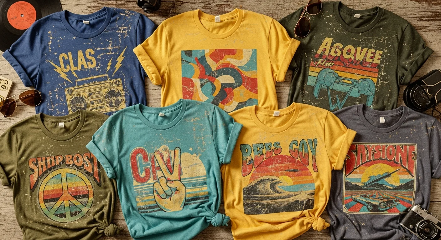
Decade-Specific Aesthetics: 70s, 80s, and 90s
Each decade carries its own distinct visual language that extends beyond typography into color palettes, graphic styles, composition approaches, and cultural references. Understanding these holistic aesthetic packages allows you to create vintage designs that feel cohesive and authentic rather than a random collection of retro elements.
1970s Aesthetic
The seventies aesthetic is characterized by warm earth tones, organic shapes, and a handcrafted feel. Colors like burnt orange, avocado green, mustard yellow, and chocolate brown define the decade's palette. Graphic elements include rainbows, sunbursts, rolling hills, and van-life imagery. Typography favors thick, rounded letterforms with generous curves. Stripe patterns, especially in the sunset-gradient rainbow arrangement, are instantly recognizable seventies motifs.
On custom t-shirts, the seventies look works beautifully as a front-center chest graphic, often framed within an arched text arrangement above and below the main image. Printing on cream, tan, or soft yellow shirt blanks rather than stark white enhances the vintage feel significantly.
1980s Aesthetic
The eighties bring bold neon colors, geometric shapes, and an unmistakable sense of excess. Hot pink, electric blue, neon green, and chrome silver define the color palette. Grid patterns, laser lines, palm trees, and synthesizer-inspired graphics capture the decade's obsession with technology and futurism. Typography features sharp angles, italic slants, and chrome or gradient fill effects.
Eighties-inspired designs on custom shirts pair dramatically with black or dark navy blanks where neon colors can achieve maximum contrast. The key is leaning fully into the aesthetic rather than trying to modernize it, as the charm of eighties style lies precisely in its unapologetic boldness.
1990s Aesthetic
The nineties aesthetic spans a broader stylistic range, from the grunge-influenced distressed look of the early decade to the cleaner, sportswear-inspired graphics of the late nineties. Muted purples, forest greens, dusty roses, and faded blacks characterize the grunge palette, while bright primaries and geometric patterns dominated the sport and street style movement.
Nineties shirt designs often feature collage-style compositions, stamp and sticker-inspired graphic elements, and a deliberately DIY quality. The grunge approach to typography embraces imperfection, using ransom-note-style mixed typefaces, photocopied textures, and hand-scrawled text. For design inspiration across all eras, explore our guide on designing t-shirt artwork step by step.
Simulated Wear and Aging on Garments
Beyond the printed design itself, the garment can be treated to simulate years of wear. Garment aging techniques affect the fabric color, texture, and overall feel, creating a holistic vintage experience that goes beyond just the print.
Enzyme washing uses biological agents to break down fiber surfaces, softening the fabric and creating a subtle faded appearance. This process reduces pilling, relaxes the fabric structure, and produces a hand feel that genuinely resembles a well-loved shirt that has been washed hundreds of times. Enzyme-washed blanks are widely available and add a moderate premium to the base garment cost.
Sandblasting and stone washing create more dramatic aging effects, producing visible wear patterns, lightened areas, and a heavily broken-in texture. These treatments are typically applied to heavier-weight cotton garments and produce results that are immediately visible and tactile. The combination of a stone-washed blank with a distressed print creates an extremely convincing vintage product.
For brands seeking a premium vintage position, hand-finishing techniques like selective bleach spotting, edge fraying, and seam distressing add artisanal character that mass-produced vintage treatments cannot match. These labor-intensive processes are best suited for limited-edition runs where the per-unit cost can be absorbed into a higher retail price.
Vintage Color Palettes That Work
Color selection is foundational to vintage t-shirt design. The wrong colors will undermine even the most carefully distressed print, while the right palette can make a relatively simple design feel authentically aged. Study real vintage garments and advertisements from your target era to build palettes that ring true.
Universal vintage-friendly colors include muted mustard, dusty rose, faded navy, sage green, burnt sienna, and cream. These tones appear across multiple decades of vintage fashion and communicate age without referencing a specific era. They pair beautifully with most garment colors and maintain their vintage character even when printed at full opacity.
Limit your palette to three to five colors maximum. Real vintage printing was constrained by technical limitations and cost, so designs from earlier eras naturally used fewer colors. A modern design with twelve colors, no matter how desaturated, will read as contemporary rather than vintage. Embracing these constraints paradoxically makes your designs more creative and more authentic.
Printing Methods That Achieve the Vintage Look

Different printing methods produce different vintage effects, and choosing the right one for your design vision is critical. Screen printing with specialty inks remains the most popular method for vintage-style apparel because it offers the most control over texture, opacity, and finish.
Water-based inks produce an incredibly soft print that sinks into the fabric rather than sitting on top of it. The result feels like the design is part of the shirt rather than applied to it, which closely mimics how aged plastisol prints feel after years of washing have broken down the ink film. Water-based prints also develop an attractive patina over time as the thin ink layer gradually wears, meaning the shirt actually gets more vintage-looking the more it is worn.
Discharge printing removes the shirt's original dye and replaces it with a new color, producing a print with zero hand feel. The ink is literally within the fabric structure, making it impossible to feel the print with your fingertips. This technique is the closest replication of how very old prints feel and is the preferred method for premium vintage reproductions.
For photo-realistic vintage designs or complex artwork with many colors, DTG printing with post-processing offers flexibility. Print your design at full quality using DTG, then apply a single wash with enzyme treatment to instantly soften the print and garment together. This hybrid approach gives you the color accuracy of digital printing with the tactile softness of a vintage piece. For comparing these methods in detail, see our screen printing vs DTG comparison.
Digital Distressing in Design Software
Digital distressing techniques in software like Adobe Photoshop, Illustrator, and Procreate allow designers to achieve vintage effects with precise creative control. Mastering these techniques gives you the ability to preview and refine the aged look before committing to print production.
In Photoshop, the most effective workflow begins with a clean, finalized design. Create a new layer above your design and fill it with a high-resolution texture, such as concrete, old paper, or fabric weave. Set this layer's blending mode to Screen or Multiply, depending on whether you want to add light wear or dark grime. Adjust the layer opacity until the distressing feels natural, then flatten and export.
For vector-based designs in Illustrator, use the Image Trace function on a scanned texture to create vector distressing elements that can be used as clipping masks or pathfinder operations to knock out portions of your design. Vector distressing scales infinitely without quality loss, making it ideal for designs that may be printed at various sizes.
Procreate on iPad has become a favorite tool for hand-drawn vintage designs. The app's extensive brush library includes distressed, dry-brush, and textured options that naturally create vintage-looking line work and fills. Many designers sketch their initial concept in Procreate, then refine and prepare the print-ready file in Photoshop or Illustrator.
Garment-Dyed and Pigment-Dyed Options
Garment-dyeing is a finishing process where fully assembled shirts are dyed after construction rather than using pre-dyed fabric. This process produces unique color variations, softer hand feel, and a naturally worn appearance that standard garment blanks cannot achieve. Each shirt develops slightly different color saturation and wear patterns, giving every piece an individual character that reinforces the vintage aesthetic.
Pigment-dyed shirts use surface-level dyes that sit on the fabric fibers rather than penetrating them. These dyes are inherently less permanent than reactive dyes, which means pigment-dyed shirts naturally fade over time with washing and sun exposure. This built-in aging process makes pigment-dyed blanks the ideal canvas for vintage-style designs because the garment itself evolves alongside the print, creating an increasingly authentic vintage look the more the shirt is worn.
Popular garment-dyed blank brands include Comfort Colors, which has become synonymous with the vintage casual aesthetic, and alternative fashion blanks like the Alternative Apparel Keeper line. These blanks command a premium over standard options but deliver a finished product that feels genuinely vintage from the first wear. Pairing a garment-dyed blank with a water-based or discharge print creates the most convincing vintage t-shirt possible without any artificial aging treatment.
When printing on garment-dyed or pigment-dyed blanks, be aware that the irregular dye distribution can affect print consistency. Some areas of the shirt may be slightly lighter or darker than others, which can create subtle color variations in the print. For most vintage designs, this inconsistency actually enhances the aesthetic. For projects requiring precise color matching, however, it may pose a challenge that should be discussed with your printer in advance. Learn more about fabric selection in our best fabric for custom printing guide.
Frequently Asked Questions About Vintage T-Shirt Design
How do I make a new t-shirt look vintage?
Combine three approaches: digitally distress your design file with texture overlays, choose muted and desaturated colors, and print on a garment-dyed or enzyme-washed blank. Together, these elements create a convincingly aged appearance on a brand-new shirt.
What printing method is best for vintage-style shirts?
Water-based screen printing and discharge printing produce the most authentic vintage feel because the ink integrates with the fabric rather than sitting on top of it. For complex multi-color designs, DTG printing followed by an enzyme wash is an excellent alternative.
Can I achieve a vintage look with DTG printing?
Yes. Design your artwork with distressed textures and faded colors in your design software, then print using DTG on a soft, pre-washed blank. The digital distressing creates the visual aging effect, while the soft blank provides the tactile vintage feel.
What colors work best for retro t-shirt designs?
Muted earth tones like mustard, burnt orange, sage green, dusty rose, and warm cream are universally effective across vintage eras. Avoid highly saturated modern colors like neon or electric blue, which immediately read as contemporary.
How do I create distressed text in Photoshop?
Type your text, rasterize the layer, then place a grunge or concrete texture above it. Set the texture layer to Screen blending mode and merge down. Alternatively, use the Eraser tool with a dry brush tip to manually remove portions of the text along edges and curves for an organic worn effect.
Start Creating Vintage-Inspired Custom Apparel
The vintage aesthetic is not just a trend; it is a design philosophy that values character, authenticity, and the beauty of imperfection. Whether you are creating merchandise for a brand, apparel for a band, or custom shirts for a special event, the techniques in this guide give you the tools to produce vintage-style custom t-shirts that look and feel like treasured finds from another era.
Ready to bring your retro vision to life? Visit our custom t-shirts page to explore printing options and start your design, or use our intuitive design tool to experiment with vintage effects before placing your order.
Related Articles
Share this article
Written by
Tony Vu
Founder & President of RareCustom. Tony learned vintage printing techniques in his family's screen printing shop and now helps designers achieve authentic retro aesthetics using modern production methods.