All-Over Print vs Chest Print vs Back Print: T-Shirt Placement Guide
Master the art of t-shirt print placement with our comprehensive guide covering chest prints, back prints, all-over designs, sleeve options, and how each placement affects cost and style.
Tony Vu
Founder & President of RareCustom. Tony's production background—from his family's print shop to managing multi-supplier networks—gives him deep knowledge of how print placement affects cost, quality, and visual impact.
When you sit down to design a custom shirt, the artwork itself is only half the equation. Where you place that design on the garment determines how people perceive it, how comfortable it feels to wear, and how much the finished product costs. A t-shirt print placement guide is essential reading for anyone who wants their custom apparel to look polished and professional rather than thrown together as an afterthought. Whether you are creating merchandise for a brand, ordering shirts for a corporate event, or designing your first personal project, understanding print placement transforms good designs into great ones.
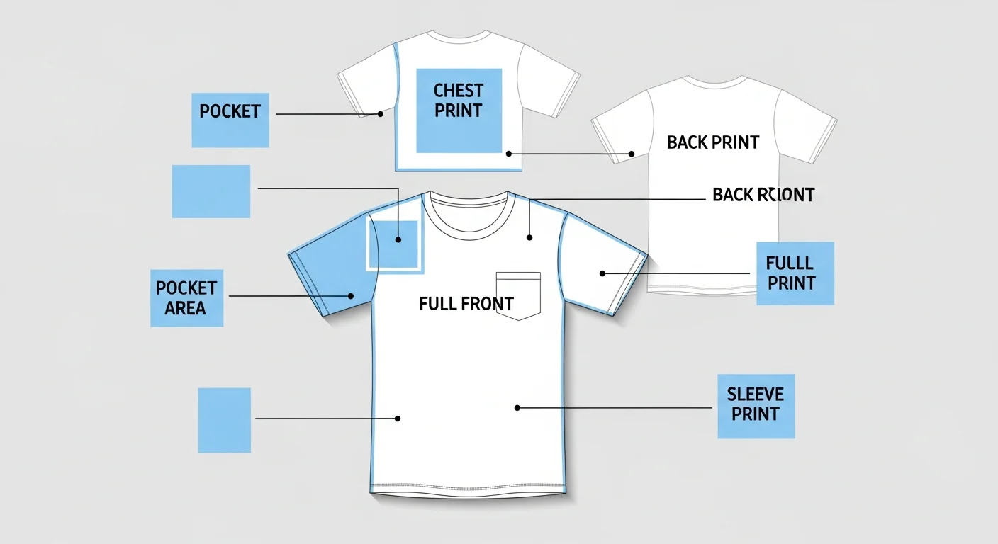
The most popular placement options include the classic left chest print, the eye-catching full front center, the bold oversized back print, and the edge-to-edge all-over print. Each zone offers unique advantages depending on the purpose of the shirt, the complexity of the design, and your budget. In this guide from RareCustom, we break down every placement zone, compare costs and visual impact, and help you choose the right option for your next order.
Why Print Placement Matters More Than You Think
Print placement is often treated as a minor detail, but it actually drives the entire visual identity of a custom shirt layout. A logo positioned on the left chest communicates professionalism and subtlety. The same logo blown up across the full back screams confidence and street style. Move it to an all-over repeating pattern and suddenly you have high-fashion appeal. The design itself has not changed at all, only its position on the garment, yet the emotional response from viewers shifts dramatically.
Placement also affects wearability. A large, heavily inked front print can feel stiff against the skin, especially with screen printing methods that deposit thick layers of plastisol. A small left chest design, by contrast, barely registers against the body. Sleeve prints sit in a high-movement area that can crack faster if the wrong printing method is used. Understanding these practical considerations ensures your custom apparel design looks great and wears comfortably for years.
From a cost perspective, placement directly impacts pricing. Larger print areas require more ink, more screen setups, or larger transfer sheets. All-over printing demands specialized equipment that most standard shops do not own, which means higher per-unit costs. A well-informed placement choice lets you maximize visual impact while staying within your budget, and our ordering process makes it easy to compare options before committing.
Left Chest Print: The Professional Standard
The left chest print is the most universally recognized placement in the custom apparel industry. Positioned over the heart, typically three to four inches wide and centered between the collar seam and the armpit seam, this placement communicates credibility and restraint. It is the go-to choice for corporate uniforms, employee shirts, polo-style branding, and any situation where subtlety outweighs showmanship.
One of the biggest advantages of the left chest placement is cost efficiency. Because the print area is small, you use less ink and require smaller screens or transfers. This makes it the most budget-friendly option for bulk custom t-shirt orders, especially when combined with single-color designs. A one-color left chest logo on a standard cotton tee is often the lowest price point any custom printer offers.
Design considerations for this zone are straightforward but important. Keep your artwork simple, because fine details shrink to near-invisible sizes at three or four inches wide. Bold logos, clean icons, and short text lines work best. Avoid photographic images or intricate illustrations that will turn into unrecognizable blobs at this scale. If your brand logo is complex, consider a simplified version specifically for left chest use. Many of the best fonts for custom shirt designs work beautifully at this scale because they prioritize legibility over decorative flourish.
Ideal Use Cases for Left Chest Prints
Corporate uniforms and staff shirts dominate this category. When employees interact with customers, a subtle branded shirt looks far more professional than a billboard-style full front graphic. Left chest prints are also popular for golf shirts, country club wear, and any occasion where the wearer wants to signal brand affiliation without drawing excessive attention. Many small businesses use this placement as their signature branding approach.
Full Front Center Print: Maximum Visibility
The full front center print places your design in the primary viewing zone of any t-shirt. Standard dimensions range from ten to twelve inches wide and cover most of the torso area between the collar and the waistline. This is the placement most people picture when they think of a graphic tee, and for good reason: it puts your design front and center where it demands attention.
This placement is ideal for detailed illustrations, photographic prints, event graphics, and designs that rely on visual complexity to make an impact. Unlike the left chest area, the full front offers enough real estate for multi-color gradients, typography with supporting imagery, and layered compositions that tell a visual story. Concert merchandise, festival shirts, and charity event tees almost always use this zone because it serves as a wearable poster.
The tradeoff is cost. Larger print areas mean more ink consumption, larger screen sizes for screen printing, and bigger transfer sheets for DTG or DTF printing methods. For multi-color designs, each additional color adds another screen setup in traditional printing, which compounds costs quickly on smaller orders. However, digital printing methods like DTG handle full-color front prints at a flat rate regardless of color count, making them increasingly popular for this placement.
When designing for the full front, consider how the design interacts with the neckline and the side seams. Designs that extend too close to the collar look cramped, while artwork that sits too low on the torso looks like it is sliding off the shirt. Standard placement centers the top of the design approximately three inches below the collar seam, though this varies by shirt size.
Oversized Back Print: Statement Streetwear

The oversized back print has exploded in popularity thanks to streetwear culture and high-fashion runway influence. This placement covers most of the back panel, often extending from shoulder to shoulder and reaching down toward the lower back. When paired with a small front logo or left chest mark, the combination creates a dynamic two-sided design that looks incredible whether the wearer is coming or going.
Back prints offer several practical advantages that designers often overlook. The back of a t-shirt provides the largest uninterrupted canvas on the garment, free from collar interference, pocket obstructions, or button plackets. This makes it perfect for large-scale artwork, detailed typography, photographic imagery, and designs that need room to breathe. Event shirts frequently use the back for sponsor logos, participant lists, or venue information while keeping the front clean with the event branding.
The streetwear approach typically features oversized graphics that intentionally break traditional proportions. Designs might extend from the neckline almost to the hem, creating a dramatic visual statement. This style works particularly well with screen printing and DTF transfers, both of which can handle large print areas with vivid color reproduction. The latest design trends show oversized back prints continuing to dominate the custom apparel landscape.
Back Print Sizing Considerations
Unlike front prints that are viewed head-on in mirrors, back prints are seen by others and in photos. This means the design needs to read well at a distance. Use bold, high-contrast elements and avoid fine details that disappear when viewed from more than a few feet away. Text should be large enough to read across a room, and graphic elements should maintain clarity without requiring close inspection.
All-Over Printing Explained
All-over print shirts represent the most visually dramatic placement option available. Unlike traditional print zones that occupy a defined area of the garment, all-over printing covers the entire shirt from seam to seam, collar to hem, and sleeve to sleeve. The result is a wearable piece of art where the fabric itself becomes the canvas.
The process behind all-over printing differs fundamentally from standard t-shirt decoration. Most all-over prints use dye-sublimation, a technique that converts solid ink into gas using heat and pressure, permanently bonding the design into polyester fibers. Because the dye becomes part of the fabric rather than sitting on top of it, sublimated all-over prints feel like bare fabric to the touch, with zero texture change. This creates an incredibly comfortable garment that does not crack, peel, or fade with washing.
The catch is material limitation. Sublimation only works on polyester or polyester-blend fabrics because the dye molecules need synthetic fibers to bond with. Pure cotton shirts cannot be sublimated, which means you sacrifice the soft, breathable feel of natural fibers for the visual impact of edge-to-edge printing. Some hybrid methods use DTG white base layers under sublimation transfers to approximate all-over effects on cotton, but the results are not quite the same.
All-over prints are perfect for fashion-forward brands, music festival merchandise, sports jerseys, and any application where maximum visual impact justifies the higher cost. If you are exploring this option, our design tool lets you preview how patterns and artwork look wrapped around a full garment before ordering.
Sleeve Prints: Subtle Branding That Stands Out
Sleeve prints occupy a unique position in the custom shirt placement hierarchy. They are small enough to feel subtle but positioned in a high-visibility area that catches attention during natural arm movement. Sleeve printing typically places a design on the outside of the upper arm, either on the left sleeve, the right sleeve, or both.
Standard sleeve print dimensions are relatively small, usually two to four inches wide. This limits the design to simple logos, small icons, flag motifs, text snippets, or pattern elements. The narrow canvas means every pixel matters, and designs must be optimized for clarity at a small scale. Many brands use sleeve prints as a secondary branding element, placing a small logo or website address on the sleeve while the main design occupies the chest or back.
The cost implication of sleeve prints is moderate. Adding a sleeve print to an existing front or back design typically adds a setup fee plus per-unit printing costs. If you are ordering in bulk, the per-unit increase is often minimal, making sleeve prints an affordable way to add perceived value and design sophistication. Sleeve prints work particularly well with employee gift shirts and branded corporate apparel where subtle, multi-location branding reinforces brand visibility without overwhelming the garment.
Pocket Area Prints: Classic and Functional
The pocket area print mimics the look of a printed pocket on a crewneck tee. This placement sits in the same position as a left chest print but often incorporates a faux pocket outline, giving the design a preppy, casual aesthetic. Some variations use actual sewn pockets with printed or embroidered embellishments, though this adds significant cost and complexity.
Pocket prints are popular for lifestyle brands, beach and surf companies, and casual menswear lines where the relaxed pocket-tee vibe aligns with the brand identity. The design typically includes a small graphic that appears to peek out of or sit inside the pocket outline, creating a playful visual trick that adds depth to a simple shirt.
From a production standpoint, pocket area prints follow the same specifications as left chest prints. The print area is small, cost is low, and design complexity should be limited. The main difference is the creative framing of the design within a pocket-shaped boundary, which requires careful alignment during printing to look intentional rather than misplaced.
How Placement Affects Cost
Understanding the cost impact of print placement helps you make smarter decisions when ordering custom t-shirts. The general rule is straightforward: larger print areas cost more because they consume more materials and require more production time. However, the relationship between placement and price is not always linear.
| Placement Zone | Typical Size | Relative Cost | Best For |
|---|---|---|---|
| Left Chest | 3-4 inches wide | Lowest | Corporate, uniforms, subtle branding |
| Full Front Center | 10-12 inches wide | Moderate | Events, merch, graphic tees |
| Oversized Back | 12-14 inches wide | Moderate-High | Streetwear, events, sponsor logos |
| Sleeve (each) | 2-4 inches wide | Low add-on | Secondary branding, accents |
| All-Over Print | Full garment | Highest | Fashion, jerseys, bold statements |
Multi-location prints, such as a left chest logo plus a full back design, require separate screen setups or print passes, which means each additional placement adds both setup costs and per-unit production costs. For budget-conscious orders, choosing a single placement and maximizing its impact is the most cost-effective strategy. Our pricing guide breaks down these costs in greater detail.
Cost-Saving Placement Strategies
If your design requires multiple print locations, consider combining them on the same side of the garment. A design that spans the full front, for example, costs the same whether it occupies the chest area alone or extends down to the waistline. Similarly, a back print plus a back neck label can often be combined into a single print pass. Smart layout planning reduces production steps without sacrificing visual impact.
Choosing Placement by Purpose
The intended purpose of your custom shirt should drive your placement decision. Different contexts demand different visual approaches, and matching placement to purpose ensures your shirts communicate the right message.
Casual and Personal Wear
For shirts intended as everyday casual wear, full front center and oversized back prints dominate. These placements deliver the visual punch that makes a graphic tee worth wearing. Consider designs that express personality, humor, or artistic flair, and choose placements that give those designs maximum real estate.
Promotional and Corporate Apparel
For promotional t-shirts and corporate events, left chest prints and small back prints work best. The goal is brand recognition without turning employees or event attendees into walking billboards. Subtlety builds credibility, and restrained placement signals professionalism. Pair a left chest logo with a small back print of a website URL or tagline for maximum brand exposure with minimum visual overwhelm.
Fashion and Streetwear
Fashion-forward designs benefit from unexpected placements. Off-center front prints, asymmetrical back designs, all-over patterns, and strategic sleeve graphics create the visual intrigue that separates fashion pieces from basic merch. If you are building a clothing brand, placement innovation is one of the easiest ways to differentiate your line from competitors.
Print Area Dimensions by Shirt Size
One of the most overlooked aspects of t-shirt design placement is how print area dimensions change across shirt sizes. A design that looks perfectly proportioned on a medium shirt might appear undersized on an XXL or overwhelm an XS. Understanding these variations is essential for maintaining design consistency across your entire size run.
| Shirt Size | Max Front Width | Max Back Width | Left Chest Max |
|---|---|---|---|
| S | 10 inches | 10 inches | 3.5 inches |
| M | 11 inches | 11 inches | 3.5 inches |
| L | 12 inches | 12 inches | 4 inches |
| XL | 13 inches | 13 inches | 4 inches |
| 2XL | 14 inches | 14 inches | 4 inches |
| 3XL | 15 inches | 15 inches | 4.5 inches |
Most custom printers use a single design file across all sizes, scaling the print proportionally to maintain visual consistency. However, some high-end producers offer size-specific scaling where the design is manually adjusted for each size to ensure optimal proportions. If your order spans a wide size range, ask your printer about their scaling approach to avoid surprises. The size guide covers garment fit in detail.
Placement for Different Print Methods

Not every print method supports every placement option equally. Understanding which methods work best for each zone ensures your finished shirts meet expectations.
Screen printing excels at front center, back, and left chest placements. It handles large solid areas and bold graphics beautifully but struggles with all-over prints due to equipment limitations. Most screen print shops can handle prints up to fourteen inches wide and seventeen inches tall, which covers standard front and back placements comfortably.
DTG printing offers similar placement flexibility to screen printing with the added advantage of full-color capability at no extra cost per color. DTG works well for chest, back, and sleeve prints but is not suitable for true all-over printing because the printer has a defined platen size. Learn more about method differences in our screen printing vs DTG comparison.
Sublimation is the preferred method for all-over printing because the entire garment panel is printed before assembly. It also works for standard placement zones but requires polyester fabrics. DTF transfers offer versatility across most placement zones and work on both cotton and polyester, making them a flexible option for mixed-placement orders. Our heat transfer vs sublimation guide covers these options in depth.
Design Tips for Each Print Zone
Every placement zone has its own design best practices. Following these guidelines ensures your artwork looks intentional and professional regardless of where it sits on the garment.
Front Center Design Tips
Center your design vertically between the collar and the midpoint of the torso. Leave at least one inch of margin from the side seams to prevent the design from wrapping around the body. Use strong visual hierarchy with a clear focal point, especially for text-heavy designs. Avoid placing critical elements near the neckline where collar folds can obscure them.
Back Print Design Tips
Position the top of back designs approximately three inches below the collar seam. For oversized back prints, ensure the design has a clear top and bottom orientation since viewers see it from behind. Use bold, high-contrast colors that read well at a distance. Consider adding a small front element like a left chest logo to create a cohesive two-sided design.
Sleeve and Pocket Area Tips
Keep sleeve designs simple and under three inches wide. Position them on the outer arm where they are most visible. For pocket prints, align the faux pocket outline carefully with the natural chest position. Use vector artwork for small placements to maintain crisp edges at reduced sizes. These tips apply whether you are using screen printing, DTG, or vector file formats for your artwork.
Frequently Asked Questions
What is the most popular t-shirt print placement?
The full front center print remains the most popular placement for graphic tees and event shirts, while the left chest print dominates corporate and branded apparel. The best choice depends on your purpose: casual wear favors larger placements, while professional settings benefit from subtle positioning.
Can I combine multiple print placements on one shirt?
Yes, multi-location printing is common and effective. Popular combinations include left chest plus full back, front center plus sleeve, and left chest plus back neck print. Each additional placement adds cost, but the enhanced visual impact often justifies the investment for branded merchandise and retail-quality apparel.
Does print placement affect how long a shirt lasts?
Placement itself does not affect durability, but high-friction areas like sleeves and lower backs experience more wear than chest areas. Choosing the right print method for each zone, such as DTG for chest prints and DTF for high-movement areas, maximizes longevity. Follow our care and washing guide to extend the life of printed garments.
What is the cheapest placement option for custom t-shirts?
Left chest prints are the most affordable because they use the least ink and smallest screens or transfers. Single-color left chest designs on standard tees represent the lowest cost per unit in the custom t-shirt industry.
Is all-over printing worth the extra cost?
All-over printing is worth it for fashion brands, unique merchandise, and high-impact designs where visual drama justifies the premium. For events, fundraisers, or basic promotional use, standard placements offer better value. Evaluate your audience and purpose before committing to all-over printing.
Ready to Choose Your Print Placement?
Now that you understand every t-shirt print placement option, from the understated left chest to the dramatic all-over print, you are equipped to make confident design decisions for your next custom apparel project. The right placement transforms a simple design into a professional product that communicates exactly the message you intend. Visit our design studio to start experimenting with placements on real shirt mockups, or explore our full custom t-shirts collection to find the perfect blank canvas for your vision.
Related Articles
Share this article
Written by
Tony Vu
Founder & President of RareCustom. Tony's production background—from his family's print shop to managing multi-supplier networks—gives him deep knowledge of how print placement affects cost, quality, and visual impact.